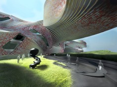
AMORPHIS, F-LAB & IDEA OFFICE
source: suckerpunchdaily
Two instincts inform the design: the calligraphic gesture and squishy masses. Calligraphy is a writing form with an extensive history and highly developed technique, both disciplined and beautifully fluid at the same time. The squishy massing works as a means for creating particular moments within the larger forms of the building that simply allows it to do what it needs to in an effortless way. That is, the squishing of the more rigid, formal typology allows for unique moments without compromising the coherence of the larger whole and it produces a posture that relies on mass effects rather than volumetric ones The relaxed posture enables the visitor to move between indoor and outdoor spaces, both equally compelling in the ways they might exhibit art as it coexists with life.
The calligraphic is essentially a series of lines or strokes that dance across the grounds of the site, changing direction, intersecting, converging and diverging. These multiple figures both hug the landscape at intimate moments and fly above it to create shaded outdoor spaces for gathering and exhibition. The various segments of the figures house the storage wing and administrative offices discretely, while restaurants, bookstores, rest areas and support facilities punctuate the varied spaces for exhibition.
The overall organization of the NTCArt is non-hierarchical, dispersed, informal, and opportunistic. It is not composed as a single narrative nor is it an abstract space for the storage and display of art. Rather the architecture visibly intends to foster and shape multiple forms of the convergence of art and life, effectively enabling a new lifestyle. As opposed to the more rigid, institutional model of museum as a precisely choreographed experience, our building allows for a different range of possible experiences. Multiple entrances, paths and experiences interact to produce the new. It is no longer important that viewers see the entire collection from one end to the other, but rather that they can have a series of satisfying experiences each time they visit the museum. It is a place of prompts, not directives, a place one returns to over and over without preconception or rote.
.
.
.
.
.
.
.
source: amorphis-la
This project explores morphological potentials of the linear museum type.
As a competition for a museum without a collection and situated in a park setting just outside a major city, the proposal employs a strategy based on configuring a line into multiple organizational, circulatory, and spatial conditions. The line is treated as an oscillation between taught volume and supple mass. The thickened line bends, folds over itself, swells, pinches, sags, etc. producing a range of interior and exterior experiences. It becomes a calligraphic object on the ground that offers multiple entry points and curatorial opportunities. While the line as a form has a start and end point, they do not dictate a linear sequence of events. There are local circuits at various scales, suggesting that one could continuously return to the museum and experience it anew.
In collaboration with IDEA Office and Flab
.
.
.
.
.
.
.
source: architbang
这是2011年新北市立博物馆竞赛参赛方案之一。
建筑师认为该博物馆是当地的艺术,生活,文化中心。同以往孤岛式的博物馆不同,该博物馆并非精英式的属于收藏家或者是高高在上文化宝库,而是一个吸引人的,亲民的,将艺术,娱乐,旅游合并在一起的博物馆。将艺术带入生活,让生活更加精彩。
建筑构架不光可以满足正式要求,也能满足各种非正式条件和互动。建筑吸取书法精髓,营造出自由的形体。使用数字设计轻松的完成了这个想要的造型。
建筑构架本身并不具有完整的多样性,丰富的多样性是通过建筑连接周边地区,城市要道,汇聚人类活动而实现,建筑以放松的姿态迎接汇聚而来的能量。游客在内外穿梭,感受与生命共存的艺术。
博物馆整体组织是无层次,分散,非正式,充满机会性的。博物馆并非由单一叙事空间组成,也不是抽象的艺术储存和展示空间。而是能激发形成各种生活与艺术融合的形式,开启一种新的生活方式。一反曾经的精确设定路径,建筑师设定多条体验线。这些多个入口和路径产生新的互动体验。一览而全,从端到终的体验不再是最重要的,重要的是每一次,你到这里,都会有新发现新体验。这里不在循规蹈矩,而是充满启发性。
取书法之精髓,建筑舞姿飘逸,轻盈的穿梭于场地之中,形成丰富的室外光影空间。儿童博物馆在西南角,行政办公室位于东南。储存空间位于各处翼端,办公,餐厅,书店,休息区等与展览空间紧密相连。建筑的各条路径与室外绿色网络相连。场地之中植物繁茂兴盛,蜿蜒的人行道,自行车道穿梭在有着势头,水体,植物的外界自然环境中。场地并未切断外界交通,而是将他们引入地下,创造一个新的,更高速的路径体验。为了不影响景观,停车场放在地下一层,这也使得人们访问博物馆更加快捷方便。


