EMMANUELLE MOUREAUX
toki
source: emmanuellemoureaux
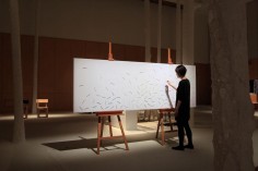
“toki” (which means “time” in Japanese) project investigates the universal element of time, expressed through the work composed of an array of sticks presented in various hues.
Each stick moves in circular motion through the implementation of magnets, which is an abstract representation of time.
.
.
.
.
.
.
.
source: mammasporlandeblogspot
てきましたデザインタイド。今回はなんと娘も連れていきました。
参加型の展示にひるむこと無く参加していく娘に母は少々疲れましたが、いつもとは違う楽しみ方が出来たと思うことにします。
体験型の展示も多い中、静かに存在感を発揮していたのはEmmanuelle Moureauxさんのtoki。食い入るように眺めては他の展示を見て、また眺めに戻る。この繰り返しでした。「時」という普遍的要素と「色」という感覚的要素の関わり。楽しませてもらいました。
久しぶりの東京散策目的地に選んだデザインタイド。他にも素晴らしい作品があり、たくさん刺激をもらいました、、、。
でも一番の刺激はお昼に飲んだワインかな。あれ本当に刺激的でした。
.
.
.
.
.
.
.
source: domuswebit
Tokyo-based architect and designer Emmanuelle Moureaux has recently presented the Toki interactive installation at the Tokyo Designtide 2012. Toki (which means “time” in Japanese) presents a large-scale whiteboard, in which a myriad coloured sticks is placed, each moving mechanically, mimicking the movement of pointers in a clock.
The sticks are displayed forming a gradient, and their mechanical, precise movement is achieved through the use of magnets. Emmanuelle Moureaux, who often works with colour to achieve three-dimensional experiences, describes her project in a rather poetic fashion, listing the components and the result of their combination: “A universal elemented called “time”, a sensuous element called “colour”. When the disparate two coincide, it lures the the emotional world of “time”.” The piece is an abstract representation of the multiple time zones of our world and seeks to evoke ideas of progress.
The self-described Tokyo Designtide is a yearly event to trade design and ideas, and took place 31 October through 4 November 2012. At the core of the event is an exhibition showcasing designers’ new works and ideas in a refined setting, where domestic and international designers, manufacturers, buyers and journalists trade and interact.
.
.
.
.
.
.
.
source: domuswebit
Con il progetto interattivo Toki (“tempo”, in giapponese), presentato all’ultima edizione di Designtide Tokyo, la progettista francese Emmanuelle Moureaux indaga l’elemento universale del tempo, che ha reso tangibile attraverso l’utilizzo della sua cifra stilistica: una serie di colori brillanti, accostati tra loro. L’opera è un pannello bianco, una grande lavagna posata su cavalletti sulla quale è allineata una serie di bastoncini colorati di varie tonalità. Ogni bastoncino si muove in modo indipendente e grazie all’applicazione di magneti, secondo angoli contrastanti e a scatti, con un movimento che ricorda quello delle lancette di un orologio. Toki è una rappresentazione astratta del tempo che passa e dei fusi orari mondiali.
Toki
Un elemento universale come il tempo,
E un elemento sensuale come il colore,
Quando questi due elementi diversi coincidono,
Si entra nella sfera emozionale del tempo.
Architetto e designer francese, Emmanuelle Moureaux vive e lavora a Tokyo dal 1996. Il suo lavoro è caratterizzato dall’uso del colore, che impiega non come forma piatta, ma piuttosto come strumento per dare vita a spazi tridimensionali. Insegna come associate professor presso la Tohoku University of Art & Design.
.
.
.
.
.
.
.
source: emmanuellemoureaux
Born in 1971, France. Emmanuelle Moureaux is a French architect living in Tokyo since 1996, where she established “emmanuelle moureaux architecture + design” in 2003. Inspired by the layers and colors of Tokyo that built a complex depth and density on the street, and the Japanese traditional spatial elements like sliding screens, she has created the concept of shikiri, which literally means “dividing (creating) space with colors”. She uses colors as three-dimensional elements, like layers, in order to create spaces, not as a finishing touch applied on surfaces. Handling colors as a medium to compose space, her wish is to give emotion through colors with her creations, which range from art, design to architecture.
Her representative works include the architectural design for Sugamo Shinkin Bank, space design for ABC Cooking Studio, installations for UNIQLO and ISSEY MIYAKE, and stick chair. Since 2011, commissioned by the New Taipei City Government in Taiwan, she is handling the artistic design of the Mass Rapid Transit “Circular Line”, working on the color scheme of 14 km section, where her colors will spread into city-scale with its completion in 2016.
Her installation series – 100 colors – express emotions from the experience of colors and layers of Tokyo. Unveiled in 2013 to celebrate the 10th anniversary of her studio, she is planning to exhibit “100 colors” in different cities around the world.
Associate Professor at Tohoku University of Art and Design since 2008, Emmanuelle’s laboratory explores the possibilities of color through a project she named 100 colors lab. Students are asked to create 100 colors palette of an item from their everyday life, such as glasses, bubble foam, rice, umbrella, watches, CD, chocolate block and so on.
Member of “Tokyo Society of Architects”, the “Architectural Institute of Japan”, and the “Japan Institute of Architects”.


