Stefan KLECHESKI, Yingjing MA and Siwei REN
Cute Seams-Seems Cute

source: yingjingma
Thesis Brief
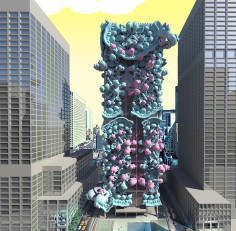
How can cuteness be deployed in architecture? Is there a relationship between the uncanny and the cute? By proposing a perversion of Mies’ architecture of sobriety, we unpack the field of aesthetic categories extant in architecture today. Cute forms are agglomerated, as a means to unpack the Seagram Building’s unique quality, and as a means to investigate cute effects and tectonics.
SEEMS CUTE/ CUTE SEAMS | UNCANNILY CUTE SEAGRAM BUILDING
Graduate Thesis Project
Burton L. Kampner Memorial Award Honorable Mention
Spring 2016
Project Location: New York, USA
Collaborators: Stefan Klecheski, Siwei Ren
Instructor: Matias Del Campo
Cuteness: The Field
The desire to care, and cuteness, is performative, addictive. It triggers empathy. Simultaneously, cuteness has its own field, gradually evolving from conventional cute to contemporary cute and to uncannily cute. Recently, cuteness has been hybridizing with the grotesque. Cute can be disturbing, and there’s a fine line.
Uncanniness: The Curve
The uncanny valley describes a condition in which as something approaches resemblances to reality, at a certain point, our feeling of empathy towards it drops, and we feel disgust. Can we use the uncanny as a method of design to disturb the elegance and silence of the Seagram Building? This curve shows our various disturbances which attempt to make the building cute. Our design, in the middle, being populated by just enough cute elements taking on the quality of the uncannily cute.
Fabrication Strategy
This uncannily cute Seagram Building can be built with the sheet material. To prove that, these three stages serve as the mock-up prototypes demonstrating how the panels work as the complexity of the geometries increase. They are divided and combined by the finger joints, which offer perfect solution bridging the design and build.
The fundamental strategy is dividing the sphere into horizontal strips or panels, A Grasshopper script is developed to add fins along the edges and to guarantee that they are matching side by side.
The following stages suggest that any space and geometry can be treated as the combination of basic spheres and can be further divided into panels. Thus, the whole building can be built in sheet materials. Moreover, the shape of seams, constituted by the finger joints will largely influence the impression as well as the physical performance of the whole building at large.
Fabrication Brief
Due to certain limitations of scales and part to whole relationships, the model of the whole Seagram Building is built with multiple fabrication methods including CNC milling and various sheet material assembling.
The majority of the facade is milled from foam, creating a cute, thick field hugging the Seagram Building’s curtain wall and integrating with the original I-Beams. Discrete panels emphasize features within this field. The cute objects and field of the uncannily cute Seagram Building are round, featured, and made of foam and plastic. The new cute constructs bite away at the floor slabs, and rest on the original plaza, reconsidering the relationship between object and context.
.
.
.
.
.
.
.
source: ste-fan
How can cuteness be deployed in architecture? Is there a relationship between the uncanny and the cute? And what about that cutie, Mies? ;) We investigate these questions through the design of an uncannily cute Seagram Building. The Seagram Building, the emblem par excellence of high-modernist architecture, embodies key aspects of the movement: purity of form distilled to a replicable aesthetic, material and construction system; expression of function and structure; embrace of technological advancement in the service of social progress; and construction of the project enabled by corporate interests. All of these factors produce an aesthetic of elegance. The uncannily cute Seagram Building questions and upturns these traits of high-modernism, opening a space for less commonly explored architectural aesthetics.
with YJ Ma and Siwei Ren
.
.
.
.
.
.
.
.
source: filescargocollective
I am a designer who was born in New York City and raised globally. Having lived in Russia, Poland, the Philippines, Switzerland, and the US growing up, each phase of life was tied to a specific environment. I’ve learned I have a knack for understanding, deploying, and complementing others’ design sensibilities; 3d modeling; thriving when working alone or in teams; and solving both technical and conceptual problems. I hope to enrich my design skills, technical prowess, and communication+leadership abilities.
.
.
.
.
.
.
.
source: yingjingma
Yingjing Ma is an architectural designer and recently received her Master of Architecture with distinction from the University of Michigan.
Yingjing is passionate about developing the architectural environment to engage people and context, and to close the gap between utopian designing and pragmatic construction through spatial narrating, material utilizing and detail articulating. Her academic works, ranging from the multiple types of architecture design, the material study, architectural representation and digital fabrication. explore the potential of versatility as a dry run of architectural practice and as a site of architectural research.
Yingjing experienced professional practice at Gluckman Mayner Architects in New York and at Central South Architectural Design Institute in Wuhan, China.

