highlike

Olafur Eliasson

DET LYTTENDE SPEJL
Visitors to DNV-Gødstrup, a new hospital near Herning, Denmark, are greeted at the main entrance by an airy, round pavilion. Two curved pipes, crossing one another perpendicularly, hold a large disc aloft at a slight angle. The reflective underside of the disc mirrors the semicircular pipes, creating the illusion of two complete circles passing through the ceiling and rising into an imaginary space above. As visitors enter the pavilion, they can gaze up at their own reflections in the mirror and see themselves incorporated, upside down, into the artwork, embraced within the globe drawn by the pipes. The tilt of the ceiling allows the reflections to be seen from the outside. As the viewer moves towards and around the pavilion, the rings appear to shift in shape, changing from ellipses to circles and back again.

danny karas

sofi

in analysis of the modern skyscraper there is traditionally an aesthetic agenda that localizes itself in a “shoes” or “hat” location. The tower typology has ignored the possibility of a center distortion. This distortion acts as an aesthetic element as well as an organizational(programmatic) locator. By designing from the middle out there is a chance for the building to better blend with its context by keeping the processional elements in the center. Entrance and roof conditions mimic their tower brothers and give a moments rest in the exuberance of design. This proposal creates a center distortion and layers form through a simulation of gravity and the“claspyness” of the outer skin. The inner void acts as a way of creating a Secretary oriented office program rather than a traditional first floor security, freeing up the center of the building to the public. The project looks to rationalize itself through components rather than a monolithic form.

numen / for use

tape sao paulo
file sao paulo 2016
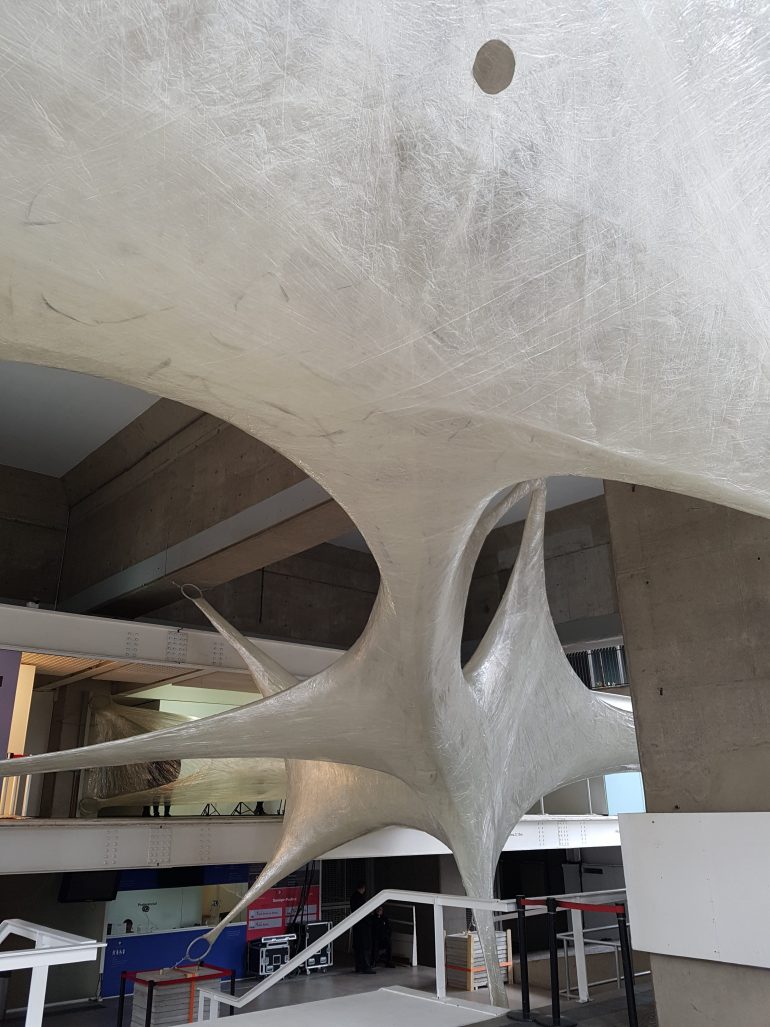
Constant wrapping of pillars with a transparent adhesive tape results in a complex, amorphous surface through the process reminiscent of growing of organic forms. One line evolves into surface that forms an organic shape of extraordinary strength. The entrance of the audience inside the volume transforms the sculpture into architecture. It was practically “found” through the act of chaotic wrapping, where a one-dimensional line (“tape”) slowly turned into two-dimensional plane, which then finally curved into volume.

Ann Veronica Janssens

Hot Pink Turquoise
Janssens’ works range wide, but they can all be described as sculptures that use the space as a stage for sensory activity. The simple white architecture of Louisiana’s South Wing becomes a resonating surface for Janssens’ both fragile and dizzying art – fragile because the works and their components are very simple while their effect elevates them above the material. Janssens herself often uses the word fluid to describe the effect of her works – even for example when they consist of a 6.5 metre long iron girder polished at the top so the room is reflected and it is hard to fix your gaze on the object. Janssens seeks no control of either works or viewers, for as the Dutch theorist Mieke Bal has said, Janssens’ artworks are at one and the same time object and event. Many of the works in the exhibition can evoke the sensation of standing at the threshold of something. They stress transitions and transformations between on the one hand a material level – evoked by glass, colour, liquids and not least light – and on the other hand a dynamic experience of time and space.

Michele Spanghero

Dià
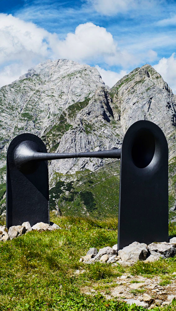
Dià (from greek διά, through) is a sculpture installed on a piece of no man’s land on the top of mount Pal Piccolo on the border between Italy and Austria, where World War I was fought. The double-trumpet shaped sculpture symbolically connects, both visually and acoustically, the first lines’ trenches. Two arched doors, that refer to the entrance of the shelters and trenches, turn into cavities to listen or observe the surrounding landscape. The work, conceived as a symbolic link between the two fronts, combines the dimensions of silence and sound: dià is indeed a device that invites audience to interact with the two cavities as a megaphone or a peephole, to start an intimate dialogue through the sculpture.

Eirik Brandal

Waldian
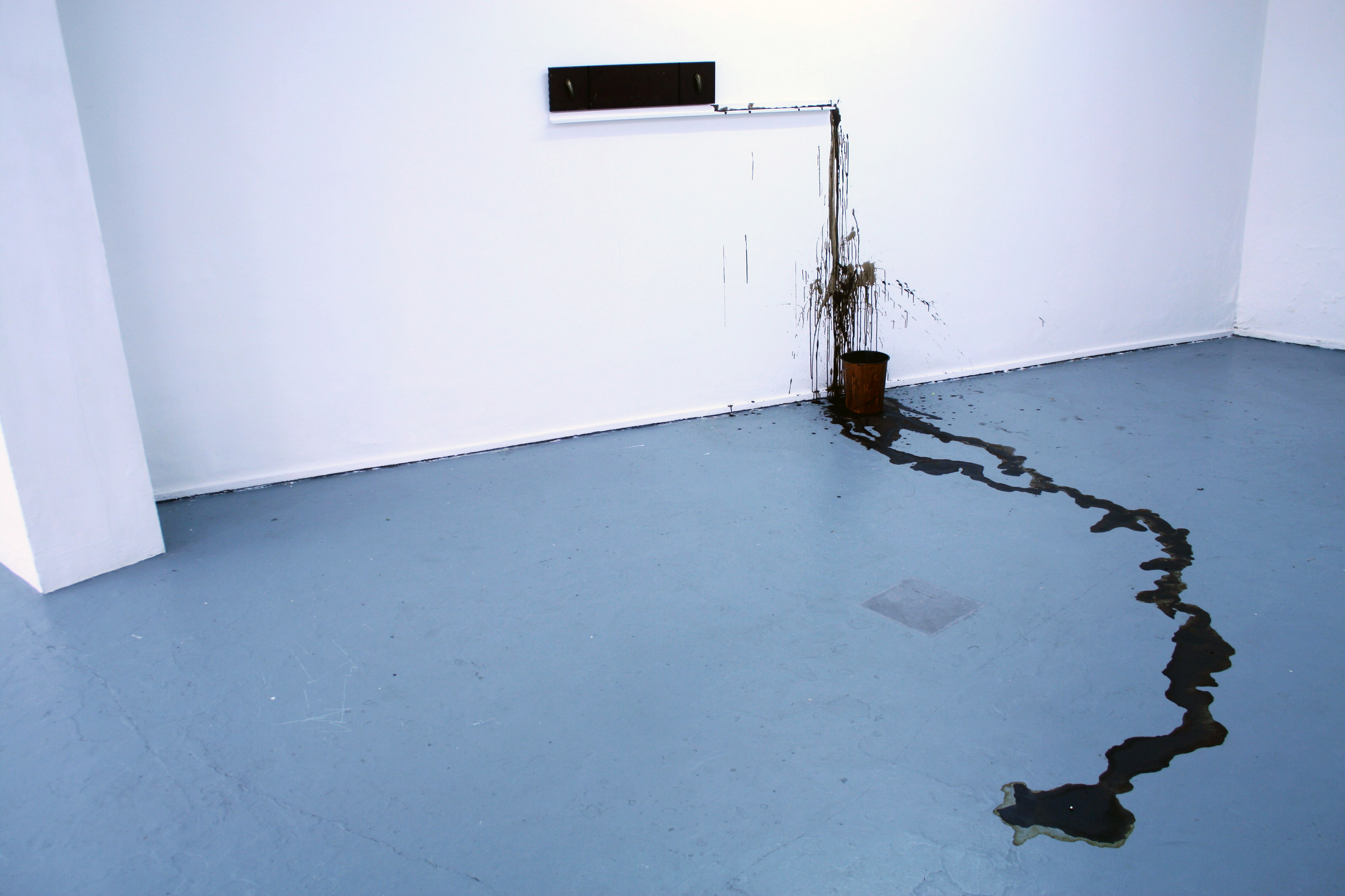
Waldian is a standalone, wall hanging sound and light fixture capable of playing a near infinite amount of melodic permutations over a predetermined musical scale, complemented by emerging light patterns from twelve separate LEDs spread across the sculpture. In technical terms, Waldian contains two oscillators, an envelope generator and a voltage controlled amplifier, all controlled by impulses from a network of logic gates akin to those of early computers. These impulses are essentially the nerves in the electronic ecosystem, deciding over pitch and amplitude changes as well as creating bursts of light to highlight the entrances of each note. Finally, there is a tube overdrive stage that creates harmonic and subharmonics based on how far away the two oscillators are from each other in frequency. Most parameters are customizable, such as the aforementioned pitch, amplitude and overdrive, but the responsiveness and envelope of the light bursts can also be adjusted, directly affecting the appearance of the light patterns.

Clap Studio

Mist Installation
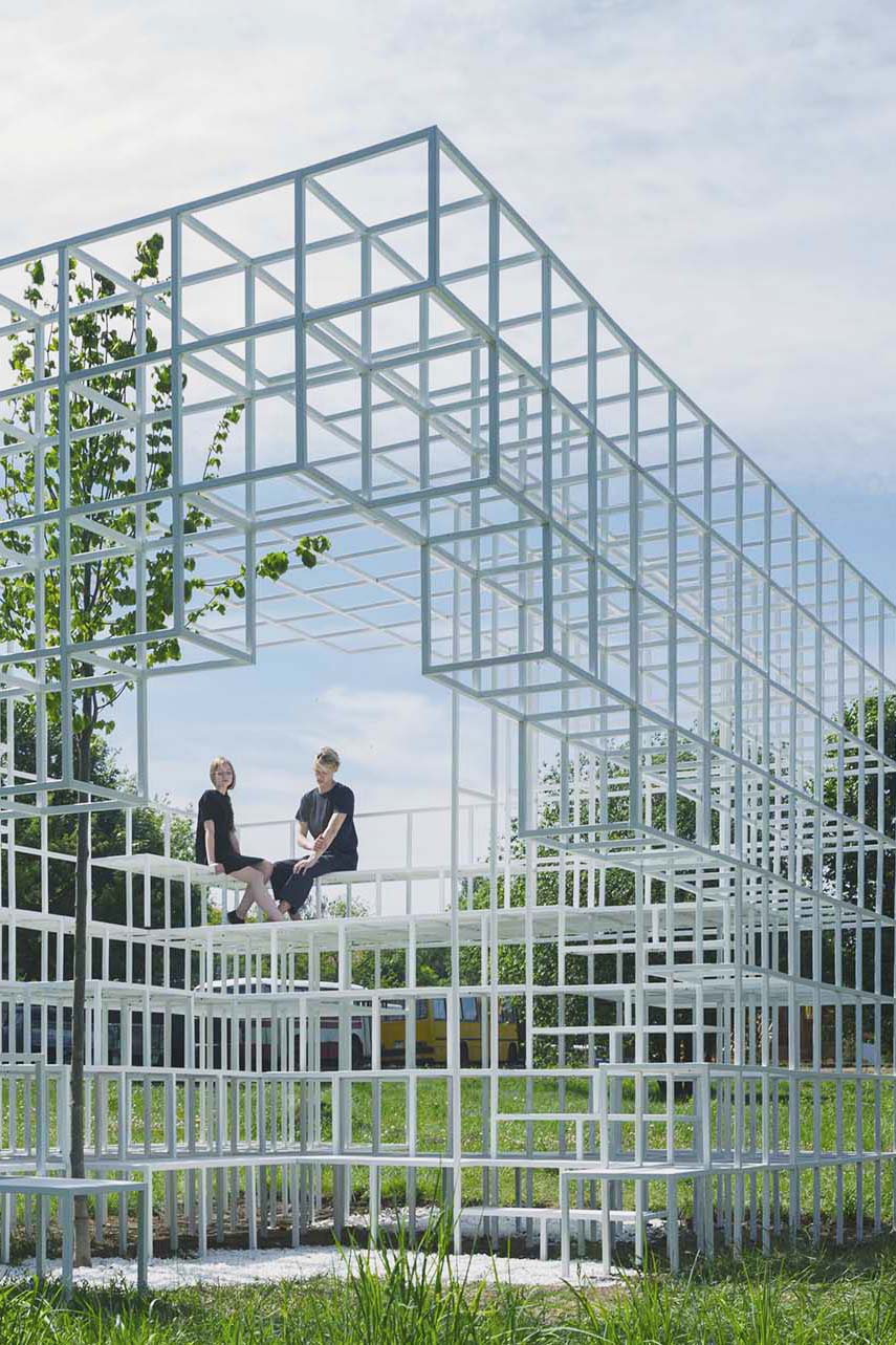
An installation designed by Clap for Minsk, Belarus, that was built by volunteers from the city itself. For the concept of this installation Clap starts from the history of Minsk, a city that during the Second World War was devastated. The bombs destroyed 80% of the buildings and the city was not rebuilt until the 1950s. That is why the population of this city remembers these times as something unpleasant and many of them prefer not to talk about it. The design studio starts from a geometric volume that represents in a conceptual way the volume of a building. They imagine that the bombs fall on him destroying it, generating new openings and brand new volumes. These new openings result ingeniously in an entrance and a viewpoint on the top. The destruction gives way to the function generates grandstands, stairs and seats. From the inside, life makes its way in the form of a tree, exceeding the height of the installation itself.

jurgen h. mayer and juan rey

Mira Madrid
Jürge Hermann Mayer and Juan Rey sign this project whose flagship is the placement of seven bastions (one for each star of the Community flag) 100 meters high that would be illuminated at night. Km 0 and the statues would maintain their position, and the entrances to the Metro would be surrounded by landscaped areas and perimeter seats.

Ana Montiel

Taking in her paintings is like opening your eyes after a nap in the sand. The colourful masses on her canvas appear to be in motion, plunging the spectator into a semi-conscious state. Beyond the merely pictorial, Ana Montiel’s works read like spiritual, dreamlike invitations, that hit you with a feeling of satisfaction and involuntary entrancement. Any tangible form looks acid-washed; a silhouette or a ray of sun gives way to a sfumato of light and pigments. The artist is interested in the conceptual issues of perception and phenomenology, based on the premise that reality is nothing but a collective and controlled hallucination.

MARK HANSEN & BEN RUBIN

“Moveable Type”

In the entrance hall of the New York Times Building there is an installation made by Mark Hansen and Ben Rubin “Moveable Type” with hundreds of small monitors where fragments of the newspaper’s electronic files, words, phrases, quotations, places, crosswords, etc… permanently appear in an endless series of combinations.
.

Steven Chilton Architects

wuxi taihu show theatre design
The building’s appearance is composed of three primary elements, the columns, the shade canopy and the building envelope. Representing an abstract impression of a bamboo forest, the slender white columns are positioned around the perimeter of the building in such a way as to provide a screen between the building façade and surrounding landscape. The ‘bamboo’ columns clear around the various entrances to help frame the accesses into the building.

Wade Kavanaugh and Stephen B Nguyen

Hubris Ate Nemesis
Curvy and bent wooden strips are laid out to resemble a wave in this installation in Maine, created by local designers Wade Kavanaugh and Stephen B Nguyen. Kavanaugh and Nguyen designed the Hubris Atë Nemesis installation for the Center for Maine Contemporary Art (CMCA), taking cues from the from the rough waters and wind in Maine. Long, timber strips are layered across the floor and up the ceiling to fill the open-plan gallery space, with crests curling over entrances to other parts of the contemporary art gallery.

ARCHITECTENBUREAU MARLIES ROHMER

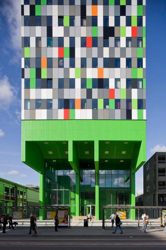
The building of student dwellings in the complex of buildings belonging to Utrecht University has transformed the Uithof site into a full-fledged campus. It will also help relieve the chronic housing shortage for young people in the city of Utrecht. Within the line of freestanding buildings (‘Objectenstrook’) the master plan designed by OMA, our block of 380 independent and clustered rooms presents itself as a solitary mass with a 20 metre cantilever. The spectacular main concrete supporting structure consists of four slabs that together form a theatrical single table leg. The ‘leg’ and its rocking bench dramatize the main entrance and create an urban rendezvous which distills the encounters and the to-and- from of all those students.

Steven Holl Architects

Ecology and Planning Museums

Entering on the ground level to the ecology museum reveals a projection next to the restaurant and retail areas. an elevator takes guests to the top level where their descent through the three ecologies – earth to cosmos, earth to man, earth to earth – begins, connected through a series of ramps.
the earth to earth exhibit on the bottom floor features a plane that turns clockwise, moving slowly down towards the ocean ecology space appropriately situated under the reflecting pond of the exterior plaza. the earth to earth section contains four outdoor green terraces as temporary exhibit spaces that change with the seasons.The shared public square also marks the entrance to the planning museum where visitors are greeted by a large model of the eco-city and another temporary display area. a multimedia system makes the next sequence of program, the theory and practice zones, come to life with dynamic informative videos, images, and sounds, all located on the second level. mechanical escalators transport guests to the third floor where one-way display is turned into an interactive relationship with the viewer. this is accompanied by a 3D cinema and a restaurant with views out towards the sea. on the top storey one can find the green architecture, landscape and water resources exhibits as well as access to the vegetative roof-scape offering offering unmatched views.