HANSJE VAN HALEM
W FOR W
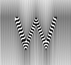
source:hansjenet
Graphic designer Hansje van Halem (1978) gathered recognition with her distinctive typography and geometric, almost psychedelic illustrations built on complex patterns. Van Halem digitally scratches, draws or weaves her letters and designs stamps, posters and illustrations. Her design-experiments sometimes lead to commissioned applications for public space, including a border fence at the Dutch Schiphol Airport. Her work is in the collection of museum, amongst others Stedelijk Museum Amsterdam (NL), Museum Meermanno / House of the Book (NL) and Museum für Gestaltung Zürich (CH). Since 2017 Hansje is the head designer of music festival Lowlands.
Passionate about typography, book design and print in all its forms, Hansje van Halem has run her own studio in Amsterdam since 2003. She works digitally, creating intricate typographic experiments that explore the tension between a systematic approach, legibility and irregularity. Fascinated by the interplay between pattern, texture and typography, Hansje van Halem had developed a distinctive style that bridges the gap between digital and print to suit her needs – she’s as comfortable generating striking visuals as she is experimenting with screen print and riso.
.
.
.
.
.
.
.
source:typothequecom
Dutch graphic designer Hansje van Halem (1978) graduated from the Gerrit Rietveld Academy and started her own studio in Amsterdam in 2003. She creates alphabets, textures and patterns, both digitally and manually, that she applies to designs for posters, illustrations and public space art works such as gates and floors.
.
.
.
.
.
.
.
source:2017typographicscom
Hansje van Halem has run her studio in Amsterdam since 2003. In between deadlines for book designs, she fills time gaps with type drawings and empty book space with patterns. With a “practice makes perfect” mind-set, she taught herself not to be afraid of failure. Her time gaps soon took the upper hand and became her core business. While working on commissions from patterns for endpapers, architectural typography, and all scales in between, she creates a lot of overproduction. The talk will display a richness of design attempts that did not make the cut or ones that are waiting for the right opportunity. The benefits of 10+ years design experiments, failures and unused starting points have led to sweet revenge by up-cycling and up-scaling.
.
.
.
.
.
.
.
source:architecturaldigestcom
“OK, now this is the real thing,” graphic illustrator and typographer Hansje van Halem recalls thinking when she saw the result of her first architectural project—16 perforated steel sliding sun screens designed for De Heldring, a special education school in Amsterdam.
Working with Berger Barnett Architects, she created the façade screens’ striking designs based on wind flow, staying within tight technical limitations to preserve the integrity of the material and the allowance of daylight.
“I really, really liked the materialization of the design,” says van Halem of the project. “Printed matter suddenly felt like a sketch compared to something so large and made to last so many years.”
While the materials and scale were new to her, developing intricate, mesmerizing patterns is van Halem’s calling card. So it seems a natural progression that the Amsterdam-based designer has found herself fielding more and more requests from developers and architects wanting to apply her wizardry to building features.
After graduating from Gerrit Rietveld Academy in 2003, van Halem went to work designing books and reports, while her personal sketchbook became her passion. It grew thick with drawings of letters and patterns, which she first published in endpapers. Soon, book publishers were asking specifically for her endpapers, and then clients came to her solely for her idiosyncratic patterns, with repetitive layers and barely recognizable lettering bordering on the psychedelic. Her posters and monographs have been shown in exhibits and collected by museums.
The designer’s trippiest work is likely the full complement of images she creates for Lowlands, a Dutch music festival, where she’s been head designer since 2017. She works with coders and animators to produce the event’s hallucinogenic body of work.
Van Halem, a frequent speaker on the graphic design circuit, also made a recent splash with “Wind,” an optical-illusion typeface with layers that can be overlaid to create hypnotic patterns and with variable fonts capable of a 360-degree rotation.
Van Halem’s most recently completed architectural projects include a 190-foot-long perforated steel screen fence at Amsterdam’s Schiphol Airport, which floridly spells out “SmartGate” within a decorative pattern, and a nearly quarter-mile-long (1,148 feet) text monument to honor a historic Jewish area of Amsterdam. The latter, which runs along Tugelaweg, a residential street on the east of the city, relies on laser-cut reliefs resembling balusters to spell out a poem by K. Michel. The words unfurl elegantly alongside a weathering steel retaining wall next to a walking path.
She also has designed a swirling-tile pattern for a portion of the nave at Bonifatius Church in Zaandam, Netherlands; a decorative pattern of bricks along a pedestrian and driveway roadway at Pieter Baan Center, a psychiatric facility in Utrecht, Netherlands; and is working toward a final design for an exterior door as part of an addition to the historic Lakenhal (“Cloth Hall”) in Leiden, Netherlands, using repetitive shapes stamped in embossed steel.
Comparing the creative processes of her graphic and architectural projects, van Halem says the origins aren’t so different.
“If you look in my computer files, you’ll find many similarities in how things are working, but the technical material makes it completely different,” she says. “My patterns aren’t so much about drawing or an impression but about making a line and calculating it into 100 lines or making them thicker. I start with an element and have it grow in a certain way. It’s all based on a technical curiosity. At the end I have almost a recipe, and then I can rebuild the system.”
Van Halem’s current architecture project, still in the design phase, is her most ambitious, as she designs motifs in the main entryways of two four-story affordable housing developments by housing corporation Ymere in Amsterdam. Tasked with the goal of giving residents “the feeling of coming home” before entering their own apartments, she took inspiration from 20th-century Amsterdam rowhouses with stoops adorned with tiles, akin to ceramic doormats and wallpaper. Her vision calls for vibrant tile patterns in the entryway and perhaps beyond to mimic that mood.
However van Halem designs it, she expects the unexpected when translating her ideas from paper and computer to buildings.
“What’s super interesting to me is that, because I’m working with different materials and the scale is larger, the outcome always feels surprising.”