highlike

Pierre Boulez

Répons

“Oh yes, there is a metre, slightly irregular on one level but very regular on another. There are so many irregular things in this piece that at one point you need to have a regular metre as you say – a bass and a regular pulse anyway – but also a series of harmonies which are all symmetrical. The harmony always gives this impression of something followed by its inverse; there is always a centre – an axis of symmetry. This symmetry of harmony corresponds in harmonic terms to a regular metre. This is very important. There are three types of time. That which is chaotic and irregular such as you have in the beginning (in the speed I mean). Then you have, in the speed, the very regular rapid repeated notes – always in semiquavers. Finally at the end there is a regularity, a kind of metre – but with much ornamentation. The ornamentation is in fact very irregular, but the metre itself is very regular”. Pierre Boulez
Mohamadreza Tazari

HYPER FRACTAL

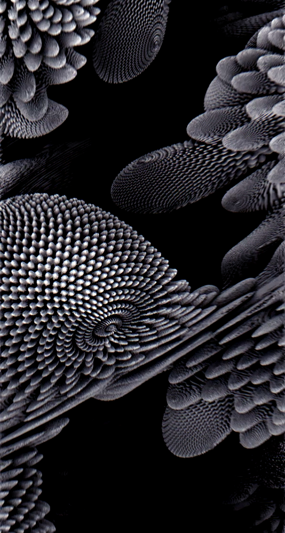
When I was a child I had some vivid dreams. They felt like I was falling and flying into an infinite multi-dimensional environment. They were satisfying and terrifying at the same time but I couldn’t find any explanation for them. 6 years ago I read about Benoit Mandelbrot’s theory, the fractals, and it changed my perspective. I realized that my dreams were fractals. So I tried to remake my dreams as a visual VR experience. According to Benoit Mandelbrot’s theory, Fractals are the mathematical\visual explanation of the nature’s structural geometry. Geometry for irregularity.

IRIS VAN HERPEN

Айрис Ван Эрпен
イリス ヴァン ヘルペン

Una colaboracion entre Daniel Widrig y MGX, la pieza principal es una camisa para mujer de una sola pieza rigida, con formas repetitivas creadas por computadora. Dándonos un look and feel muoy techn y futurista sin buscar una forma ergonómica que imite al cuerpo humano como regularmente se hace, la prenda recae solamente en los hombros del portador lo cual es bastante curioso y distintivo.

carsten holler

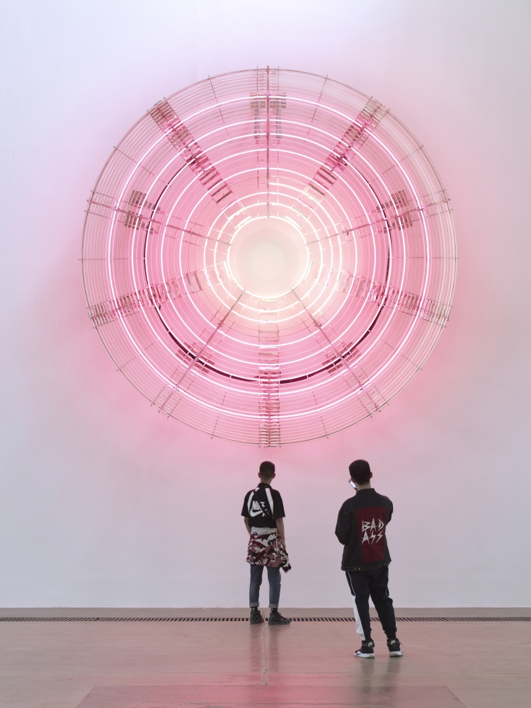
Decimal Clock
dans Decimal Clock (White and Pink), les instincts rationalistes de Höller se tournent vers la division du temps. L’horloge fonctionnelle, qui représente 10 heures, 100 minutes et 100 secondes, nous rappelle que l’homogénéisation globale du temps n’a eu lieu que récemment en réponse au degré sans précédent d’interconnexion planétaire. Decimal Clock (White and Pink) fait signe aux expériences avec le temps décimal pendant la Révolution française et rend hommage aux efforts visant à la comparabilité et à la régularité temporelles. Pourtant, il reconnaît également diverses manières non occidentales de mesurer le temps et, plutôt que de les voir comme une menace pour l’empire de la raison , les célèbre comme une expression enrichissante de la diversité de notre existence dans le temps.

Julien Mier, Magical Mistakes & Keita Onishi

Divide, Multiply
The King Deluxe label teamed up with animator Keita Onishi to create an innovative music video for ‘Divide, Multiply’[…] The final result is a seriously aesthetically pleasing work of videographic art, living up exactly to King Deluxe’s ‘audio-visual laboratory’ manifesto. With its geometric simplicity, and cog-like machinery driven by symmetrical beats, the video instills the utmost satisfaction deep within every viewer.

SAM BUXTON

Electric Chair

The distinctive work of Sam Buxton is dominated by his innovative use of advanced materials and technologies. From his immensely popular MIKRO series (miniature fold-up sculptures, laser cut into thin strips of stainless steel through an acid etching process) to his explorations concerning interactive intelligent surfaces on the familiar objects around us, his work has continually managed to blur the lines between art, science and design.Through his work, which has regularly involved relatively common objects ranging from business cards to a dining table, Buxton has demonstrated an ability to see potential in what others take for granted. His on-going efforts in developing objects that can communicate, display information and react to the actions of the user, demonstrate his commitment to investigating the delicate relationship between the human body and its environment. Buxton’s fusion of art and science has resulted in a highly innovative and unique range of personal designs, many of which, have utilized the latest, most advanced materials and technologies available.

JON MCCORMACK

flicker

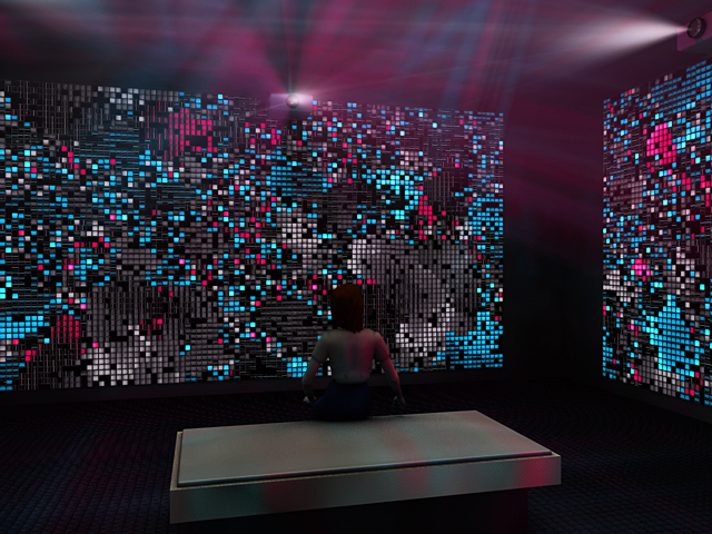
Flicker is an immersive electronic environment of generative image and sound. A collaborative work with Oliver Bown. Based on biological models of firefly behaviour, Flicker generates an ever shifting rhythmic, meditative environment to the viewer. Flicker uses 4 channels of synchronised high definition video and 8 channels of sound to immerse the viewer in a phenomenologically rich environment of artificial life. The work is a large-scale agent-based simulation, with each agent providing a rhythmic pulse at regular intervals. Agents try to synchronise their pulse with other agents in their immediate neighbourhood. The collective pulsations of groups of local agents are spatially sonified with int exhibition space. Over time, large groups synchronise at different rates, leading to complex visual and aural structures, syncopating and constant shifting in to a long term complexity.

Nieto Sobejano Arquitectos and realities:united

Contemporary Art Centre in Cordoba
BUILDING FAÇADE WITH AN INTEGRATED LIGHT AND MEDIA INSTALLATION

To transform the façade into a light and media display without fundamentally changing its solid appearance as envisioned by Nieto Sobejano turned out to be the biggest challenge in the project. The façade is accordingly designed to deliver a tactile and solid appearance in the daytime while it turns at night into a unique and dynamic communication wall that reacts very specifically to the architecture. The 100-meter façade consists of 1,319 hexagonal, recessed and pre-fabricated “bowls” on different scales. Each of the bowls serves as a reflector for an integrated artificial light source. The intensity of each lamp can be controlled individually, forming a huge irregular low-resolution grey scale display. The thorough immersion of the “pixel-bowls” – like negative impressions – in the volume of the façade turns the architectural scheme itself into a digital information carrier. During the day, the façade shows a three-dimensional landscape with no sign of being a media facade. Additionally, this tectonically modulated surface topography is characterized by a playful composition of light and shadow that constantly changes with the movement of the sun.