highlike

Liam Johnson

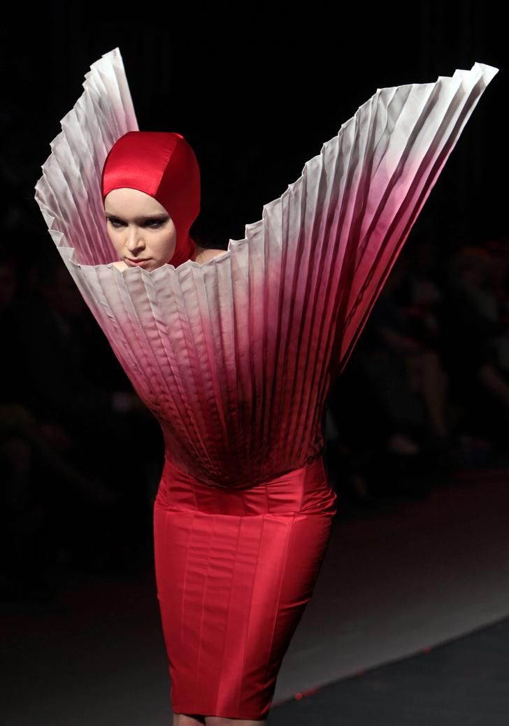
Liam was chosen for the scholarship by lead designer at Alexander McQueen, Sarah Burton. He spent his year in industry in Paris, working at Maison Margiela under John Galliano, working personally with the designer on both the artisanal and ready-to-wear collections. As a designer, his own collections often centre upon alternatives to normal fashion and instead offer remodelled silhouettes, bright colours, unexpected textures and sculptural, exaggerated forms.

RYUNOSUKE OKAZAKI

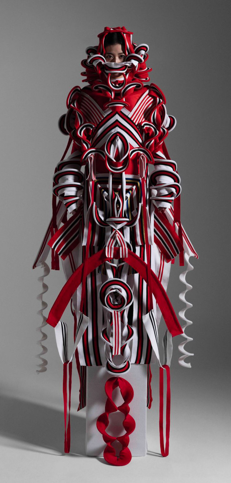
Ryunosuke Okazaki 001
For his graduate project from the Tokyo University of the Arts, Ryunosuke Okazaki created a collection consisting of three couture dresses in bold colours and shapes titled JomonJomon that are informed by Japanese Jōmon-era pottery and Shinto, an ancient religion that originated in Japan. The striking designs are modelled and decorated on Jōmon-era pottery, where vessels were decorated through pressing rope and coils into wet clay to create ornate designs. The JomonJomon collection was made using polyester, cotton and ribbed knits, in red, blue, black and white as the primary colours.

Jon McCormack

Colourfield
Colourfield is an evolutionary ecosystem of colour. Colour agents try to exist in a simple universe by producing colours that are suited to their environment. This environment is determined by the other agents and the colours they produce. Entering into complex feedback cycles, Colourfield presents an evolving palette of shifting colours. Different configurations emerge based on the strategies the ecosystem discovers for co-existance and co-dependency. Harmonious configurations often remain stable for a short while, before eventually being replaced by new relations, better able to survive in the ever shifting environment.

Peter Eötvö

Peter Eötvös

Multiversum

Multiversum is written for two solo instruments and orchestra, for two instruments of the same family: the traditional organ with its rich but static colours and the modern Hammond, which can continuously change colours. It was very important for me that the sound of the two organs could completely wrap around the audience, like we imagine the cosmos envelops us. The traditional organ sounds from the front, the Hammond from the back. If we visualise the two organs as our galaxy, then the different groups of the orchestra can represent different galaxies. That’s how the “Universe” becomes the “Multiversum”.

Olafur Eliasson

Your uncertain shadow
Five coloured spotlights, directed at a white wall, are arranged in a line on the floor: a green light positioned next to another green light, followed by a magenta light, an orange light, and, finally, a blue light. These colours combine to illuminate the wall with a bright white light. When the visitor enters the space, her projected shadow, by blocking each coloured light from a slightly different angle, appears on the wall as an array of five differently coloured silhouettes.

Robert Breer

Float
The Floats – or floating sculptures – that Robert Breer took up producing again at the end of the 1990s, emerged in 1965. The word “float” meaning something floating – a marker, fishing float or buoy – and which also describes those carnival vehicles whose pretend wheels give them the appearance of floating above the tarmac, enabled Robert Breer to apply this principle to works of a new genre. Primary shapes, neutral colours and, for the most recent, an industrial aspect, the Floats were then made with polystyrene, foam, painted plywood, and, more latterly, out of fibreglass. At first glance, these simple structures appear immobile. In fact, they are moving, imperceptibly, within the space they inhabit. Motorised and on mini-rollers – which raise them slightly above ground, giving them an air of weightlessness – they glide unbeknown to the visitor, following random paths that are interrupted by the slightest obstacle that they encounter.

Mathias Krissmer

II00II0I0I00II000I
“Krissmer’s ‘Kinetic Paintings’, explore visual composition, movement and scale in a way that thrills and disorientates. They are an optical experience simultaneously aesthetic and perceptual. The digital projections can be taken to any scale making them architectonic and potentially intimate. Their focus on a geometric language set in dynamic movement creates a certain sculptural juxtaposition, enhanced by the predominant use of black and white. The occasional introduction of bright colours further dramatises the Krissmer aesthetic. These are works that inspire, that must be experienced by the mind and the body.”

Maxim Zhestkov

Supernova
Supernova is an experimental 4K art film directed and designed by Maxim Zhestkov and made in Zhestkov. Studio Everything around and inside us was conceived in a huge explosion of a star billions of years ago… and, probably, recycled from other matrices myriad times. In this eternal carousel of matter, particles gather, form complicated structures and then burst into all directions fusing atoms together and producing new elements and points of view, new colours and patterns of perception.

Eliška Sky

WOMANEROES

“Eliška Sky’s tribe of ‘womaneroes’ stand bold and bright, their bodies and heads adorned in vibrant shapes, colours, and textures. Beneath the wigs and paint are women of all ages, shapes and ethnicities, photographed with a large-format camera to capture every detail, rough or smooth, with the intention for the images to eventually be printed and exhibited life-size. “It started as visual play, but transformed into a series that challenges depictions of women’s bodies,” explains the London-based Czech photographer. “In light of my own experience of working in the fashion industry, I felt the need to portray the body in new ways and forms, with an element of playfulness and humour in opposition to western media advertising”.” Marigold Warner

robert seidel

Vitreous
The nine virtual sculptures underlying vitreous resulted from experimental setups by Robert Seidel for generating three-dimensional clusters of fibrous refractions, as well as the gravitational lensing of different volumetric and chromatic densities. Singular elements gravitate towards each other, accumulating in a gigantic sculptural system, where each entity exists with its own visual axis and vanishing point. The impalpable luminous formations create prismatic interactions between the ridges and plateaux of the main colours floating in front of the infinite violet background.

Jeppe Hein

Breath from Pineal to Hara

Coloured neon rings light up in a specified sequence behind a two-way mirror, layered with reflections of the visitors and the surrounding space. Starting with the inner ring, the individual rings light up one after the other. Once all rings are illuminated, they switch off again from the outer ring to the inside. The sequence and colours are reminiscent of the breathing technique from Pineal to Hara and the artwork invites the viewer to breath accordingly. Combined with the two-way mirror in front of it, it seems to awaken viewers to the present moment and make the usually unconscious process of breathing conscious for a while. Breathe in. Breathe out.

Sanja Marusic

Dutch-Croatian photographer Sanja Marušić uses an experimental approach to colour, composition, materials, and manipulations in her work to create dreamlike scenes that are at once cinematic and alienating.She travels the world in her production of these otherworldly images, finding settings and forms that play with our relation to the subconscious, simplifying the bodies of her subjects with geometric shapes, and abstracting the human form even further by incorporating stylised dance movements.Putting places above people, many of Sanja’s photographs are set in wide open futuristic spaces in an attempt to create surreal and alienating visual emotions. She often uses cool and bright colours as well as singular objects and accessories in order to create unique and enigmatic narratives.

guda koster

Wrapped up
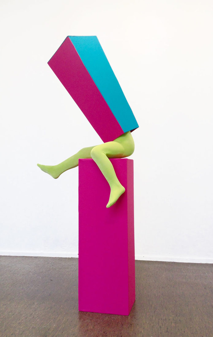
With her installations, sculptures and photographs, Dutch artist Guda Koster transforms the human body and attaches a new identity to her characters or to herself, using clothing as the main visual art form, patterns and colours to create surreal stories.

daniel von sturmer

electric-light
Electric Light presents a scenography of forms borrowed from the world-behind-the-scenes of lens based image production. Backdrops, stands, flats, flags and bounces populate the gallery space, illuminated by a changing array of coloured lights. A moving light animates the space with changing forms, shapes and colours, adding another layer of dynamic activity. This new work brings light to the foreground and renders the gallery as an unfolding set.

Michael Pinsky

Transparent Room
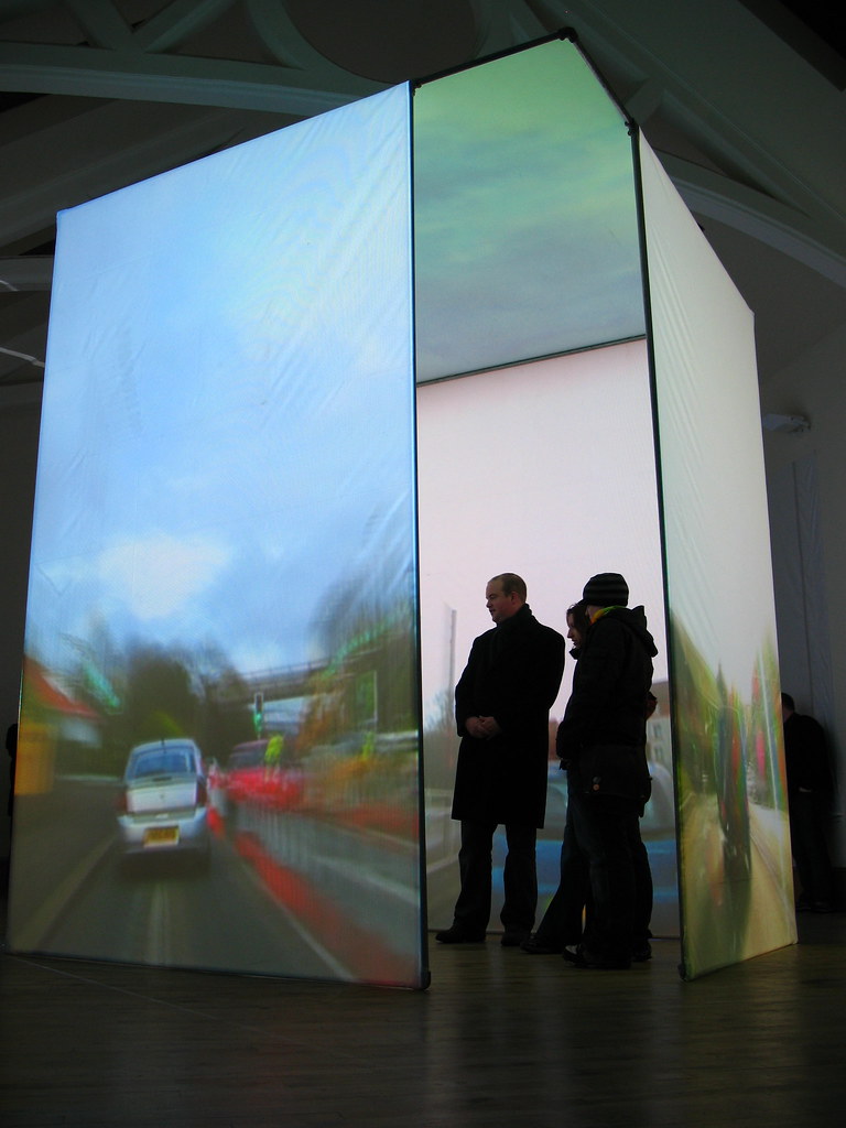
Transparent Room suspends viewers in a virtual space where they see through walls to hidden rooms and city streets, and through ceilings to the sky. The room’s confining walls are replaced by projections of the outside world, its time accelerated as clouds speed by and as cars and pedestrians alike race down the street. In this caricatured passing of time, views of the cityscape and of the building’s interiors are magnified, first showing details, then textures and, finally, just single colours.

Guda Koster

All above
Guda Koster is a Dutch artist who creates living sculptures and performances, which the photographs are the results of. Koster’s works are created in parallels of time, space and textile. In her works Koster uses fabrics, colours and patterns that underline the codes and meanings our clothing conveys.

Mary Katrantzou

pre-fall-17
Collection explores the exquisitely detailed world of these overlooked patterns to delve into a plethora of plethora of pattern, colour and aesthetic.The initial part of the collection draws from the ornate patterns of turn-of-the century William Morris prints, contrasting colours and lightweight fabrics to create perfect wardrobe pieces for the summer.

Guda Koster

En face
I always sew the clothing myself and those will then be part of an installation or sculpture.
I may also build a set, dress myself and photograph myself in the set with the self-timer. I use fabrics, colours, patterns and new cuts to underline the codes and meanings clothing conveys.

Manon Kündig

Bowerbird
Manon Kündig’s master 2012 graduate menswear collection called ” Bowerbird” is full of digital prints and acid colours. Photoshop is probably one of the most important tools of her collection and she confesses being completely addicted to online research. Like the bird, she was inspired by to create her collection, bird stealing rubbish to create its nest; Manon stole Google images to create her prints. We asked Manon about her work and the relationship between the Internet and her collections.

GUDA KOSTER

compositie met oranje cirkel
Guda Koster is a Dutch artist who creates living sculptures and performances, which the photographs are the results of. Koster’s works are created in parallels of time, space and textile.In her works Koster uses fabrics, colours and patterns that underline the codes and meanings our clothing conveys.

Olafur Eliasson

Your Body Of Work
Transparent sheets of coloured plastic – in either cyan, magenta, or yellow – are suspended from the ceiling to form a maze. Additional colours appear where these hues visually overlap, forming spontaneous compositions that continually change in response to viewers’ movement through the space. ‘Seu corpo da obra’ was inspired by the work of Brazilian artist Hélio Oiticica (1937–1980).

SHARON JOHNSTONE

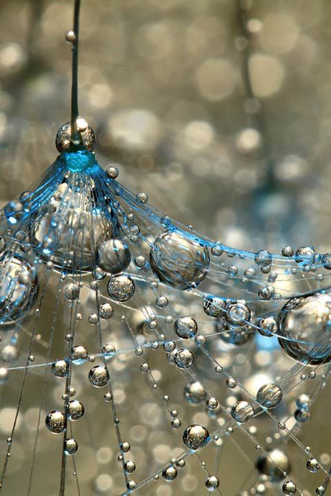
“With macro photography I escape to another little world. I love exploring the tiny details in nature that often get over looked. I love finding beautiful colours and abstract compositions within nature and can even get passionate about photographing moss or a blade of grass.”

cristina coral

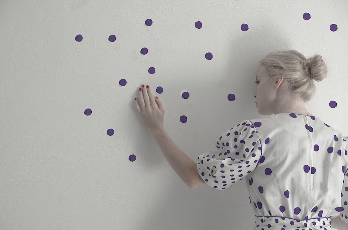
Losing dots
via highlike submit

Cristina loves experimenting with light, colours, space, and female figures to create poetic photographs. At the first glance, the images seems to be rather static, but they embody a rich story behind every singular detail. The muses, which are mysterious young ladies, are captured by the artist in a minimal environment.

David Marinos

Skin 2
His work often uses classical imagery that is transformed and energised using decidedly non-classical colours and forms. He uses collage and glitch techniques on his own and found images to create a quickly expanding body of work which has a recognisable and consistent style but has un unexpected energy making it feel fresh and dynamic.

Peter Jones

colourscape
Colourscape is a large labyrinth of colour and light. It’s a sculpture of pure colour that the public actually go inside. Everyone puts on a coloured cape to become part of the colour experience and enters into a new world where one can freely explore the potentials of light, colour and space. There’s also music, dance and theatre taking place inside. Originally created by artist Peter Jones in the early 70s, Colourscape is a walk-in structure of nearly 100 interlinked chambers.

KILIAN ENG

Kilian Eng is an illustrator/graphic designer based in Stockholm, Sweden. Born in 1982, he graduated from the Konstfack University of Arts Craft & Design in 2010 with a masters in storytelling, graphic design and illustration. A couple of years ago, he discovered the possibilities of working with computers, and digital illustration proved to give him the flow he was looking for. His works are rich in colours and most often depict alternative worlds in which imagination takes over and creates the unexpected.

KAMILA GAWRONSKA-KASPERSKA

METROPOLIS
Kamila Gawronska-Kasperska’s collections have stretched the boundaries of Fashion. Her inspiration was drawn from the films Metropolis and Sky Captain. The unique fashion photography by Tomek Slupski, Maciej Boryna and Bartek Sejwa, accentuates the bold geometry of her collections. The city is the backdrop of this stylish, urban and elegant collection, the morphing of fashion and architecture. Black and white with strokes of red are the main colours of her canvas used to experiment with form and fabric processing.

Leslie Henshaw

Chromatophores Collection
“Chromatophores are the cells that give some creatures of nature the miraculous ability to change their colour to protect themselves,” says Leslie. “Like chameleons, jellyfish, cuttlefish and frogs they can change from muted tones into brightly coloured and vibrant stripes or patches of colours that are mesmerising. With this collection I imagined what it would be like if humans could perform this amazing feat with their hair.”

Isabelle Schad

SOLO FÜR LEA
Isabelle Schad re-organizes the dancer’s deconstructed body and plays with analogies and formal aspects of cubism, as well as Picasso’s drawings composed of a single line. The result is a dance portrait, which plays with and reveals the specific features of Moro’s body and its rhythms, contours, colours and energies. more

KRIJN DE KONING

laberinto cromatico
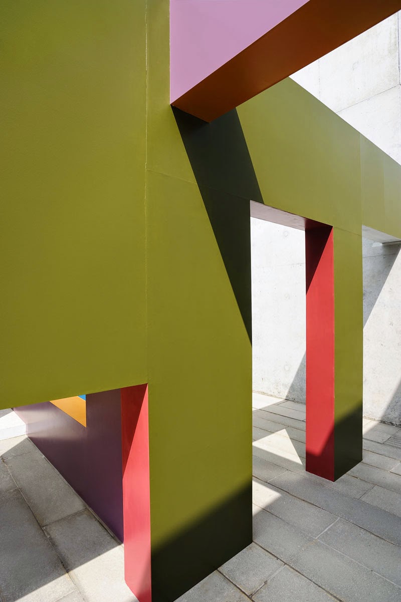
Dutch artist Krijn de Koning has created a labyrinthine walkway between brightly coloured walls on a terrace at the Turner Contemporary gallery in Margate, England.
The first public commission in England by De Koning, the Dwelling installation comprises a series of angled walls punctured with doorways and windows that create a trail for visitors to navigate through.Situated on the south terrace of the David Chipperfield-designed Turner Contemporary, the walls are positioned between the exterior of the gallery building and the site boundary.The elements slot between existing structures, incorporating changes in floor level and abutting permanent concrete balustrades.“The artist’s site-specific works – part architecture, part sculpture – challenge the viewer, offering new possibilities to navigate and experience the space the works inhabit,” said a statement from the gallery.Perpendicular surfaces, including door and window recesses, are all painted in different colours.The bright tones reference traditional seaside pavilions and beach huts, a common feature along the UK coast.The maze is open to the sky so shadows move across the surfaces of installation through the day.Architectural features including windows and doors are different sizes and positioned at various heights, allowing some to be clambered over or crawled beneath.

JUDY PFAFF

朱迪·普法夫
Moxibustion

She mainly created installations but what caught my eye was her paintings. She uses alot of textured materials in both he installations and paintings. Her installations are big scaled pieces that take control of the room there in. She is somewhat similar to Karla Black but they have alot of things in contrast aswell. Judy uses alot more darker and bolder colours that i think create a more harsh and busy look. Her pieces also look a bit more edgeyer and eerie almost.

Studio Nucleo

CARBONIFEROUS table

Carboniferous is a table that cuts through space, definite and strong.Its many layers of black surface together create a shape, a crystallization of a quick movement, crushing, leading the eye towards the future.The honeycomb cardboard, covered with fiber glass and resin is finished off with layers of carbon fiber.The carbon fiber composes and traces the design, the movement into its unique strength.
In Carboniferous you get the feeling that the top surface does not necessarily represent the ideal landing platform.On another perspective the landing surface generates the powerful and matherical base.
Carboniferous is flowing and exploding, like an aggressive wind with a clear direction.As the earth below, coal is extracted into a new form, the result of sediment build-up of plants,
and also the secrecy and conspiracy of the Carbonari, from underground and from the depth of their hiding places,which emerges a few decades later into the tricolore (the three colours of the Italian flag).
Coal, a dense network of plant remains, and Italy, a mix of cultures and different latitudes.Italian amalgam of different origins, Italy particle edges, Italy multiform, Italy tangle of angles,Italy blunt, concave and convex, Italy Alpine wedge, Italy coal.Sediment of a combustion that melted and transfigured particles.

CONTRAPTION PAINTING MACHINE

françois xavier saint-georges
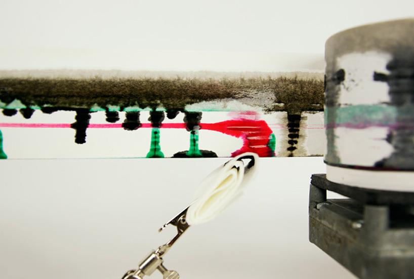
Assembled from chinese brushes and medical equipment, the low-tech automata creates ‘endless line’ ink paintings. Created by canadian designer François Xavier Saint Georges, ‘contraption’ is an autonomous painting machine, capable of creating a ‘never-ending line’ of paint. The low-tech device is composed of medical equipment like syringes and tubing, chinese brushes, and paper with an electric motor, that together continuously run a roll of paper along the wall, to be ‘painted’ upon by ink pumped into the set of brushes. Random variations in the ink’s consistency and viscosity at a given moment produce different effects on the paper, and different colours can be fed into the unit or layered on top of previous ‘paintings’. We will show you more projects from this guy, so if you like it you will see more about him. Enjoy it!

UVA UNITED VISUAL ARTISTS

ユナイテッド·ビジュアルアーティスト
美国视觉艺术家
Always/Never
Always/Never is the result of UVA’s recent investigations of the perception of time.
Always/Never is a grid of pyramidal elements inspired by the sundial, each passing through time at a different rate.
Changing patterns of light and shadow create the illusion of a fluid surface; shifting combinations of colours from nature recall different times of day.