highlike

Diébédo Francis Kéré

Installation from Brightly Colored Thread for First U.S

“Conceptually, the installation takes inspiration from the contrasting city plan geometries of the African village and the American city. Overlaying the organic+plan of Gando with the rigid grid of Philadelphia, Kéré shows that despite the two cities’ obvious differences, underneath you can find many similarities in how the societies use architecture to provide a gradient of social spaces ranging from the individual and private to the collective and public” Patrick Lynch

Alisa Andrasek

This research used stigmergy behaviour, another example of agency-based systems, which could be programmed to be highly adaptive to local data. What is most intriguing and attractive in this case, is contrasting organic aesthetics emerging from algorithms like stigmergy, with its plant like formations, and the hyper-rationalisation and genericity of voxelised geometry. Different resolutions were introduced in the facade panels, by using an octree algorithm. The result is a building skin that from afar looks like a plant, but in close up has almost Minecraft-like aesthetics coming from a multi-resolution voxel field. Organic stigmergy (stígma + ergon) partly plays a role in the distribution of data through the facade field, rather than generating geometry. It leaves its imprint in the density of geometry

Datapaulette

Topographie digitale
“Topographie Digitale” is an interactive installation created by DataPaulette. This landscape uses electrically functionalized and pleated textiles as sensitive surfaces reacting to touch. This interaction brings to life a “digital clone”, video-projected. This mirrored scene reveals an organic side contrasting with the mineral aspect of the physical scene.

Harrison Pearce

Defence Cascade
In the installation inflated silicone forms are suspended amidst an austere metal structure, and are prodded by automated rods. Set to contrastingly beautiful music by composer Alex Mills, which is punctuated by the industrial sounds of the mechanised device, the art work looks like a science experiment, or some kind of torture device, and you may find yourself anthropomorphising the poor, inflated bags which are at the mercy of their mechanical environment.

John Tavener

Ikon of Eros

The tempo of the music changes frequently, illustrating love that at times may be almost austere and at other times ecstatic. In the second movement an ethereal female chorus is suddenly punctuated by deep percussion instruments and gives way to an almost erotic middle eastern beat, contrasting a pure spiritual love with a more physical, sensual form.

ATSUSHI AND MAYUMI KAWAMOTO

Riverbank House
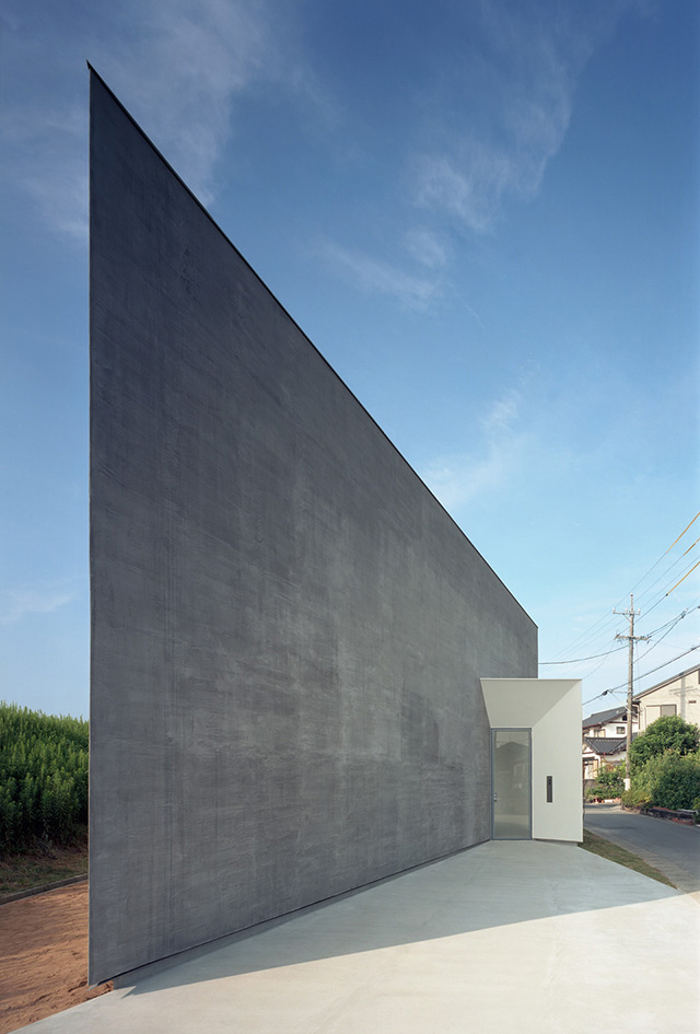
Located on a narrow strip of land, sandwiched between a quiet riverbank and a residential neighborhood, the home’s unique form was inspired by the juxtaposed views offered by the surrounding environment. Standing on the riverbank you had views of the calm stream traveling to an unknown destination, unfazed by the birds, joggers and other small life form taking advantage of its natural serenity. However, a few steps down the bank, away from the river, revealed a startlingly contrasting view; homes and more homes, so grounded and monumental.

Mary Katrantzou

pre-fall-17
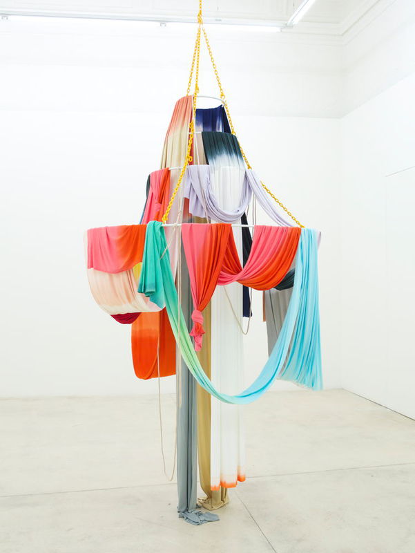
Collection explores the exquisitely detailed world of these overlooked patterns to delve into a plethora of plethora of pattern, colour and aesthetic.The initial part of the collection draws from the ornate patterns of turn-of-the century William Morris prints, contrasting colours and lightweight fabrics to create perfect wardrobe pieces for the summer.

Isabel Nolan

A fixture for a solar storm
The startling objects of Isabel Nolan’s art take wildly unpredictable forms, — but they are at the same time the fully consistent outcomes of a singular, searching artistic sensibility. Nolan’s works evolve out of almost scholarly processes of investigation — intensive enquiries into cosmological and botanical phenomena, perhaps, or analytical scrutiny of literary and historical texts. These contrasting means of representing reality (and of comprehending its infinitely various components) provide divergent points of departure for Nolan as she attempts to somehow account for the enduring strangeness of the world, even in its most intimately familiar forms.

Amy Stephens

Against expectations
Amy Stephens’ work is fundamentally sculptural in both its form and content, taking for its starting point the tactile and expressive qualities of a range of materials. Contrasting the angularity of wood and metal with the soft tactility of fabric and flock, her assemblages occupy a space between the abstract and the associative, and between seduction and control.

Willy Verginer

ВИЛЛИ ВЕРДЖНЕРА
意大利雕塑家
ciuria de foies

These lifelike sculptures are typically carved from solid linden wood then painted with acrylic paint. Their subtle but strange gestures coupled with unexpected objects give the sculptures a quietly surreal atmosphere. Verginer’s peculiar style of painting his work adds to each piece’s enigmatic quality. Rather than realistically paint each individual detail, Verginer applies large swaths of color to his sculptures. The pieces nearly seem to be dipped in pools of pigment. These large fields of color work in contrasting against the realism of each sculpture.

j. mayer h.

于爾根·邁爾
يورغن ماير
위르겐 마이어
יורגן מאייר
ユルゲン・マイヤー
Юрген Майер
finalizes mixed-use sonnenhof complex

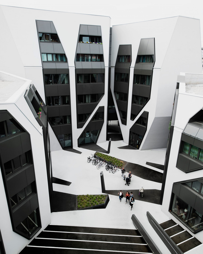
J Mayer H Architects has completed a housing and office complex in Germany, covered with graphic patterns that extend down from facades to create the impression of elongated shadows.The four buildings that make up the Sonnenhof complex range in height from five to seven storeys, and are clustered around a central courtyard.All four buildings feature faceted monochrome facades. Skewed pentagonal and square windows are outlined by grey aluminium panelling, contrasting the stark white plasterwork.In homage to this detailing, J Mayer H chose to paint different areas of the courtyard black and white, creating the illusion that dark shadows are cast onto the ground.Wedge-shaped planters with integrated benches contribute to this effect.The Sonnenhof complex is located in Jena, a town in the Saale river valley in eastern Germany.

POUL GERNES

Drømmeskib / Dream Ship
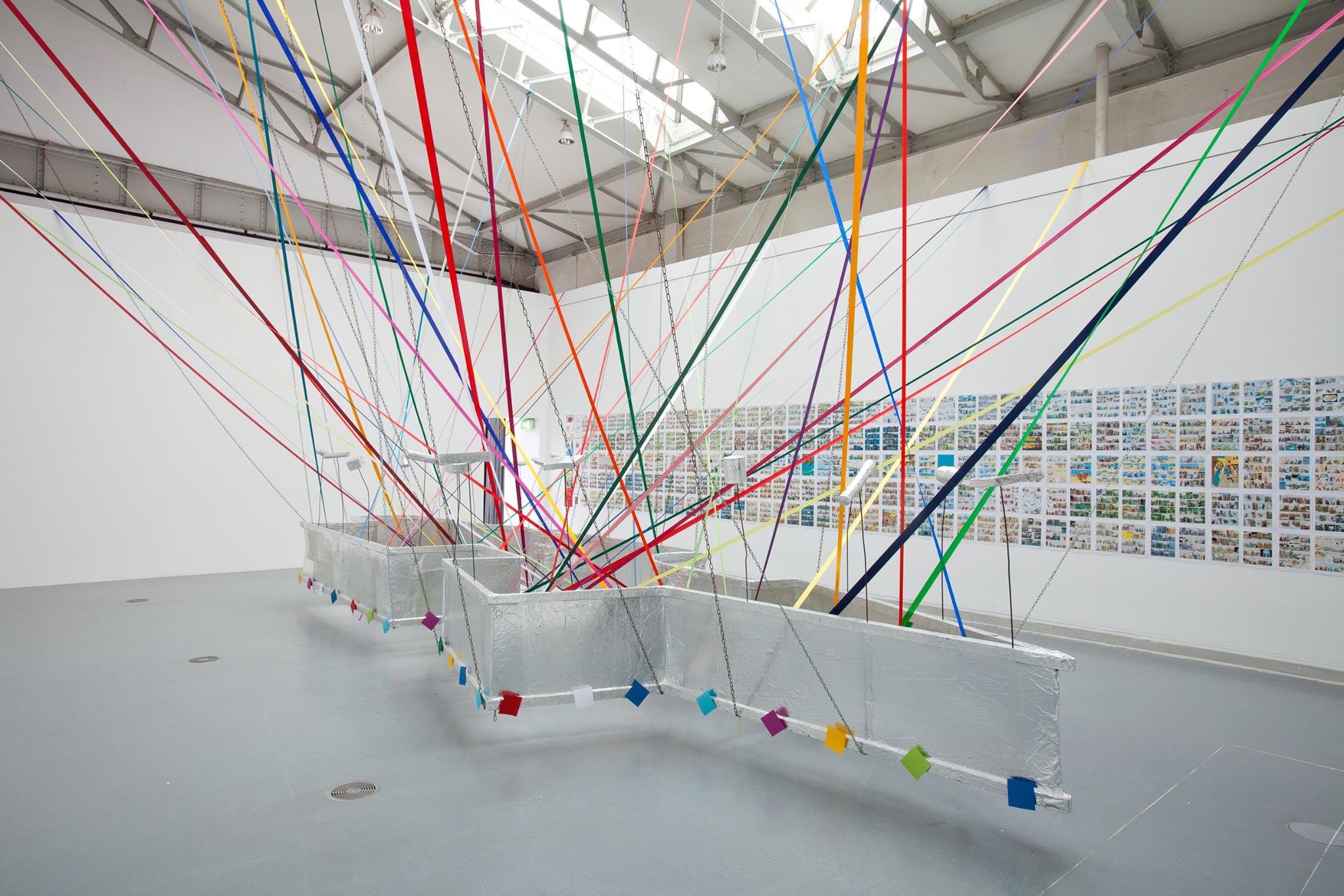
n the early 1960s, Poul Gernes started to concentrate on simple, reduced forms making strong visual effects like circles, stripes or dots in his painting, similar to pop motivs. Most of the approx. 40 Targets painted then were designs for architecture-related works. At first he drew the rings for his Targets in pencil, but later he went over to scratching them into the ground with a pair of compasses. This gave the paintings a relief-like character and created clearly defined color fields. The contrasting color intensities in the circles make each color seem like a distinct, three-dimensional volume. The vivid color combinations of the Targets (shown at the Venice Biennale in 1988) come from sketches or ready-mades like the stripes on a t-shirt. Sometimes Gernes used random systems as well, for example by putting paint pots behind him and dipping the paintbrush into one pot blind. Although it may not seem to be the case, Gernes’ work makes no passing references to contemporary works by other artists.

GREGOR GAIDA

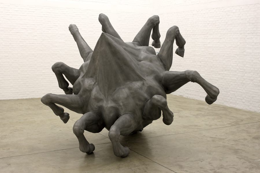
Polygonal Horse II
Gregor Gaida’s sculptures have something almost unreal, in them surrealism is powerful, there is transfiguration, symbol and narration; creates incredibly exciting sculptures in which even the elements: wood, resin and concrete mix without losing their contrasting nature. Its themes can be seen as three-dimensional snapshots, with fictional protagonists fighting and being advanced, extracted and distant from their original framework of action. In his sculptures, Gaida literally shapes this approach and stories without finishing them; many of his subjects are also physically cut in half, incomplete and, therefore, to be completed.