highlike

Troika

Thixotropes
They’re called Thixotropes. Compositions comprised of eight illuminated mechanized structures create choreographies of lighting effects that alternate form warm to cold light. Designed by London based design firm Troika, these suspended systems merge technology with art and explore the realm in which rational observations intersect with the metaphysical and surreal. Each of the structures is shaped as a composition of intersecting angular and geometric forms, made of thin tensed banding lined with rows of LED’s. The constructions continuously revolve around their own axis thereby materializing the path of the light and dissolving the spinning structures into compositions of aerial cones, spheres and ribbons of warm and cold light while giving life and shape to an immaterial construct.

Andreas Schmelas

Grid
Grid 4×4 is an autonomous apparatus that creates an endless series of geometric forms. The vertices of the form are located on discs, each of them rotatable by a motor. A computer software plays tenderly with the rotation of the discs and generates an endless amount of geometric and chaotic patterns.

Ann Veronica Janssens

Bleu Red Yellow
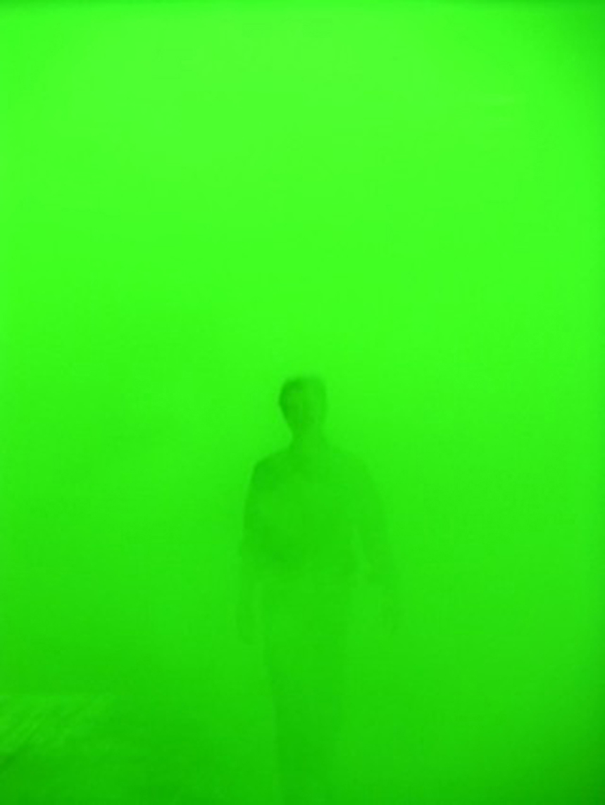
Born in 1956 in Folkstone (England), lives and works in Brussels. Photography, video, sculptures, installations. Ann Veronica Janssens stepped into the public area with her installations, which find their roots in minimalist art. She constructs rooms and sculptures with simple building materials, above all making allowance for all aspects of the light, thus appearing as ephemeral. Clear, geometric forms are a dominant feature of her sculptural work.

JOHN MCCRACKEN

Джон Мак-Кракен
约翰·麦克拉肯
ジョン·マクラッケン
Star, Infinite, Dimension, and Electron

“The geometric forms McCracken employed were typically built from straight lines: cubes, rectangular slabs and rods, stepped or quadrilateral pyramids, post-and-lintel structures and, most memorably, tall planks that lean against the wall. Usually, the form is painted in sprayed lacquer, which does not reveal the artist’s hand. An industrial look is belied by sensuous color.His palette included bubble-gum pink, lemon yellow, deep sapphire and ebony, usually applied as a monochrome. Sometimes an application of multiple colors marbleizes or runs down the sculpture’s surface, like a molten lava flow. He also made objects of softly stained wood or, in recent years, highly polished bronze and reflective stainless steel.Embracing formal impurity at a time when purity was highly prized, the works embody perceptual and philosophical conundrums. The colored planks stand on the floor like sculptures; rely on the wall for support like paintings; and, bridging both floor and wall, define architectural space. Their shape is resolutely linear, but the point at which the line assumes the dimensional properties of a shape is indefinable.” Christopher Knight

Ateliers Jean Nouvel

努维尔
جان نوفيل
ז’אן נובל
ジャン·ヌーヴェル
Жан Нувель
장 누벨
Serpentine Pavilion

The design contrasted lightweight materials with dramatic metal cantilevered structures, rendered in a vivid red that, in a play of opposites, contrasts with the green of its park setting. In London, the colour reflects the iconic British images of traditional telephone boxes, postboxes and London buses. The building consists of bold geometric forms, large retractable awnings and a sloped freestanding wall that stands 12m above the lawn.
Striking glass, polycarbonate and fabric structures create a versatile system of interior and exterior spaces, while the flexible auditorium accommodates the changing summer weather and Park Nights, the Serpentine’s acclaimed programme of public talks and events, which attracts up to 250,000 visitors each summer.
Nouvel’s Serpentine Gallery Pavilion, the architect’s first completed building in the UK, operates as a publicly accessible structure within Kensington Gardens and as a café. The pavilion design highlights the idea of play with its incorporation of traditional French outdoor table-tennis tables.
This 2010 Pavilion is the tenth commission in the gallery’s annual series, the world’s first and most ambitious architectural programme of its kind, which has become an international site for architectural experimentation and follows a long tradition of pavilions by some of the world’s greatest architects. The immediacy of the commission – a maximum of six months from invitation to completion – provides a unique model worldwide.

QUBIT AI: SurrealismToday.com

The Legend of Ogie

FILE 2024 | Aesthetic Synthetics
International Electronic Language Festival
SurrealismToday.com – The Legend of Ogie – United States

What worlds exist beyond Einstein’s speed limit? Inspired by Eric Weinstein’s theory of Geometric Unity, the work explores the idea that space-time is like a melody playing over an eight-dimensional universe. Abstract and metamorphic forms transition from organic forms to parastatic patterns, creating a dance of visuals and sounds that merge into an immersive experience of fractal unfolding.

Bio

SurrealismToday.com is an artist collective and educational platform dedicated to the proliferation of surreal and visionary ontologies in contemporary art. The group began as an esoteric cargo cult dedicated to discovering the beautiful, the fantastic, and the transcendent in the pseudo-philosophical landscape of the art world. His methods include searching for gems in the digital world and infusing mystical enchantments into generative diffusion models.

Neri Oxman

MAN-NAHĀTA
Computational growth across material and urban scales offers a framework for design through self-organization, enabling the generation of vast, diverse forms exhibiting characteristics like those that emerge through the biological growth processes found in Nature. In this project, we construct an oriented volume spanned by surface normals of the shape at every point. The value of the oriented volume drives the iterative deformation of the shape. Depending on the parameterization of this process, we can obtain distinctly different growing forms. Importantly, the emergence of these forms is driven only by the time evolution of a geometric operator acting on the shapes iteratively, thereby connecting geometry and growth through an algorithm. To form the Man-Nahata landscape, the buildings of the urban landscape are transformed through repeated morphological closing operations, where the field of influence follows a gradient from the center to the outskirts of a circular region.

The Collective

2°C
2°C is a unique AI generated art installation imagined through the mind of a machine. Utilising machine learning algorithms trained on thousands of archival images of geometric structures of man made cities and naturally occurring organic corals forms, the AI takes this learned data to visualise an otherwise unseen coral city. 2°C is about coral bleaching, one of the phenomenon mainly caused by rising sea temperature brought about by climate change. To prevent the massive, irreversible impacts of ocean warming on the coral reefs and their services, it is crucial to limit the global average temperature increase to below 2°C above pre-industrial levels.

Ouchhh

H OM E OMOR PH ISM

Dome A/V Performance

A homeomorphism, also called a continuous transformation, is an equivalence relation and
one-to-one correspondence between points in two geometric figures or topological spaces
that is continuous in both directions.Many forms observed in nature can be related to geometry. In accordance with classical geometry,the shapes that found in nature are consisting of lines and planes, circles and spheres,
triangles and cones. These shapes actually are a powerful abstraction of reality, so we need primitive objects to give a form and understand the complex structure that exists in nature.


FEDERICO DIAZ

geometric death frequency 141

The title of the piece is a pun that, with irony, alludes to the exceeding of tradition, irreconcilable dichotomy between life and death in a sculpture made, provocatively, by lifeless forms“, adds Diaz. “The line between life and none-life is more fleeing than we usually think: think about a virus that attacks a complex organism and reproduces in the same way as a micro-organism, even though it’s only an agglomerated of lifeless molecules: a natural crystal that, even though is a stone, can be born and undergo a fascinated process of growth that mimes perfectly the ways of an organic life“.

Sanja Marusic

Dutch-Croatian photographer Sanja Marušić uses an experimental approach to colour, composition, materials, and manipulations in her work to create dreamlike scenes that are at once cinematic and alienating.She travels the world in her production of these otherworldly images, finding settings and forms that play with our relation to the subconscious, simplifying the bodies of her subjects with geometric shapes, and abstracting the human form even further by incorporating stylised dance movements.Putting places above people, many of Sanja’s photographs are set in wide open futuristic spaces in an attempt to create surreal and alienating visual emotions. She often uses cool and bright colours as well as singular objects and accessories in order to create unique and enigmatic narratives.

Sanja Marusic

Moonflight
The fashion short was inspired by the symbolic abstract forms and geometric shapes of the avant- gardist Triadic ballet. Sanja Marusic simplied bodily shapes by substituting them with cylinders and circles, she made her own costumes and then abstracted the human form even further by incorporating stylised dance movements by filming herself dancing. The result is a surrealist symbiosis of the human body moving through time and space.

Asao Tokolo

ppp-creatures-generator
Asao Tokolo studied at the AA School of Architecture in London following graduation from Tokyo Zokei University in 1992. His decorative patterns based on the concept of ‘connection’ stem from September 11, 2001, and he continues to work in fields straddling art, architecture, and design. He designs and creates simple geometric crests and patterns that can be drawn with a ruler and compass, and three dimensional forms using the same principles.

Martin and Erik Demaine

Fuller Craft Series

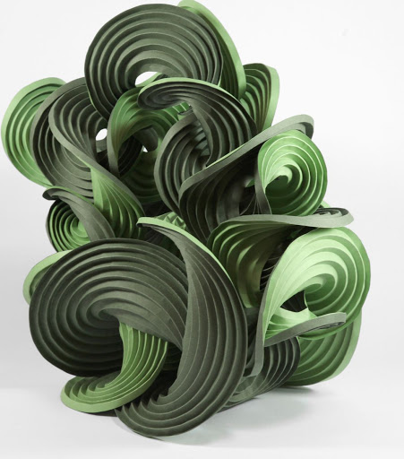
“On the one hand, we have some very interesting geometric sculpture. And, on the other hand, we are growing our understanding of these forms that ultimately will lead to some scientific and engineering applications,” he says. “Our sculptures also represent a different way of communicating with the public. For scientists, it’s another medium to communicate that there are both interesting and beautiful things in science and math.”

Sydney Sie

Сидни Си
Gradient Colors and Female Forms

Sydney Sie es una diseñadora gráfica y fotógrafa originaria de Taiwan. Aunque también ilustra y anima, lo que más me llamó la atención de su portafolio fueron sus fotografías, pues están llenas de gradientes de colores pasteles que les dan un toque ultra femenino (sin estar lleno de glitter y corazoncitos), y que a la vez están cargadas de misterio y surrealismo. Crea atmósferas e ilusiones ópticas mediante espejos y figuras geométricas que cortan y hacen contraste con las figuras suaves y femeninas.

TOBY ZIEGLER

Encompassing painting and sculpture, Zeigler’s practice takes its starting point from the digital. His works often begin as computer-constructed images, which are then painstakingly transformed by hand onto canvas or into three-dimensional forms. The geometric aesthetic contrasts with the organic subject matter of landscapes, skies and animals; the use of computer programming speaks to a contemporary condition of understanding and interacting with the world through technology.

Strijdom van der Merwe

Reaching for the sky
“He works with the materials provided by the chosen site and shapes sculptural forms in relation to the landscape.It is a process of working with the natural world, the elements of which are shaped into geometrical forms that participate with their environment, continually changing until their final destruction.”more

Tom Hull

hyperbolic cube
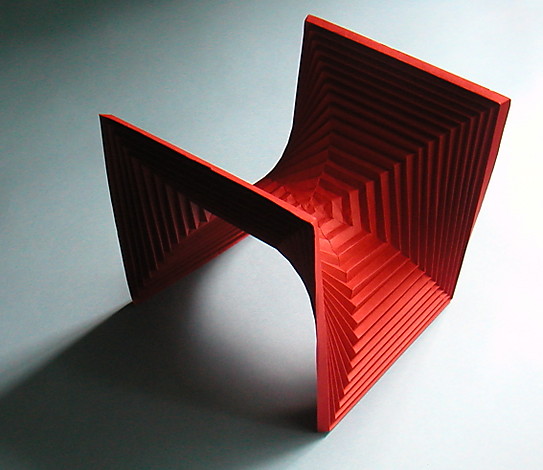
Departing from the Hyperbolic Cube (Thomas C. Hull, 2006), a regular octagon symmetrically folded, we produced origami studies of octagonal and cubic volumes in order to understand the spatial qualities of classic hyperbolic paraboloid shapes. The geometric principle is a folded octagon that traces the outline of a cube, creating an internal, vaulted space. After several iterations we achieved the intended balance: the asymmetry of the structure enhances the visual properties of the basic form, the duplicity between the strong orthogonal geometry and the curvilinear forms continuously altering from different viewpoints. It reveals itself in a constant, visual shift as one navigates towards and around it.

video