highlike

Berenike Corcuera

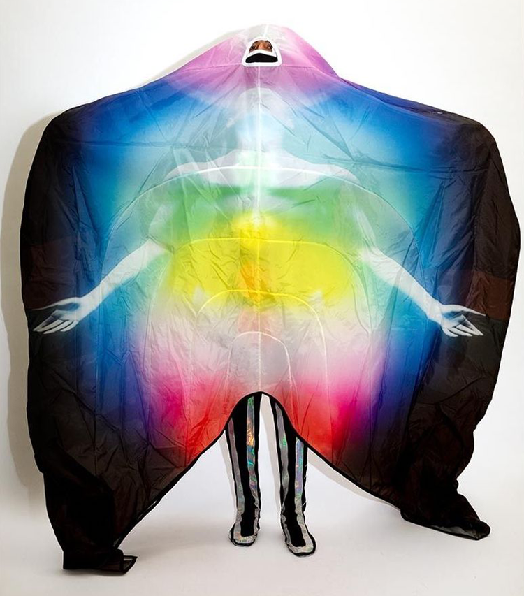
Berenike Corcuera’s collection was inspired by kirilian photographs of her aura, first captured in Chinatown’s reowned Magic Jewelry. when she lived in New York in 2014. She began studying the electromagnetic field of the human body to understand how to translate the invisible. She began the practice of mandala and colour studies, to understand how metaphysical bodies could be interpreted into physical bodies and contemporary menswear clothing.

Liam Johnson

Liam was chosen for the scholarship by lead designer at Alexander McQueen, Sarah Burton. He spent his year in industry in Paris, working at Maison Margiela under John Galliano, working personally with the designer on both the artisanal and ready-to-wear collections. As a designer, his own collections often centre upon alternatives to normal fashion and instead offer remodelled silhouettes, bright colours, unexpected textures and sculptural, exaggerated forms.

OSKAR SCHLEMMER

أوسكار شليمر
奥斯卡·施莱默
אוסקר שלמר
オスカー·シュレンマー
오스카 슐 렘머
Оскар Шлеммер
Triadic Ballet
1-Margarete Hastings, Franz Schömbs, Georg Verden
1970
2-Super 16mm colour film, directed by Helmut Ammann.
Oskar Schlemmer saw the human body as a new artistic medium. He saw ballet and pantomimes as being free from the historical baggage of theater and opera and, therefore, capable of presenting his ideas of choreographed geometry, the man as a dancer, transformed by his costumes, moving in space. He saw the puppet and puppet movement as superior to that of the human, as this emphasized that the average of all art is artificial. This device could be expressed through stylized movements and the abstraction of the human body. Schlemmer saw the modern world being guided by two main currents, the mechanized (man as a machine and body as a mechanism) and the primordial impulse (the depths of creative urgency). He claimed that choreographed geometry offered a synthesis; the Dionysian and emotional origins of dance become rigid and Apollonian in its final form.
3-Bayerisches Junior Ballet München

Jon McCormack

Colourfield
Colourfield is an evolutionary ecosystem of colour. Colour agents try to exist in a simple universe by producing colours that are suited to their environment. This environment is determined by the other agents and the colours they produce. Entering into complex feedback cycles, Colourfield presents an evolving palette of shifting colours. Different configurations emerge based on the strategies the ecosystem discovers for co-existance and co-dependency. Harmonious configurations often remain stable for a short while, before eventually being replaced by new relations, better able to survive in the ever shifting environment.

Peter Eötvö

Peter Eötvös

Multiversum

Multiversum is written for two solo instruments and orchestra, for two instruments of the same family: the traditional organ with its rich but static colours and the modern Hammond, which can continuously change colours. It was very important for me that the sound of the two organs could completely wrap around the audience, like we imagine the cosmos envelops us. The traditional organ sounds from the front, the Hammond from the back. If we visualise the two organs as our galaxy, then the different groups of the orchestra can represent different galaxies. That’s how the “Universe” becomes the “Multiversum”.

Olafur Eliasson

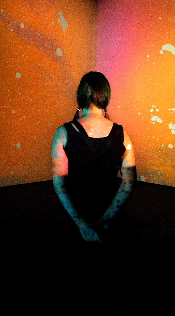
Your uncertain shadow
Five coloured spotlights, directed at a white wall, are arranged in a line on the floor: a green light positioned next to another green light, followed by a magenta light, an orange light, and, finally, a blue light. These colours combine to illuminate the wall with a bright white light. When the visitor enters the space, her projected shadow, by blocking each coloured light from a slightly different angle, appears on the wall as an array of five differently coloured silhouettes.

Robert Breer

Float
The Floats – or floating sculptures – that Robert Breer took up producing again at the end of the 1990s, emerged in 1965. The word “float” meaning something floating – a marker, fishing float or buoy – and which also describes those carnival vehicles whose pretend wheels give them the appearance of floating above the tarmac, enabled Robert Breer to apply this principle to works of a new genre. Primary shapes, neutral colours and, for the most recent, an industrial aspect, the Floats were then made with polystyrene, foam, painted plywood, and, more latterly, out of fibreglass. At first glance, these simple structures appear immobile. In fact, they are moving, imperceptibly, within the space they inhabit. Motorised and on mini-rollers – which raise them slightly above ground, giving them an air of weightlessness – they glide unbeknown to the visitor, following random paths that are interrupted by the slightest obstacle that they encounter.

Ann Veronica Janssens

Hot Pink Turquoise
Janssens’ works range wide, but they can all be described as sculptures that use the space as a stage for sensory activity. The simple white architecture of Louisiana’s South Wing becomes a resonating surface for Janssens’ both fragile and dizzying art – fragile because the works and their components are very simple while their effect elevates them above the material. Janssens herself often uses the word fluid to describe the effect of her works – even for example when they consist of a 6.5 metre long iron girder polished at the top so the room is reflected and it is hard to fix your gaze on the object. Janssens seeks no control of either works or viewers, for as the Dutch theorist Mieke Bal has said, Janssens’ artworks are at one and the same time object and event. Many of the works in the exhibition can evoke the sensation of standing at the threshold of something. They stress transitions and transformations between on the one hand a material level – evoked by glass, colour, liquids and not least light – and on the other hand a dynamic experience of time and space.

Olafur Eliasson

Beyond-human resonator
A large ring of bevelled glass, a pane of colour-effect filter glass, and an LED lamp are arranged before the wall, supported by a steel rod. The glass ring refracts, reflects, and disperses the light from the LED to create a painting on the wall with vivid bands of coloured light.

Denis Villeneuve

Arrival

“Arrival’s narrative plays out in four languages: English, Mandarin, Russian and Heptapod. Though they are not spoken in the film, we learn that Louise is also fluent in Farsi, Sanskrit and Portuguese (and possibly others). The language learning process and the growing translingual bond between Louise and the heptapods forms the film’s narrative arc and the majority of its plot. Thus language, and specifically the mechanics of ←215 | 216→multilingualism, is Arrival’s central theme. Within this context, the ability to communicate across language barriers is an asset, and the flexibility to navigate new linguistic challenges is invaluable. The heptapods are pure science fiction, but serve a powerful metaphorical function. As Emily Alder (2016) writes in The Conversation, “ultimately, Arrival is less about communicating with the aliens than with each other – internationally but also individually […] The film’s message is that difference is not about body shape or colour but language, culture and ways of thinking. It’s not about erasing that difference but communicating through it”. Gemma King

.

语言学习过程以及路易丝与七足动物之间越来越多的跨语言联系形成了电影的叙事弧线和大部分情节。 因此,语言,尤其是←215的机制| 216→使用多种语言是到达中心的主题

.

Процесс изучения языка и растущая межъязыковая связь между Луизой и гептаподами составляют повествовательную дугу фильма и большую часть его сюжета. Таким образом, язык и, в частности, механика ← 215 | 216 → многоязычие – центральная тема Арривала.
Steve Messam

Apollo
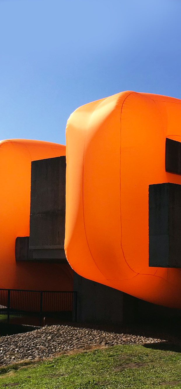
Victor Pasmore’s ‘Apollo’ Pavilion sits at the heart of the Sunny Blunts estate in Peterlee[…] Four large orange forms intersect the pavilion at right angles to the main orientation and appear to slice through the pavilion. The blocks are drawn from the geometry of the pavilion and a nod to the remote object planes of Victor Pasmore’s work. The inflatable textiles blocks create a juxtaposition between the angular grey concrete of the pavilion and the soft, rounded, colourful forms of the installation. The intervention is deliberately bold with a strong visual aesthetic to temporarily transform the pavilion. The piece is also, on the surface, playful, tactile and accessible – encouraging the audience to look at the pavilion with fresh eyes.

Mathias Krissmer

II00II0I0I00II000I
“Krissmer’s ‘Kinetic Paintings’, explore visual composition, movement and scale in a way that thrills and disorientates. They are an optical experience simultaneously aesthetic and perceptual. The digital projections can be taken to any scale making them architectonic and potentially intimate. Their focus on a geometric language set in dynamic movement creates a certain sculptural juxtaposition, enhanced by the predominant use of black and white. The occasional introduction of bright colours further dramatises the Krissmer aesthetic. These are works that inspire, that must be experienced by the mind and the body.”

LAUREN BOWKER

The Unseen Collection
Experimental fashion studio The Unseen has produced a range of accessories that alter in response to environmental changes using inks developed from its colour-shifting wearable sculptures. Bowker has previously embedded her specially developed ink into feathered, leather and gemstone-encrusted headdresses. The Unseen also presented a sculptural jacket that changes colour depending on the wearer’s mood.

Schweigman & en Cocky Eek

Spectrum
How intensely can you experience colour? Colour as a phenomenon which you don’t just see, but which totally absorbs… Spectrum is a spatial installation that makes colour tactile and tangible.
Fall backwards into a black hole and reawaken in an infinite spectrum. An immersive experience which will give you a whole new perspective on the coloured cycles of our everyday light. Following Blaas and Curve, Spectrum completes a triptych centred on white space, each piece created with spatial designer Cocky Eek in collabaration with Schweigman&. In Blaas you crawl through an inflatable balloon; in Curve you enter an endlessly spiralling tunnel. Spectrum starts by asking: how can we make the colour physically tangible?

Liz West

Our Colour
Does colour change the way you feel? What does it feel like to be inside a rainbow? For the 2016 edition of the Bristol Biennial British artist Liz West invited visitors to drench themselves in the spectrum. West transformed architectural space and turned colour into an immersive and embodied experience by refracting light through carefully arranged coloured theatre gels. A vivid world was created, exploring human visual perception and how colour affects our emotions and our bodies.

steven chilton architects

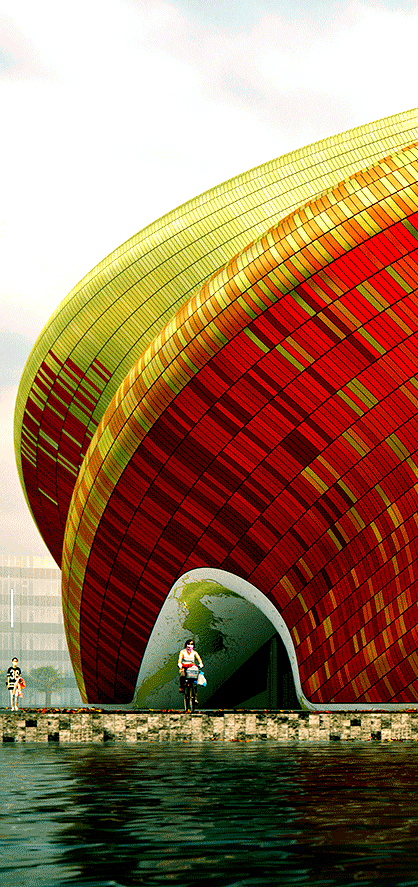
guangzhou yue show theatre

“The folds of the surface are emphasised by using darker hues on downward-facing areas that fall into shadow as the sun rises,The south-facing area of cladding is composed of predominantly gold-coloured anodised aluminium panels to help reflect heat away from the building.”

Superflex

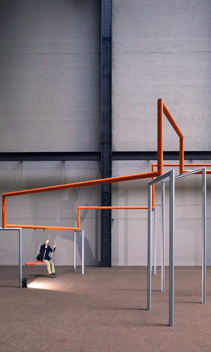
One Two Three Swing!
One Two Three Swing! challenges society’s apathy towards the political, environmental and economic crises of our age. The installation is experienced in three states: apathy, production and movement. The state of apathy compromises a large pendulum suspended by a 20 metre cable from ceiling and swinging above a 770 square metre carpet in a colour scheme inspired by British currency. Occupying the far end of the hall is the state of production, a factory station where swing seats are assembled, stamped and stored prior to distribution and use. Emerging from the state of production, an orange line formed of sets of interconnected, three-seated swings invite and frame the movements of users.

Maxim Zhestkov

Supernova
Supernova is an experimental 4K art film directed and designed by Maxim Zhestkov and made in Zhestkov. Studio Everything around and inside us was conceived in a huge explosion of a star billions of years ago… and, probably, recycled from other matrices myriad times. In this eternal carousel of matter, particles gather, form complicated structures and then burst into all directions fusing atoms together and producing new elements and points of view, new colours and patterns of perception.

Zaha Hadid Architects

bow chair
designed by Zaha Hadid Architects, Ross Lovegrove and Daniel Widrig

Bow is the latest result of the extensive, ongoing research that ZHA is conducting within the domains of 3D printing and material experimentation.The chair combines pristine design informed by structural optimisation processes typically found in nature, with innovative materials and the most advanced fabrication methods. The pattern and the colour gradient concur in redefining the traditional spatial relationship between furniture and its setting.

UVA UNITED VISUAL ARTISTS

Blueprint
Blueprint embraces the relationship and parallels between art and science, creating compositions through the mathematical principles of logic that underpin life. Exploring analogies between DNA and computer code, UVA have created the Blueprint series; works that pair genetics and code as the blueprints of artificial and natural systems. As the work slowly changes over time, patterns fluctuate between varying degrees of complexity. Blueprint uses the basic concepts of evolution to create an ever-transitioning image. With cells literally transferring their genes to their adjoining others, colour flows like paint across the canvas. Drawing up a unique colourful composition every minute, Blueprint presents the unlimited outcome that results from a single algorithm; a single set of rules.

Índice

Jonattas Poltronieri, Luis Mello, Pedro Venetucci & Rofli Sanches
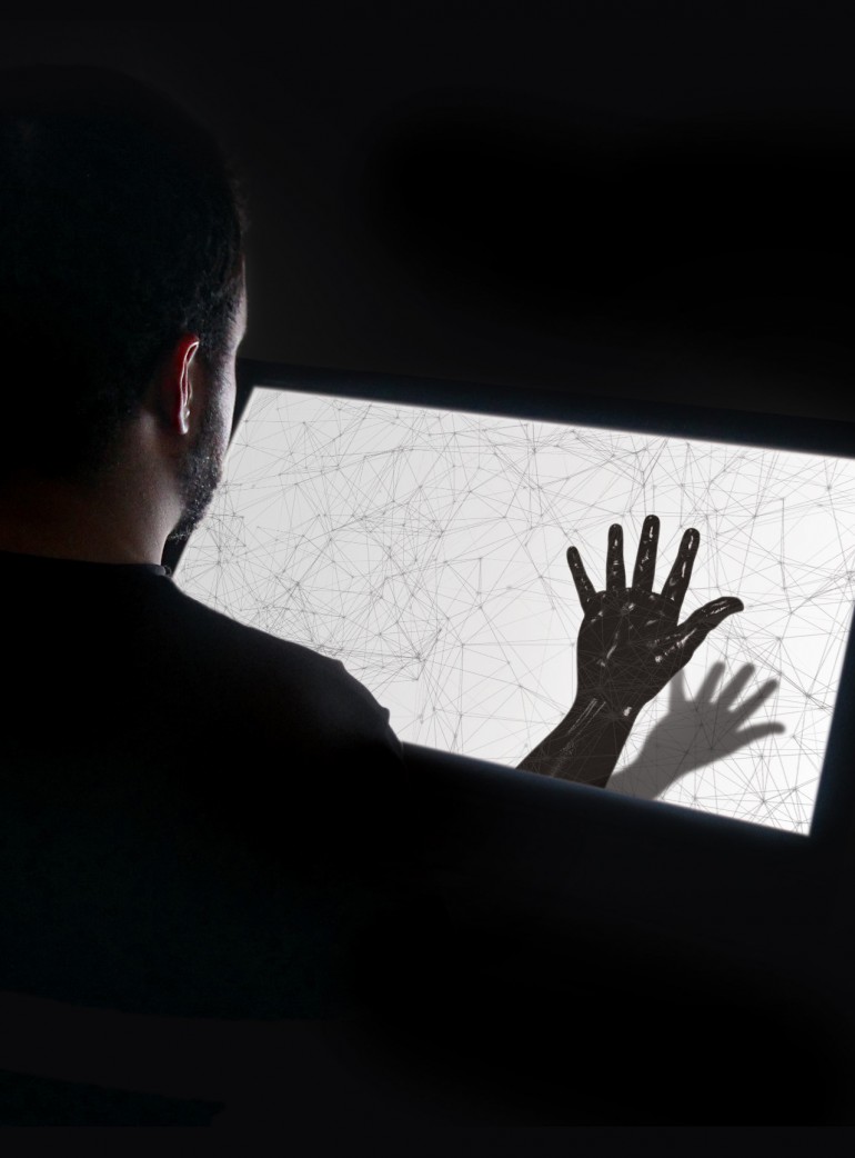
Phantom Limb

Just like the original box, the installation is a rectangular unit where the user inserts his arm and is urged to move it in different ways. The similarity with the original object disappears as, instead of having a mirror to provide the image that motivates the interaction, there is a screen that mediates the user’s view and the place where his arm actually is. The displayed image of the user’s arm can be reversed, distorted and coloured, among several modifications to simulate in a rich way the strangeness of not having control over a member, and to question whether what is seen is an accurate portrayal of the real body. Although deep and subjective, the topic addressed in this experience is easy and accessible in its interaction, offering various sensory feedbacks to the user. Through it, it is proposed that we experience and reflect upon the disconnection between thought and body, intention and action, sensation and reality.


FILE SAO PAULO 2015

Eliška Sky

WOMANEROES

“Eliška Sky’s tribe of ‘womaneroes’ stand bold and bright, their bodies and heads adorned in vibrant shapes, colours, and textures. Beneath the wigs and paint are women of all ages, shapes and ethnicities, photographed with a large-format camera to capture every detail, rough or smooth, with the intention for the images to eventually be printed and exhibited life-size. “It started as visual play, but transformed into a series that challenges depictions of women’s bodies,” explains the London-based Czech photographer. “In light of my own experience of working in the fashion industry, I felt the need to portray the body in new ways and forms, with an element of playfulness and humour in opposition to western media advertising”.” Marigold Warner

Circus Family

Triph
“When left alone with no audience, the object glows dimly as if it were asleep. Yet when visitors approach, the installation slowly comes back to life. Colour gradients pour into each shape, whilst mirrored surfaces start reflecting light – all to the orchestra of an encompassing soundscape. This project invites visitors to become part of something. An immersive light experience in which the audience directs the intensity, audio and colour palettes simply by approaching, moving around in and between the large geometric shapes of the installation. Truly, a merging of art, interaction design, sound, tech and vision. As visual architects, our aim with ‘TRIPH” is to demonstrate that a number of different techniques can be combined into a mix of unexpected shapes and materials, that in turn help to create a new truly unique way of experiencing a story. Both in daylight condition and at night. With our self-initiated work, we aim to find undiscovered methods of narrative, questioning the ways people discover and open themselves up to new conceptual work.” Circus Family

UVA UNITED VISUAL ARTISTS

Harmonics
Harmonics challenges our perception of light and sound unfolding at great speed, an illusion of time blending. As the two kinetic sculptures speed up, rotating beams of light blend to form volumes of colour, while multiple discrete sounds become a major chord. Unable to process extremely fast information, our brain reads sequential sensory inputs as a single event in time. A disconnected reality perceived as a continuum, a harmonious whole.
VIDEO

GeeksArt

Wavelet
It uses the changing light to mimic the flowing water. Wavelet is composed of 1,300 light-responsive light bulbs. Each light bulb is designed in an arc shape, which gives the light wave a distinct direction. Each of the teardrop-shaped light bulbs is embedded with custom-made electronics that detect and react to changes in light and colour. When any of the light bulbs detect a change in colour or light, it displays the colour accordingly. When any of of the lights are turned on, the adjacent light bulbs react to the light change and the light waves automatically expand out to the very edge of the installation. From a single source of light, waves spread out like a series of dominoes. The random variable patterns created give a pleasant surprise to the audience.

BarabásiLab

Hidden Patterns
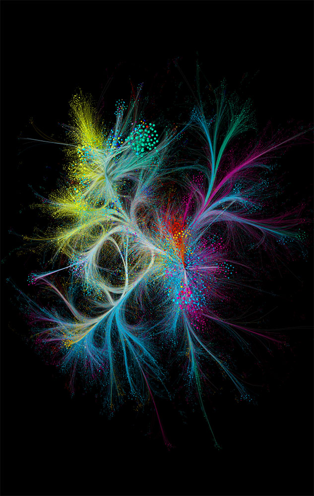
The co-citation network for Nature: more than 88,000 papers published by the journal since 1900 are each represented by a dot, coloured by discipline. Papers are linked if another scientific paper (of those indexed in the Web of Science) cites both; the dot size reflects the number of these co-citation links.
Invisible, hidden connections and constantly repeating patterns within nature, society, language, and culture can not only be explored but also made visible. Barabási’s network approach promises to deliver a comprehensive, universal method that will illuminate many phenomena with scientific precision.

Gustav Metzger

Liquid Crystal Environment

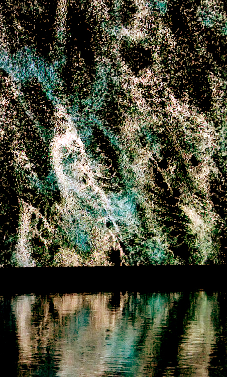
Liquid Crystal Environment is made using heat-sensitive liquid crystals that are placed between glass slides and inserted into projectors. The slides are rotated to create movement within the liquid, and as the crystals are heated and cooled they change colour. The patterns produced within the various slides are then simultaneously projected onto screens around the exhibiting space, all under the control of a computer program.

heinz mack

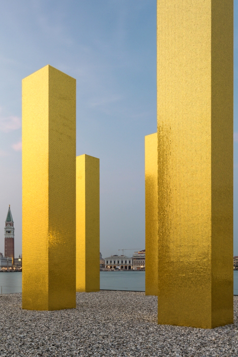
The Sky over Nine Columns
Heinz Mack has developed a genuine language of light and colour since the 1950s and is a leading exponent of kinetic art. The concept of ‘Light Stele’, to which ‘The Sky Over Nine Columns’ refers, was first formulated by Mack in the late 1950s in his Sahara Project. His works in public spaces – whether in urban settings or nature – are always conceived as objects for light: “Light is decisive for my art. As far as light is concerned, I want to go to the limits of the possible.” (Heinz Mack)

robert seidel

Vitreous
The nine virtual sculptures underlying vitreous resulted from experimental setups by Robert Seidel for generating three-dimensional clusters of fibrous refractions, as well as the gravitational lensing of different volumetric and chromatic densities. Singular elements gravitate towards each other, accumulating in a gigantic sculptural system, where each entity exists with its own visual axis and vanishing point. The impalpable luminous formations create prismatic interactions between the ridges and plateaux of the main colours floating in front of the infinite violet background.

TZUSOO

SCHRÖDINGER’S BABY
Schrödinger’s Baby(2019/20), TZUSOO alludes to the popular thought experiment devised by Austrian physicist Erwin Schrödinger in 1935. Schrödinger proposed a scenario in which a cat is locked in a box with an unstable radioactive atom that could potentially begin to emit radiation and release a toxic gas. However, there is no way to say with certainty when or indeed whether this will happen without opening the box. The result is a paradox, with Schrödinger asserting that the cat enters a state of superposition that makes it impossible to say whether it is alive or dead.The South Korean artist translates this famous paradox into the reality of her own life, creating a digital baby in virtual space. Based on her inner grappling with potential motherhood, TZUSOO bought the digital model of a developing embryo, refining it according to her own ideas. She is free to determine the sex, skin colour and other characteristics or to dispense with all specifications so as to avoid stereotyping. In Schrödinger’s Baby, TZUSOO thus discuss core aspects of her work including reflection on gender and origin for which she also draws on her personal experience as a South Korean artist in Europe.

Norimichi Hirakawa

Datum

Any pixel in a digital movie file can be described as a point in 6-dimensional Euclidean space [x,y,R,G,B,t]. the rotations in 6-dimensioal space converts curve in form to gradation in colour, colour to motion in time axis, motion to curve and curve to colour. relations beween all of pixels are mathematically conserved through the conversion.
this visual object is “mathematically” digital colour movie data itself as sequence of numbers. it’s a nature of data.

Ann Veronica Janssens

States of Mind
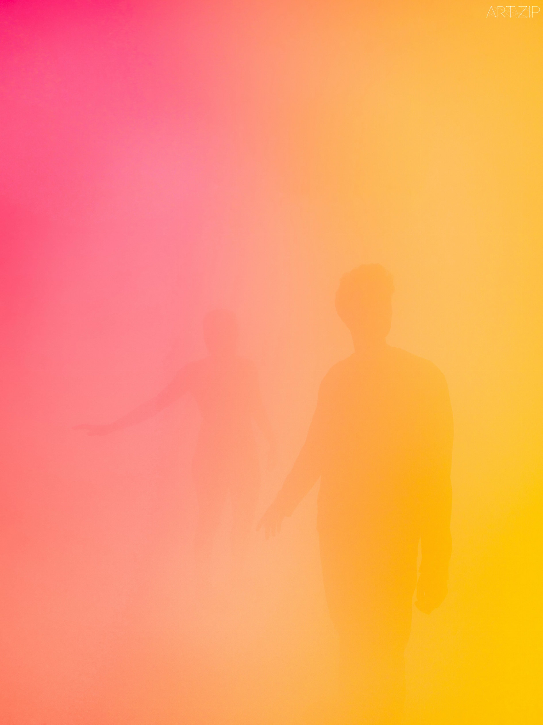
Brussels-based artist Ann Veronica Janssens’ practice is concerned primarily with light, colour, and perception. Janssens makes very few art objects. Instead, her work attempts to escape the ‘tyranny of objects’ and what she describes as their ‘overbearing materiality’. Since the late 1990s, Janssens has filled spaces with washes of coloured light or ‘haze sculptures’: dense, illuminated clouds of vapour that render surroundings unfamiliar and sensory perception altered.

Jeppe Hein

Breath from Pineal to Hara

Coloured neon rings light up in a specified sequence behind a two-way mirror, layered with reflections of the visitors and the surrounding space. Starting with the inner ring, the individual rings light up one after the other. Once all rings are illuminated, they switch off again from the outer ring to the inside. The sequence and colours are reminiscent of the breathing technique from Pineal to Hara and the artwork invites the viewer to breath accordingly. Combined with the two-way mirror in front of it, it seems to awaken viewers to the present moment and make the usually unconscious process of breathing conscious for a while. Breathe in. Breathe out.

Regine Schumann

colormirror dornbirn
Regine Schumann is a minimalist artist who works with Light Art, initially inspired by Color Field Painting and artists as Mark Rothko, Donald Judd and Dan Flavin. Schumann’s boxes and installations are made of acrylic colour plates especially produced for her. Her work is more than just Concrete Art. Conceptualized as emotive spaces, Schumann’s colour– lled light rooms provoke intense feelings of something otherworldly. Her minimalistic approach affects everything from her choice of materials to the way she plays with form and colour.

Latifa Neyazi

Graduate Fashion Week 2018

“One of the boldest statement pieces of the week, even more so than the fluorescent collections! Neyazi’s huge puffy fat suit resembling garment was incredibly unusual. The ballooning dress took on a very unique silhouette.The models were send down the runway wearing headpieces which matched the round bunched bottom shaped dress. The brown, beige and burnt orange colour pallet evoked a bonfire and the huge blown up dresses adhere to a fire form.” Chloe Alexandra Lawrence

South Georgia Heritage

NEON – Fantastical Architecture, Art and Design

FROM DARKNESS TO LIGHT
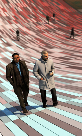
South Georgia Heritage Trust launched an open call for a site-specific commission to be located on Grytviken the former whaling station of sub-Antarctic Island of South Georgia. The project was required to celebrate the whale through a reinterpretation of the former Flensing Plan (a large timber deck used to process the captured whales) and offer a message of hope for future generations by demonstrating how humankind can move from exploitation to conservation. Our proposal imagines that the deck of the Flensing plan has been cut like a piece of flesh from the ground and bent upwards to form an arc. The timber deck is replaced with concrete pavers which are coloured based on the activities which took place in the sites past and present (whale processing and whale watching). The coloured pavers are positioned to create a gradient which provides the visitor with a visual representation of the way the site has changed over time.

Sanja Marusic

Dutch-Croatian photographer Sanja Marušić uses an experimental approach to colour, composition, materials, and manipulations in her work to create dreamlike scenes that are at once cinematic and alienating.She travels the world in her production of these otherworldly images, finding settings and forms that play with our relation to the subconscious, simplifying the bodies of her subjects with geometric shapes, and abstracting the human form even further by incorporating stylised dance movements.Putting places above people, many of Sanja’s photographs are set in wide open futuristic spaces in an attempt to create surreal and alienating visual emotions. She often uses cool and bright colours as well as singular objects and accessories in order to create unique and enigmatic narratives.

guda koster

Wrapped up
With her installations, sculptures and photographs, Dutch artist Guda Koster transforms the human body and attaches a new identity to her characters or to herself, using clothing as the main visual art form, patterns and colours to create surreal stories.

daniel von sturmer

electric-light
Electric Light presents a scenography of forms borrowed from the world-behind-the-scenes of lens based image production. Backdrops, stands, flats, flags and bounces populate the gallery space, illuminated by a changing array of coloured lights. A moving light animates the space with changing forms, shapes and colours, adding another layer of dynamic activity. This new work brings light to the foreground and renders the gallery as an unfolding set.

Samuel Mathieu

Guerre

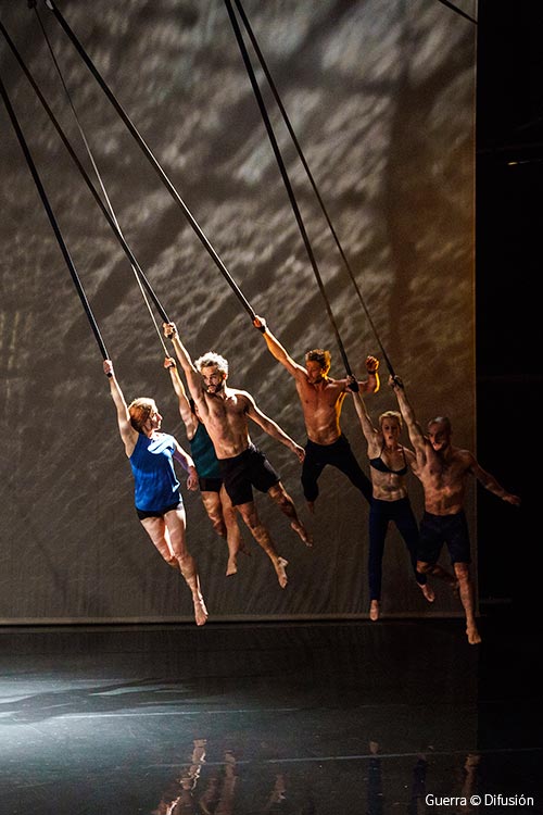
A struggle that seems to be of particular relevance today. A metaphorical title, poetry of the line and of colour, that highlights the challenge that each of the parties represents. A kind of symbolic correspondence that flirts with our world, with our history, our human condition. War opens up perspectives of matter, a struggle both real and poetic that blends lines and directions, inscribing the trace, the hue, in the flesh of the dancing body but also in a seductive paradox between line and colour.

Lauren Bowker

The Unseen Collection
Lauren Bowker describes herself a materials alchemist. After developing a pollution sensing compound while studying at Manchester School of Art, she went on to study textiles at the Royal College of Art in London and created a series of inks which change colour in response to heat, light, wind and environmental changes.

Studio Flynn Talbot

Horizon
Horizon recreates my favourite time of day – twilight – when the sun sets and daylight drops away. The surrounding scenery then darkens, leaving a soft gradient of colour that extends up into the sky. Horizon captures this moment in time, but re-imagines it as an ever changing, interactive light show.” Flynn Talbot

Rosie Danford Phillips

Opulent Virulence
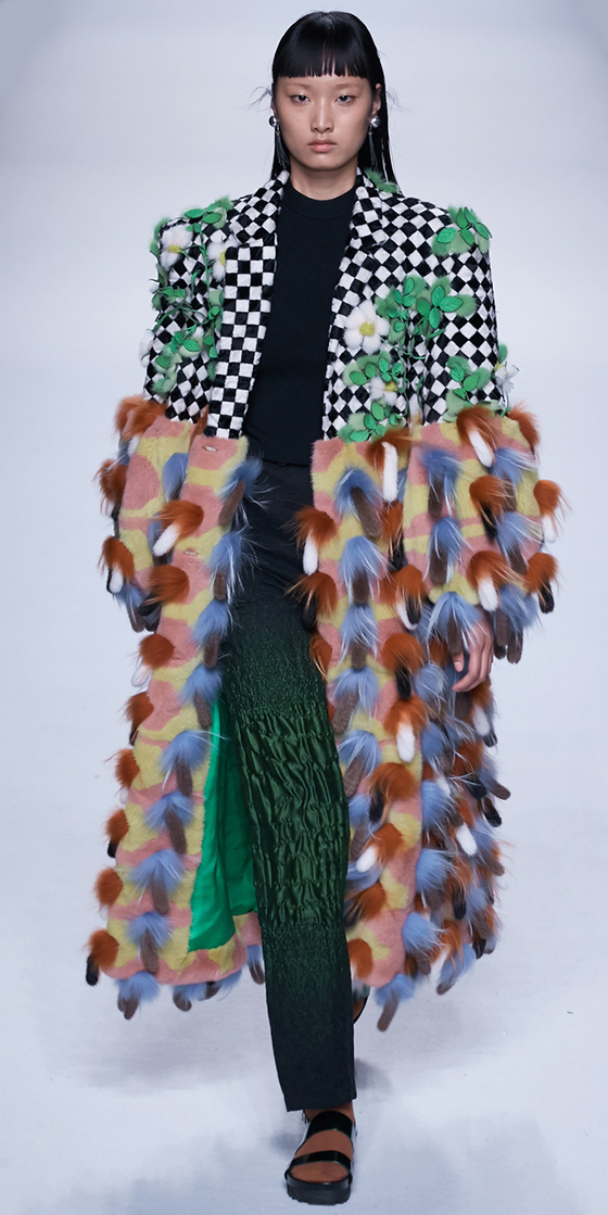
“My collection is inspired by my fascination with nature; an interpretation of the complexity and unrestrained beauty of nature, which I express through complex layering, colour and a maximalist aesthetic that takes joy in abundance and opulence. I create my own ecosystems of layered and built fabrics in knit, print and unconventional embroidery. My clothes are in a state of rewilding – I infect the silhouettes with rich colourful textiles, giving them life. I grow my embroideries over graphic and sculptural silhouettes to emphasise and contrast the organic and the built landscape.” Rosie Danford Phillips

Cho Gi Seok

“I will always focus on portraits. My aim is to try to express the characteristics of Seoul and my generation in my work.” In terms of visual motifs, Giseok’s portfolio features a few consistent elements. Firstly, a soft use of light, often accompanied by washes of colour. And, secondly, flowers of all shapes and sizes. These form a large part of Giseok’s compositions, dictating the aura of an image.
Styled by: Hyunji Shi.

Akane Moriyama + Jasper Carlsen

Reflected Roof
A series of fans gently shape the textile into a sequence of changing forms that although programmed will never exactly repeat. The daylight, cast from above, falls onto and through the fabric and as it’s angle changes throughout the day creates ever changes in colour, shadow and reflection.

Ana Montiel

Taking in her paintings is like opening your eyes after a nap in the sand. The colourful masses on her canvas appear to be in motion, plunging the spectator into a semi-conscious state. Beyond the merely pictorial, Ana Montiel’s works read like spiritual, dreamlike invitations, that hit you with a feeling of satisfaction and involuntary entrancement. Any tangible form looks acid-washed; a silhouette or a ray of sun gives way to a sfumato of light and pigments. The artist is interested in the conceptual issues of perception and phenomenology, based on the premise that reality is nothing but a collective and controlled hallucination.

Troika

Reality is not Always Probable
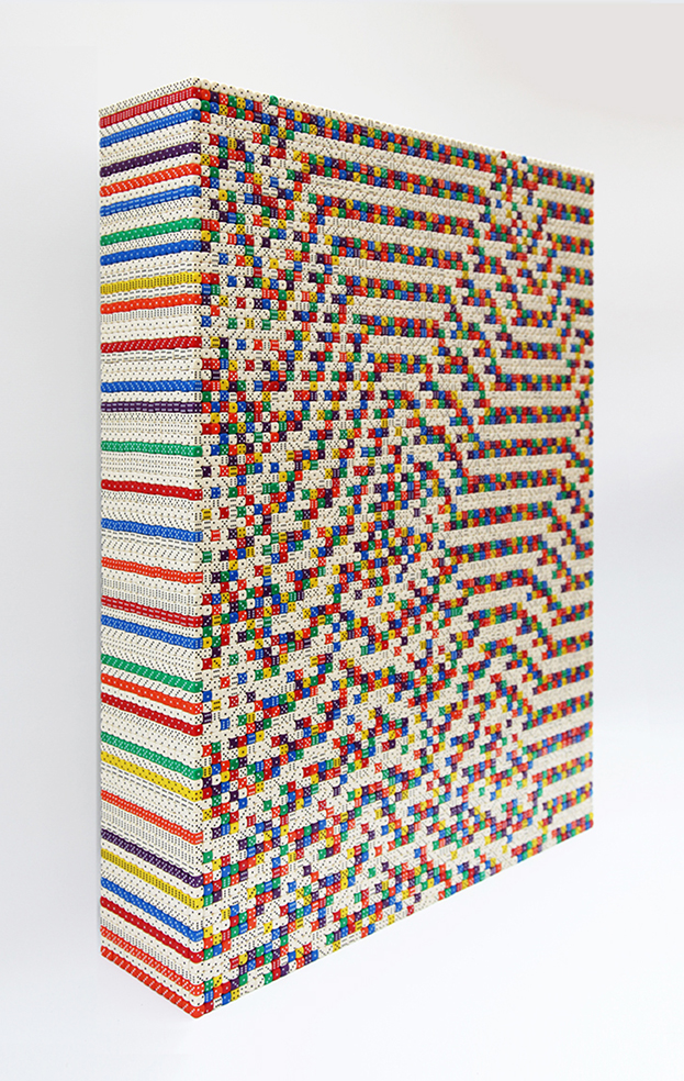
‘Reality is not Always Probable’ is constructed from tens of thousands of colourful dice and is generated, line by line, by manually emulating the rules of a simple computer binary program. Its title references a quote by Jorge Luis Borges and men’s disquiet towards a lack of controllable or predictable events and the belief that complete knowledge is impossible.

NEIL HARBISSON

Hearing Colors

Every colour has a different vibration, meaning different paintings, images or even faces have a different note or sound.
This audio input was once worn on the outside of his head, but now it has been implanted inside his skull – much like a cochlear implant – he has a greater depth of colour perception.
The new wi-fi and bluetooth connectors in the chip also means he will be the first person in the world to experience an image without actually seeing it for himself.

Michael Pinsky

Transparent Room
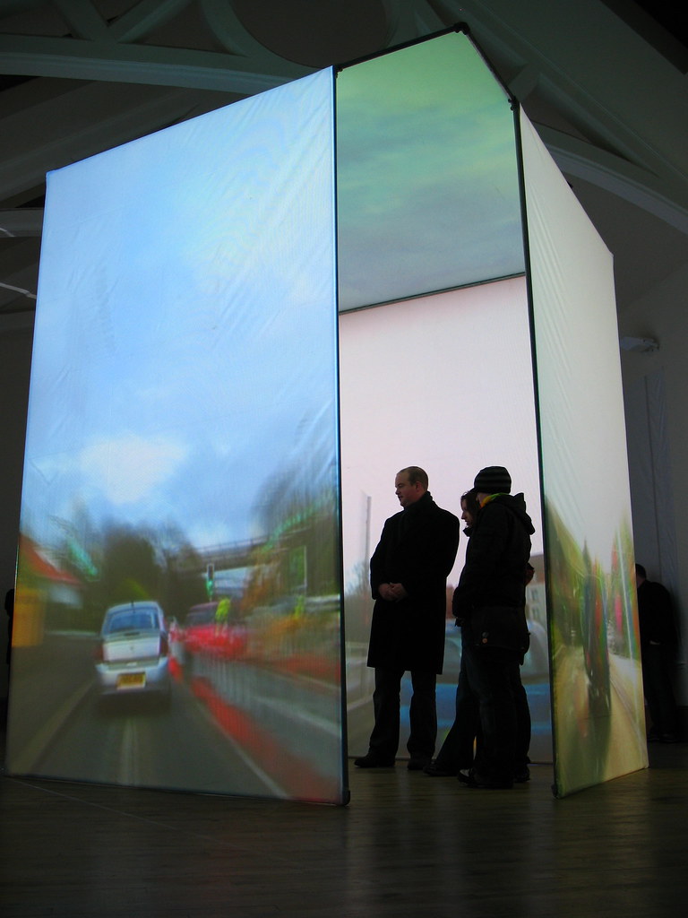
Transparent Room suspends viewers in a virtual space where they see through walls to hidden rooms and city streets, and through ceilings to the sky. The room’s confining walls are replaced by projections of the outside world, its time accelerated as clouds speed by and as cars and pedestrians alike race down the street. In this caricatured passing of time, views of the cityscape and of the building’s interiors are magnified, first showing details, then textures and, finally, just single colours.