highlike

Amigo & Amigo

Affinity
Affinity is an immersive interactive light and sound installation inspired by the human brain. Each light globe represented a memory, as people approached Affinity different memories could be heard. When people touched the memory a light would trigger, the longer they touched the further their light would travel throughout the sculpture. Affinity features 62 different colour combinations and 112 points of interaction.

Olafur Eliasson

Your uncertain shadow
Five coloured spotlights, directed at a white wall, are arranged in a line on the floor: a green light positioned next to another green light, followed by a magenta light, an orange light, and, finally, a blue light. These colours combine to illuminate the wall with a bright white light. When the visitor enters the space, her projected shadow, by blocking each coloured light from a slightly different angle, appears on the wall as an array of five differently coloured silhouettes.

Robert Breer

Float
The Floats – or floating sculptures – that Robert Breer took up producing again at the end of the 1990s, emerged in 1965. The word “float” meaning something floating – a marker, fishing float or buoy – and which also describes those carnival vehicles whose pretend wheels give them the appearance of floating above the tarmac, enabled Robert Breer to apply this principle to works of a new genre. Primary shapes, neutral colours and, for the most recent, an industrial aspect, the Floats were then made with polystyrene, foam, painted plywood, and, more latterly, out of fibreglass. At first glance, these simple structures appear immobile. In fact, they are moving, imperceptibly, within the space they inhabit. Motorised and on mini-rollers – which raise them slightly above ground, giving them an air of weightlessness – they glide unbeknown to the visitor, following random paths that are interrupted by the slightest obstacle that they encounter.

Ann Veronica Janssens

Hot Pink Turquoise
Janssens’ works range wide, but they can all be described as sculptures that use the space as a stage for sensory activity. The simple white architecture of Louisiana’s South Wing becomes a resonating surface for Janssens’ both fragile and dizzying art – fragile because the works and their components are very simple while their effect elevates them above the material. Janssens herself often uses the word fluid to describe the effect of her works – even for example when they consist of a 6.5 metre long iron girder polished at the top so the room is reflected and it is hard to fix your gaze on the object. Janssens seeks no control of either works or viewers, for as the Dutch theorist Mieke Bal has said, Janssens’ artworks are at one and the same time object and event. Many of the works in the exhibition can evoke the sensation of standing at the threshold of something. They stress transitions and transformations between on the one hand a material level – evoked by glass, colour, liquids and not least light – and on the other hand a dynamic experience of time and space.

Olafur Eliasson

Beyond-human resonator
A large ring of bevelled glass, a pane of colour-effect filter glass, and an LED lamp are arranged before the wall, supported by a steel rod. The glass ring refracts, reflects, and disperses the light from the LED to create a painting on the wall with vivid bands of coloured light.

Schweigman & en Cocky Eek

Spectrum
How intensely can you experience colour? Colour as a phenomenon which you don’t just see, but which totally absorbs… Spectrum is a spatial installation that makes colour tactile and tangible.
Fall backwards into a black hole and reawaken in an infinite spectrum. An immersive experience which will give you a whole new perspective on the coloured cycles of our everyday light. Following Blaas and Curve, Spectrum completes a triptych centred on white space, each piece created with spatial designer Cocky Eek in collabaration with Schweigman&. In Blaas you crawl through an inflatable balloon; in Curve you enter an endlessly spiralling tunnel. Spectrum starts by asking: how can we make the colour physically tangible?

Liz West

Our Colour
Does colour change the way you feel? What does it feel like to be inside a rainbow? For the 2016 edition of the Bristol Biennial British artist Liz West invited visitors to drench themselves in the spectrum. West transformed architectural space and turned colour into an immersive and embodied experience by refracting light through carefully arranged coloured theatre gels. A vivid world was created, exploring human visual perception and how colour affects our emotions and our bodies.

Eliška Sky

WOMANEROES

“Eliška Sky’s tribe of ‘womaneroes’ stand bold and bright, their bodies and heads adorned in vibrant shapes, colours, and textures. Beneath the wigs and paint are women of all ages, shapes and ethnicities, photographed with a large-format camera to capture every detail, rough or smooth, with the intention for the images to eventually be printed and exhibited life-size. “It started as visual play, but transformed into a series that challenges depictions of women’s bodies,” explains the London-based Czech photographer. “In light of my own experience of working in the fashion industry, I felt the need to portray the body in new ways and forms, with an element of playfulness and humour in opposition to western media advertising”.” Marigold Warner

Circus Family

Triph
“When left alone with no audience, the object glows dimly as if it were asleep. Yet when visitors approach, the installation slowly comes back to life. Colour gradients pour into each shape, whilst mirrored surfaces start reflecting light – all to the orchestra of an encompassing soundscape. This project invites visitors to become part of something. An immersive light experience in which the audience directs the intensity, audio and colour palettes simply by approaching, moving around in and between the large geometric shapes of the installation. Truly, a merging of art, interaction design, sound, tech and vision. As visual architects, our aim with ‘TRIPH” is to demonstrate that a number of different techniques can be combined into a mix of unexpected shapes and materials, that in turn help to create a new truly unique way of experiencing a story. Both in daylight condition and at night. With our self-initiated work, we aim to find undiscovered methods of narrative, questioning the ways people discover and open themselves up to new conceptual work.” Circus Family

UVA UNITED VISUAL ARTISTS

Harmonics
Harmonics challenges our perception of light and sound unfolding at great speed, an illusion of time blending. As the two kinetic sculptures speed up, rotating beams of light blend to form volumes of colour, while multiple discrete sounds become a major chord. Unable to process extremely fast information, our brain reads sequential sensory inputs as a single event in time. A disconnected reality perceived as a continuum, a harmonious whole.
VIDEO

GeeksArt

Wavelet
It uses the changing light to mimic the flowing water. Wavelet is composed of 1,300 light-responsive light bulbs. Each light bulb is designed in an arc shape, which gives the light wave a distinct direction. Each of the teardrop-shaped light bulbs is embedded with custom-made electronics that detect and react to changes in light and colour. When any of the light bulbs detect a change in colour or light, it displays the colour accordingly. When any of of the lights are turned on, the adjacent light bulbs react to the light change and the light waves automatically expand out to the very edge of the installation. From a single source of light, waves spread out like a series of dominoes. The random variable patterns created give a pleasant surprise to the audience.

heinz mack

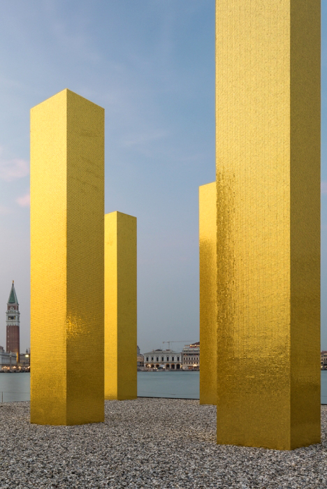
The Sky over Nine Columns
Heinz Mack has developed a genuine language of light and colour since the 1950s and is a leading exponent of kinetic art. The concept of ‘Light Stele’, to which ‘The Sky Over Nine Columns’ refers, was first formulated by Mack in the late 1950s in his Sahara Project. His works in public spaces – whether in urban settings or nature – are always conceived as objects for light: “Light is decisive for my art. As far as light is concerned, I want to go to the limits of the possible.” (Heinz Mack)

Ann Veronica Janssens

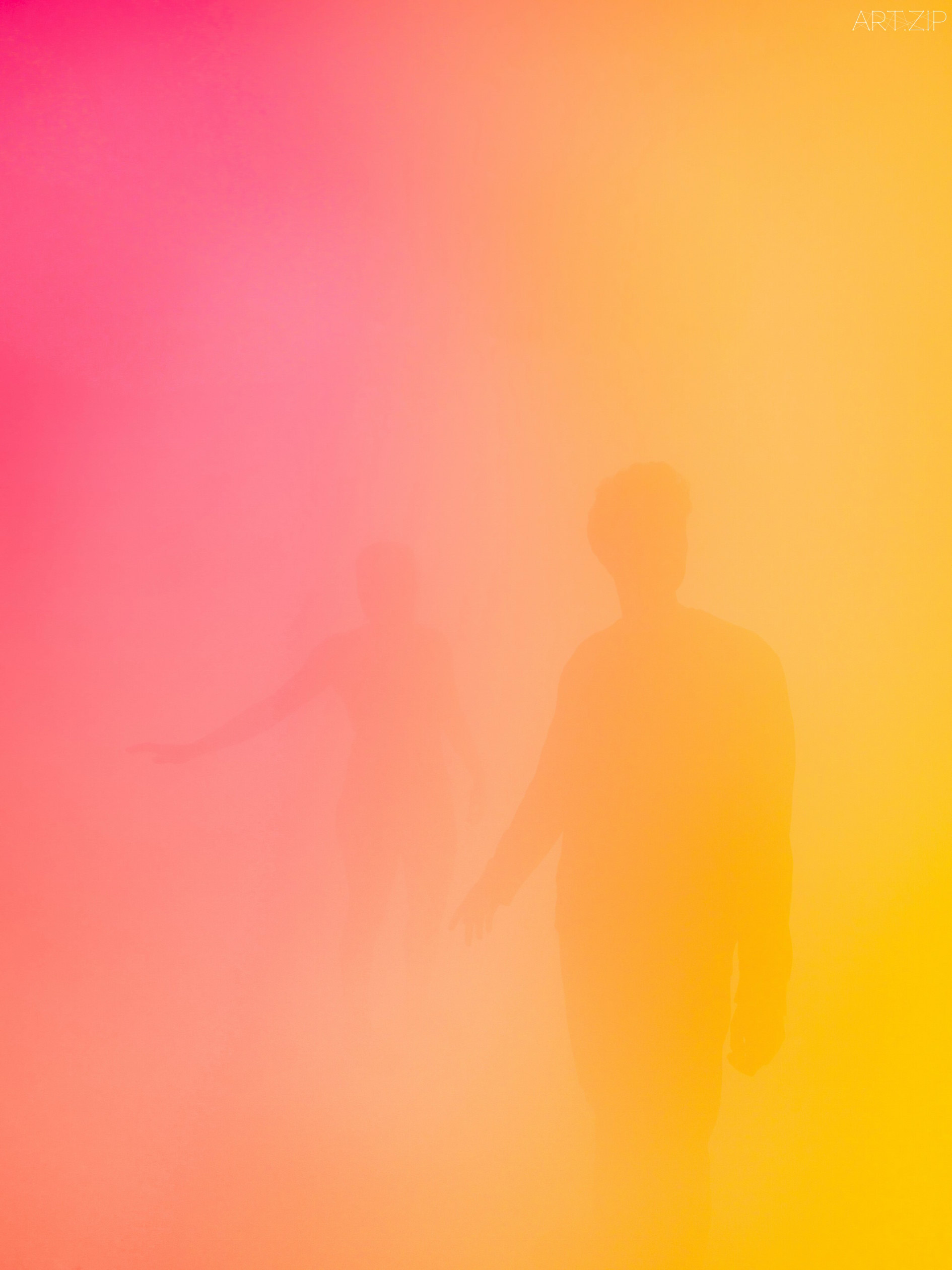
States of Mind
Brussels-based artist Ann Veronica Janssens’ practice is concerned primarily with light, colour, and perception. Janssens makes very few art objects. Instead, her work attempts to escape the ‘tyranny of objects’ and what she describes as their ‘overbearing materiality’. Since the late 1990s, Janssens has filled spaces with washes of coloured light or ‘haze sculptures’: dense, illuminated clouds of vapour that render surroundings unfamiliar and sensory perception altered.

Jeppe Hein

Breath from Pineal to Hara

Coloured neon rings light up in a specified sequence behind a two-way mirror, layered with reflections of the visitors and the surrounding space. Starting with the inner ring, the individual rings light up one after the other. Once all rings are illuminated, they switch off again from the outer ring to the inside. The sequence and colours are reminiscent of the breathing technique from Pineal to Hara and the artwork invites the viewer to breath accordingly. Combined with the two-way mirror in front of it, it seems to awaken viewers to the present moment and make the usually unconscious process of breathing conscious for a while. Breathe in. Breathe out.

Regine Schumann

colormirror dornbirn
Regine Schumann is a minimalist artist who works with Light Art, initially inspired by Color Field Painting and artists as Mark Rothko, Donald Judd and Dan Flavin. Schumann’s boxes and installations are made of acrylic colour plates especially produced for her. Her work is more than just Concrete Art. Conceptualized as emotive spaces, Schumann’s colour– lled light rooms provoke intense feelings of something otherworldly. Her minimalistic approach affects everything from her choice of materials to the way she plays with form and colour.

South Georgia Heritage

NEON – Fantastical Architecture, Art and Design

FROM DARKNESS TO LIGHT
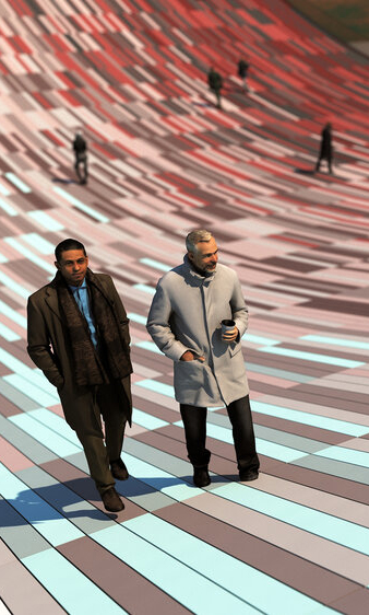
South Georgia Heritage Trust launched an open call for a site-specific commission to be located on Grytviken the former whaling station of sub-Antarctic Island of South Georgia. The project was required to celebrate the whale through a reinterpretation of the former Flensing Plan (a large timber deck used to process the captured whales) and offer a message of hope for future generations by demonstrating how humankind can move from exploitation to conservation. Our proposal imagines that the deck of the Flensing plan has been cut like a piece of flesh from the ground and bent upwards to form an arc. The timber deck is replaced with concrete pavers which are coloured based on the activities which took place in the sites past and present (whale processing and whale watching). The coloured pavers are positioned to create a gradient which provides the visitor with a visual representation of the way the site has changed over time.

daniel von sturmer

electric-light
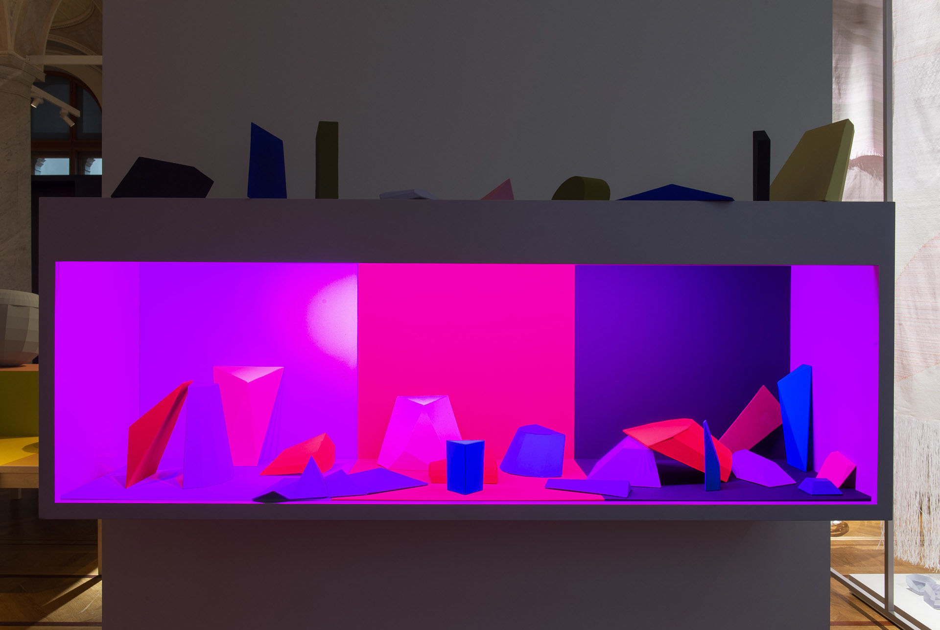
Electric Light presents a scenography of forms borrowed from the world-behind-the-scenes of lens based image production. Backdrops, stands, flats, flags and bounces populate the gallery space, illuminated by a changing array of coloured lights. A moving light animates the space with changing forms, shapes and colours, adding another layer of dynamic activity. This new work brings light to the foreground and renders the gallery as an unfolding set.

Samuel Mathieu

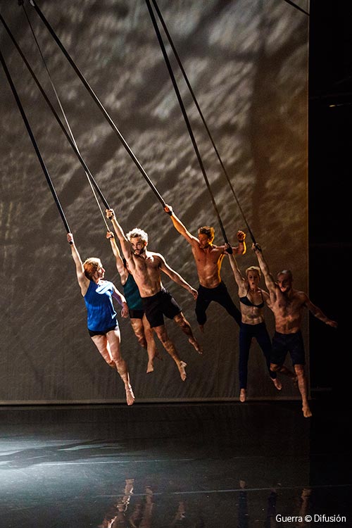
Guerre

A struggle that seems to be of particular relevance today. A metaphorical title, poetry of the line and of colour, that highlights the challenge that each of the parties represents. A kind of symbolic correspondence that flirts with our world, with our history, our human condition. War opens up perspectives of matter, a struggle both real and poetic that blends lines and directions, inscribing the trace, the hue, in the flesh of the dancing body but also in a seductive paradox between line and colour.

Lauren Bowker

The Unseen Collection
Lauren Bowker describes herself a materials alchemist. After developing a pollution sensing compound while studying at Manchester School of Art, she went on to study textiles at the Royal College of Art in London and created a series of inks which change colour in response to heat, light, wind and environmental changes.

Studio Flynn Talbot

Horizon
Horizon recreates my favourite time of day – twilight – when the sun sets and daylight drops away. The surrounding scenery then darkens, leaving a soft gradient of colour that extends up into the sky. Horizon captures this moment in time, but re-imagines it as an ever changing, interactive light show.” Flynn Talbot

Cho Gi Seok

“I will always focus on portraits. My aim is to try to express the characteristics of Seoul and my generation in my work.” In terms of visual motifs, Giseok’s portfolio features a few consistent elements. Firstly, a soft use of light, often accompanied by washes of colour. And, secondly, flowers of all shapes and sizes. These form a large part of Giseok’s compositions, dictating the aura of an image.
Styled by: Hyunji Shi.

Akane Moriyama + Jasper Carlsen

Reflected Roof
A series of fans gently shape the textile into a sequence of changing forms that although programmed will never exactly repeat. The daylight, cast from above, falls onto and through the fabric and as it’s angle changes throughout the day creates ever changes in colour, shadow and reflection.

Ana Montiel

Taking in her paintings is like opening your eyes after a nap in the sand. The colourful masses on her canvas appear to be in motion, plunging the spectator into a semi-conscious state. Beyond the merely pictorial, Ana Montiel’s works read like spiritual, dreamlike invitations, that hit you with a feeling of satisfaction and involuntary entrancement. Any tangible form looks acid-washed; a silhouette or a ray of sun gives way to a sfumato of light and pigments. The artist is interested in the conceptual issues of perception and phenomenology, based on the premise that reality is nothing but a collective and controlled hallucination.

Mary Katrantzou

pre-fall-17
Collection explores the exquisitely detailed world of these overlooked patterns to delve into a plethora of plethora of pattern, colour and aesthetic.The initial part of the collection draws from the ornate patterns of turn-of-the century William Morris prints, contrasting colours and lightweight fabrics to create perfect wardrobe pieces for the summer.

Hella Jongerius

Breathing Colour
“Hella Jongerius’ work puts colour center stage. Never one to folllow commercial trends, she has developed a use of colour that is uniquely her own. Jongerius has been researching colour pigments and the connection between colour, fabric and light for years.

Lin Hwai-min

White Water and Dust
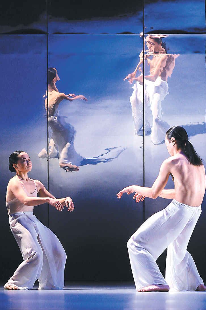
Set to the piano scores by Erik Satie and other composers, White Water is a lyrical dance of pure movement that flows beautifully as its title suggests. The curtain opens to a projected colour image of a flowing river; it slowly transforms into black and white. In serenity and in turbulence, whiteness of waves and ripples streams out of the blackness. Green netting and girds used for digital design interrupt the flow of water, thus revealing the process of creating virtual images and illusion of light, providing a pleasant surprise to the dance.
Cloud Gate
Cloud Gate is the name of the oldest known dance in China. In 1973, choreographer Lin Hwai-min adopted this classical name for the first contemporary dance company in the greater Chinese-speaking community.

FEEL SEATING SYSTEM

Animi Causa
Feel Seating Deluxe can shift into many different shapes and sizes, making it incredibly diverse and cosy. You can fold it and mold it any way you like. This seating system is made of 120 plush soft balls which you can lay, sit or lounge on. Feel Seating comes in bright red and blue colour which will lighten any room. The balls are made of 100% foam, while the upholstery is made of special stretch fabric. Although this sectional sofa might be too risqué for some, its comfort is undeniable.

Jessica Eaton

ジェシカ·イートン
杰西卡·伊顿
polytopes

Jessica Eaton’s photographs dissect chemical and optical phenomena, the materiality of film, and the language of light itself. Eaton came to international acclaim through her Cubes for Albers and LeWitt (commonly referred to by the acronym cfaal)—a series of vibrant photographs that deconstruct her studio practice. Like the majority of Eaton’s works, these optically charged images are made by taking multiple in-camera exposures of common studio supplies. Through her abundant use of traditional analog photography practices—such as colour-separation filtering and in-camera masking—Eaton imbues her large-format images with an aesthetic more reminiscent of the paintings and drawings of hard-edge geometric abstraction than the photographs of traditional studio work.

cristina coral

Losing dots
via highlike submit

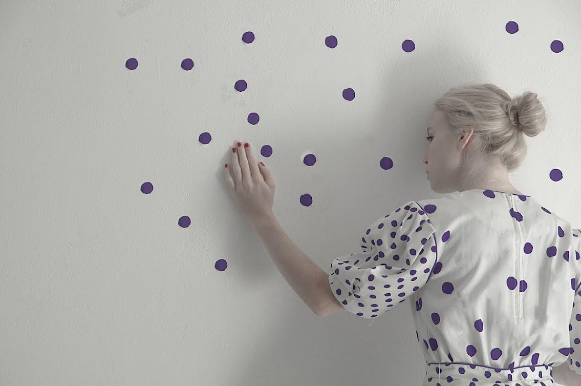
Cristina loves experimenting with light, colours, space, and female figures to create poetic photographs. At the first glance, the images seems to be rather static, but they embody a rich story behind every singular detail. The muses, which are mysterious young ladies, are captured by the artist in a minimal environment.

Peter Jones

colourscape
Colourscape is a large labyrinth of colour and light. It’s a sculpture of pure colour that the public actually go inside. Everyone puts on a coloured cape to become part of the colour experience and enters into a new world where one can freely explore the potentials of light, colour and space. There’s also music, dance and theatre taking place inside. Originally created by artist Peter Jones in the early 70s, Colourscape is a walk-in structure of nearly 100 interlinked chambers.

Susanne de Graef

Rhythm of light
‘the rhythm of light’, designed by susanne de graef the ‘rhythm of light’ lamp, created by dutch designer susanne de graef, references the cyclical rhythm of time, while its colour and movement draw attention to the dynamic, living properties of light.

Liz West

Your Colour Perception
L’artiste britannique Liz West, spécialiste du light-art, a choisi d’interroger nos perceptions des couleurs en créant un gigantesque arc-en-ciel d’intérieur.
En inondant de couleurs une pièce de 500 mètres carrés au 4ème étage de la Castlefield Gallery’s New Art Spaces Federation House de Manchester, l’installation Your Colour Perception immerge le public dans un univers multicolore et bigarré, saturé de lumière.

Heather Nicol

Soft Spin
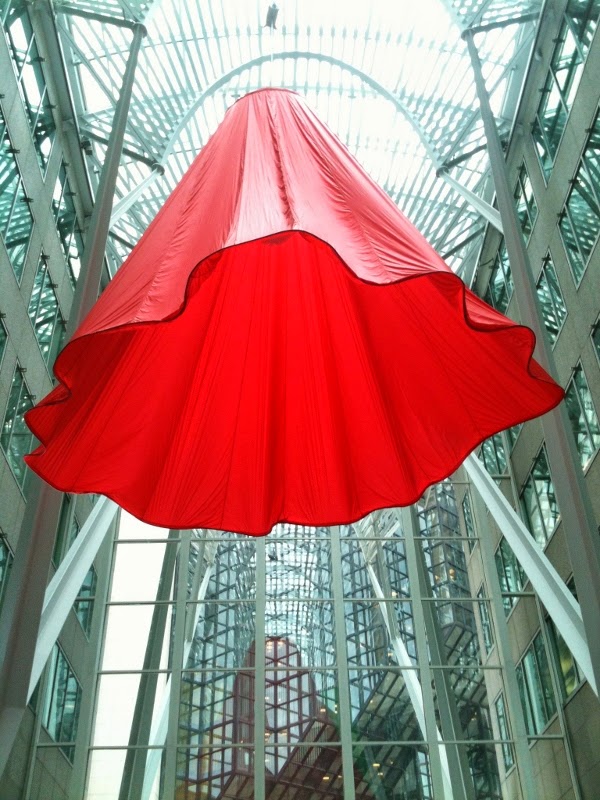
Soft Spin is a public art project which also featured a performance intervention, in the style of “flash mobs”. Colour, texture, movement, and decidedly flirtatious forms invite visitors to look up and embrace the unexpected, highlighting the ever-present potential for encounters with unforeseen pleasure and drama in the day-to-day. From the possibility of feeling miniaturized by the enormity of the installation’s curvaceous hemlines to the play of sunlight through the bursts of spring-time colour, Soft Spin steps away from legers, straight lines, and the black and white. The clean, engineered certainty of corporate grandeur is infused with an immersive dose of the whimsical, the feminine, and the celebratory.

ANNE HARDY

Residual Balance

The type of objects she chooses have ranged from large antlers, brightly coloured cables, old Christmas trees, light bulbs, American basketballs, orange balloons, scientific test tubes and even butterflies. Hardy puts these everyday objects together and transforms them into unusual, almost dreamlike, environments which can be unnerving with their themes of abandonment and desolation.

Ateliers Jean Nouvel

努维尔
جان نوفيل
ז’אן נובל
ジャン·ヌーヴェル
Жан Нувель
장 누벨
Serpentine Pavilion

The design contrasted lightweight materials with dramatic metal cantilevered structures, rendered in a vivid red that, in a play of opposites, contrasts with the green of its park setting. In London, the colour reflects the iconic British images of traditional telephone boxes, postboxes and London buses. The building consists of bold geometric forms, large retractable awnings and a sloped freestanding wall that stands 12m above the lawn.
Striking glass, polycarbonate and fabric structures create a versatile system of interior and exterior spaces, while the flexible auditorium accommodates the changing summer weather and Park Nights, the Serpentine’s acclaimed programme of public talks and events, which attracts up to 250,000 visitors each summer.
Nouvel’s Serpentine Gallery Pavilion, the architect’s first completed building in the UK, operates as a publicly accessible structure within Kensington Gardens and as a café. The pavilion design highlights the idea of play with its incorporation of traditional French outdoor table-tennis tables.
This 2010 Pavilion is the tenth commission in the gallery’s annual series, the world’s first and most ambitious architectural programme of its kind, which has become an international site for architectural experimentation and follows a long tradition of pavilions by some of the world’s greatest architects. The immediacy of the commission – a maximum of six months from invitation to completion – provides a unique model worldwide.

UVA UNITED VISUAL ARTISTS

ユナイテッド·ビジュアルアーティスト
美国视觉艺术家
Always/Never
Always/Never is the result of UVA’s recent investigations of the perception of time.
Always/Never is a grid of pyramidal elements inspired by the sundial, each passing through time at a different rate.
Changing patterns of light and shadow create the illusion of a fluid surface; shifting combinations of colours from nature recall different times of day.