highlike

Neri Oxman

MAN-NAHĀTA
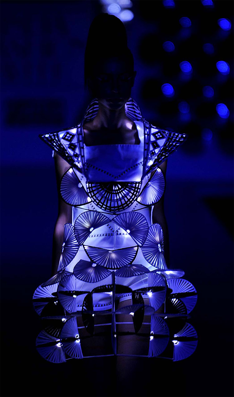
Computational growth across material and urban scales offers a framework for design through self-organization, enabling the generation of vast, diverse forms exhibiting characteristics like those that emerge through the biological growth processes found in Nature. In this project, we construct an oriented volume spanned by surface normals of the shape at every point. The value of the oriented volume drives the iterative deformation of the shape. Depending on the parameterization of this process, we can obtain distinctly different growing forms. Importantly, the emergence of these forms is driven only by the time evolution of a geometric operator acting on the shapes iteratively, thereby connecting geometry and growth through an algorithm. To form the Man-Nahata landscape, the buildings of the urban landscape are transformed through repeated morphological closing operations, where the field of influence follows a gradient from the center to the outskirts of a circular region.
ANISH KAPOOR

Espejo Islámico
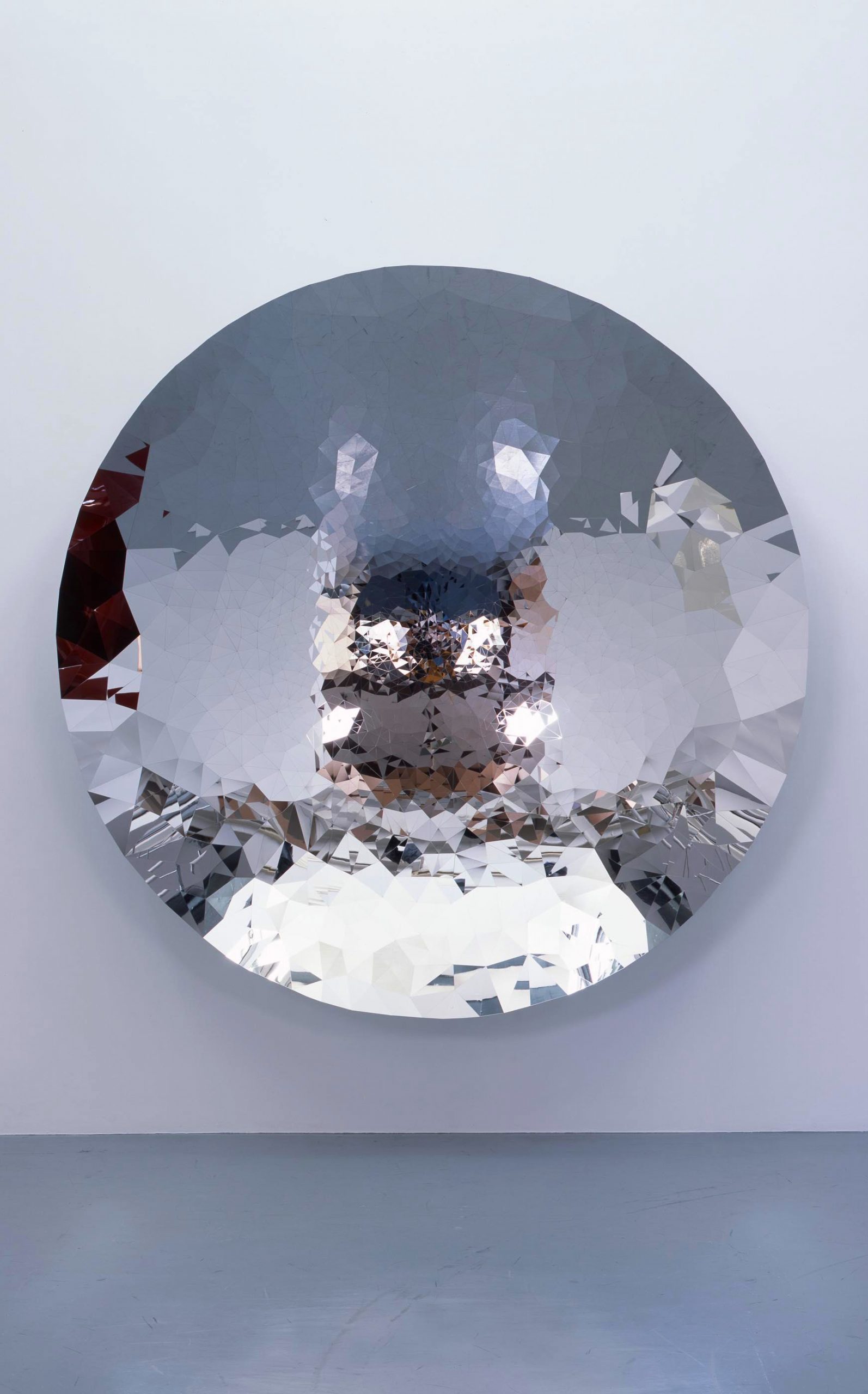
El Espejo Islámico es un espejo cóncavo circular que mide 2,4 metros de diámetro. Está compuesto por un total de 4437 piezas de acero inoxidable pulido (2241 octágonos y 2196 cuadrados) y su perfecta interpretación alude a la transición formal, matemática y geométrica entre el cuadrado y la esfera, una preocupación intelectual milenaria para arquitectos, místicos , científicos y artistas por igual.

Cornelius Cardew

TREATISE
KYMATIC ensemble
Treatise is a graphic musical score comprising 193 pages of lines, symbols, and various geometric or abstract shapes that largely eschew conventional musical notation. Implicit in the title is a reference to the philosophy of Ludwig Wittgenstein, which was of particular inspiration to Cardew in composing the work.

HANS VAN MANEN

Peças polonesas
Neste exuberante trabalho conjunto, o coreógrafo holandês van Manen mostra sua maestria para construir criações deslumbrantes a partir de motivos simples e padrões geométricos. Impulsionados pelos ritmos da partitura de Henryk Górecki, os dançarinos se reúnem e se dispersam em formações em constante mutação que culminam em dois pas de deux sensuais.

CLAP STUDIO

Installazione della nebbia
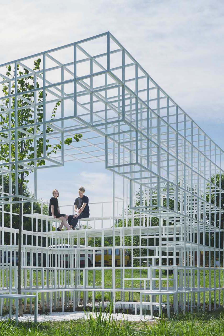
Un’installazione progettata da Clap per Minsk, in Bielorussia, realizzata da volontari della città stessa. Per il concept di questa installazione Clap parte dalla storia di Minsk, città che durante la seconda guerra mondiale è stata devastata. Le bombe distrussero l’80% degli edifici e la città non fu ricostruita fino agli anni ’50. Ecco perché la popolazione di questa città ricorda questi tempi come qualcosa di spiacevole e molti di loro preferiscono non parlarne. Lo studio di progettazione parte da un volume geometrico che rappresenta in modo concettuale il volume di un edificio. Immaginano che le bombe cadano su di lui distruggendolo, generando nuove aperture e volumi nuovi di zecca. Queste nuove aperture risultano ingegnosamente in un ingresso e un belvedere in alto. La distruzione lascia il posto alla funzione genera tribune, scale e sedili. Dall’interno, la vita si fa strada sotto forma di albero, superando l’altezza dell’installazione stessa.

PAUL ROBERTSON

File Festival
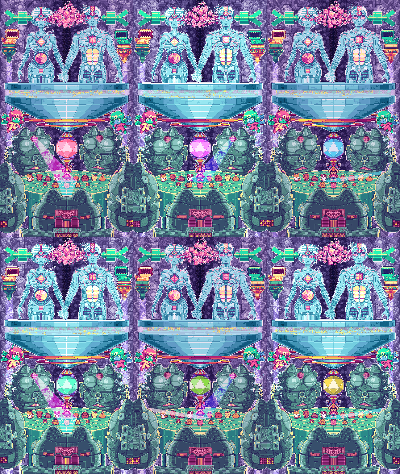
Paul Robertson is an Australian animator and digital artist who is known for his pixel art used in short films and video games. He is mostly known for Scott Pilgrim Vs. the World: The Game and the recent release, Mercenary Kings. Apart from his seasoned career as a game designer and movie creator, Robertson has been recently spotted on Tumblr with these GIFS. His interest in inserting flashing neon colors, geometric shapes, Japanese character animation, and 1990′s computer imagery, deems his work as heavily influenced by the Seapunk/Vaporwave aesthetic.

WALTER DE MARIA

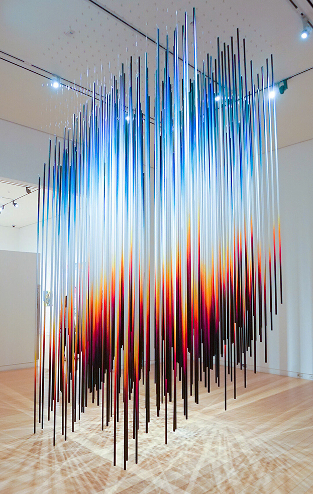
The Lightning Field

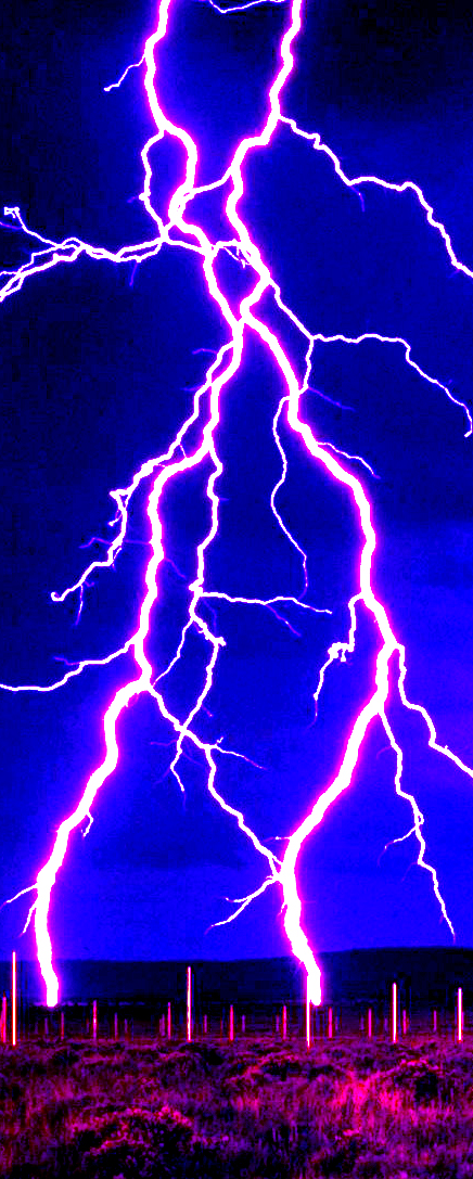
His last large-scale work “The Lightning Field”, a Land Art project built on a semi-desert plain in New Mexico, in the United States, between 1971 and 1977, consists of four hundred meters high, placed in a geometric matrix strict. This area is often plagued by storms and these metal stakes serve to attract the rays, accentuating the dramatic spirit and the scale of the place.

One Life Remains: André Berlemont, Kevin Lesur, Brice Roy & Franck Weber

FILE SAO PAULO 2017
LES DISCIPLINES DU RECTANGLE
Inspired by Michel Foucault’s work, Les disciplines du rectangle is a videogame proposition about the nature of rules and norms at the digital age. If society provides models of accomplishment we are supposed to fit inside, then the rectangle is the pure abstraction of this idea. The geometrical shape works as a symbol of the very nature of normativity, blind to individual differences. The rectangle, existing only on the screen, reveals how digital technologies can in some ways become the new location for this normativity and the ambivalent results of their intangible and invisible nature. Besides, the installation offers an occasion to think about the way games can become manipulation tools. The fact that in the end, players act as if they were piloted by the rectangle (an inversion of the traditional relationship between player and avatar) gives an aesthetical highlight to this.

.

Inspirado en el trabajo de Michel Foucault, Les disciplines du rectangle es una propuesta de videojuego sobre la naturaleza de las reglas y normas en la era digital. Si la sociedad proporciona modelos de realización en los que se supone que encajamos, entonces el rectángulo es la pura abstracción de esta idea. La forma geométrica funciona como símbolo de la naturaleza misma de la normatividad, ciega a las diferencias individuales. El rectángulo, que existe solo en la pantalla, revela cómo las tecnologías digitales pueden convertirse de alguna manera en la nueva ubicación de esta normatividad y los resultados ambivalentes de su naturaleza intangible e invisible. Además, la instalación ofrece la oportunidad de pensar en cómo los juegos pueden convertirse en herramientas de manipulación. El hecho de que, al final, los jugadores actúen como si fueran piloteados por el rectángulo (una inversión de la relación tradicional entre jugador y avatar) le da un toque estético a esto.


Sterling Ruby

Резиний рубль
スターリングルビー
Стерлинг Руби
Στερλίνα Ρουμπίνι
Specter
El monolito naranja fluorescente de Sterling Ruby, SPECTRE, aparece como una aparición en el desierto. La brillante escultura geométrica crea una ilusión óptica discordante, que se asemeja a un compuesto o collage con Photoshop, como si algo se hubiera eliminado o borrado del paisaje. El bloque actúa como un cifrado o sustituto, imitando la forma que podría ser: un contenedor de envío, un búnker militar, un objeto no identificado, un hogar abandonado. La naranja fluorescente se usa tradicionalmente por seguridad, como advertencia. Aquí esa lógica se invierte: un objeto fantasmal, apartado del entorno natural, escondido a plena vista.

Jeppe Hein

Geometric mirrors
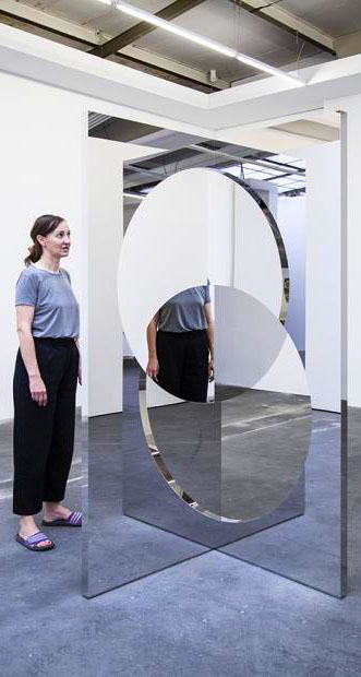
Geometric Mirrors is a series of mirror angles, each comprised of two mirror surfaces intersecting at a 90° angle. While a perpendicular viewpoint simply reflects the viewer and the opposite space, an interesting visual phenomenon occurs when the viewer faces the corner angle directly. The right angle causes a duplicate reflection, as both mirrors reflect not only the space but also each other. Their widths become extended into the adjoining side, thus appearing to the viewer as a mirrored cross rather than a mirrored angle.

DOUG AITKEN

Underwater Pavilions
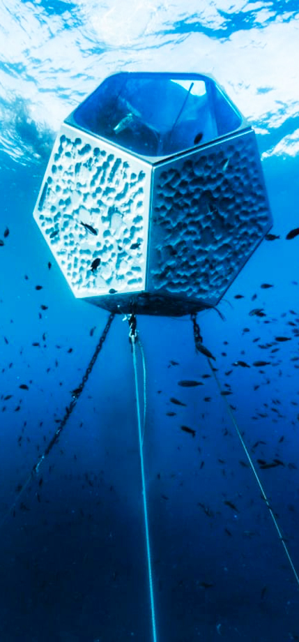
Underwater Pavilions is artist Doug Aitken’s large-scale installation produced by Parley for the Oceans and presented in partnership with The Museum of Contemporary Art, Los Angeles (MOCA). The work consists of three temporary underwater sculptures, floating beneath the ocean’s surface that swimmers, snorkelers, and scuba divers swim through and experience. Geometric in design, the sculptures create underwater spaces synthesizing art and science as they are constructed with carefully researched materials and will be moored to the ocean floor. Part of each structure is mirrored to reflect the underwater seascape and create a kaleidoscopic observatory for the viewer, while other surfaces are rough and rock-like. The environments created by the sculptures will constantly change with the currents and the time of day, focusing the attention of the viewer on the rhythm of the ocean and its life cycles.

Julien Mier, Magical Mistakes & Keita Onishi

Divide, Multiply
The King Deluxe label teamed up with animator Keita Onishi to create an innovative music video for ‘Divide, Multiply’[…] The final result is a seriously aesthetically pleasing work of videographic art, living up exactly to King Deluxe’s ‘audio-visual laboratory’ manifesto. With its geometric simplicity, and cog-like machinery driven by symmetrical beats, the video instills the utmost satisfaction deep within every viewer.

Dorian Gaudin

The coffee cup spring
The monotone repetition of the movement created by the conveyor belt recalls the pace and the landscape of animation or video games. As an extension of the conveyor, several geometric and orthogonal motifs evoking a Tetris composition are slotted together and suggest the shapes of a table, a chair or stairs. The objects are exposed on thin metal structures with fringed ends, and seem to peel off from their construction, as if they were undressing and exchanging skins, depriving themselves of sculptural depth and allowing only the surface to emerge. The technique developed by the artist to produce the sculptures inverts the usual steps of printing: first the pattern is created, then the background to which the fiberglass support is apposed. The pieces are therefore ripped off their mold, revealing their final texture, and the motif on every sculpture seems to remain the same, yet is altered by the shape of the object itself. A series of wall works using this procedure extends from the installation into the gallery space.

Yuge Zhou

Midtown Flutter
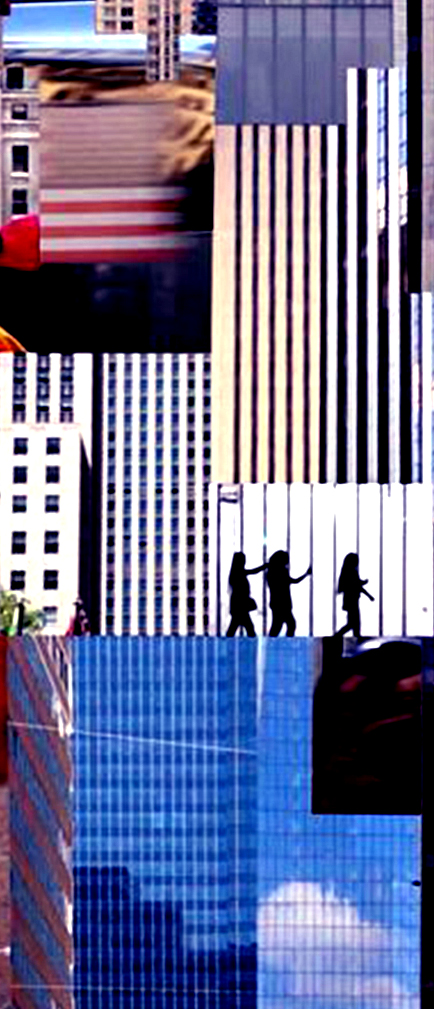
Midtown becomes a flattened, uniform construct for this play of texture, rhythm and interruptions.My installation is inspired by the concept of architectural relief (a technique where the sculpted elements remain attached but raised above the background plane). Audiences experience a gradual shift in the appearance and depth of the installation from a flat image to a three-dimensional view with protruding geometric shapes.

Clap Studio

Mist Installation
An installation designed by Clap for Minsk, Belarus, that was built by volunteers from the city itself. For the concept of this installation Clap starts from the history of Minsk, a city that during the Second World War was devastated. The bombs destroyed 80% of the buildings and the city was not rebuilt until the 1950s. That is why the population of this city remembers these times as something unpleasant and many of them prefer not to talk about it. The design studio starts from a geometric volume that represents in a conceptual way the volume of a building. They imagine that the bombs fall on him destroying it, generating new openings and brand new volumes. These new openings result ingeniously in an entrance and a viewpoint on the top. The destruction gives way to the function generates grandstands, stairs and seats. From the inside, life makes its way in the form of a tree, exceeding the height of the installation itself.

Gmunk

Telestron DTLA
Conceptually, at its foundation, the installation was an exploration of the absence and presence of light and how it defines a space. The team wanted to play with dramatic scale, and to do so they employed two Quantec KR150s as Robotic Conductors, wielding large, fabricated geometric shades to manipulate the various light sources and cast brilliant arrays of graphic shadow work throughout the space. They upgraded the show for The Row to be more immersive, adding more synchronized lighting fixtures and laser projectors around the perimeter of the space to embellish the ambient lighting states, and as a result amplified the user experience even further – creating a more sculptural and geometric installation for the masses.

superbien studio

siderea
We presented our interpretation of a gravitational anomaly, entitled Siderea, an unknown force at the outer fringes of the Universe, in the centre of the Great Attractor. Beyond anything our eyes or our minds are capable of imagining and using geometric and scientific coordinates to create a palpable world to scale, we wanted to tell a deeply immersive tale exploring the emotions that the discovery of such a stellar phenomenon might rouse. Freely inspired by the explorations and incredible advances made in astronomy, we transformed the venue into the point of observation of this extraordinary celestial body, in the literal sense of the term.

Ouchhh

H OM E OMOR PH ISM

Dome A/V Performance

A homeomorphism, also called a continuous transformation, is an equivalence relation and
one-to-one correspondence between points in two geometric figures or topological spaces
that is continuous in both directions.Many forms observed in nature can be related to geometry. In accordance with classical geometry,the shapes that found in nature are consisting of lines and planes, circles and spheres,
triangles and cones. These shapes actually are a powerful abstraction of reality, so we need primitive objects to give a form and understand the complex structure that exists in nature.


FEDERICO DIAZ

geometric death frequency 141

The title of the piece is a pun that, with irony, alludes to the exceeding of tradition, irreconcilable dichotomy between life and death in a sculpture made, provocatively, by lifeless forms“, adds Diaz. “The line between life and none-life is more fleeing than we usually think: think about a virus that attacks a complex organism and reproduces in the same way as a micro-organism, even though it’s only an agglomerated of lifeless molecules: a natural crystal that, even though is a stone, can be born and undergo a fascinated process of growth that mimes perfectly the ways of an organic life“.

ESTHER STOCKER

ЭСТЕР СТОКЕР
에스더 스토커
以斯帖施特克尔
In addition to painting on the usual canvas, Esther Stocker creates her minimal abstract work on entire rooms and structures. The Italian artist has been creating her black and white installations and wall works since 2001, which have been exhibited all over the world. Esther uses stark geometric lines to create a shaken sense of depth perception and spatial uncertainty in the eyes of the viewer, to which she simply explains: “Control is always what we do not have. This is the human condition.”

Sanja Marusic

Dutch-Croatian photographer Sanja Marušić uses an experimental approach to colour, composition, materials, and manipulations in her work to create dreamlike scenes that are at once cinematic and alienating.She travels the world in her production of these otherworldly images, finding settings and forms that play with our relation to the subconscious, simplifying the bodies of her subjects with geometric shapes, and abstracting the human form even further by incorporating stylised dance movements.Putting places above people, many of Sanja’s photographs are set in wide open futuristic spaces in an attempt to create surreal and alienating visual emotions. She often uses cool and bright colours as well as singular objects and accessories in order to create unique and enigmatic narratives.

Sanja Marusic

Moonflight
The fashion short was inspired by the symbolic abstract forms and geometric shapes of the avant- gardist Triadic ballet. Sanja Marusic simplied bodily shapes by substituting them with cylinders and circles, she made her own costumes and then abstracted the human form even further by incorporating stylised dance movements by filming herself dancing. The result is a surrealist symbiosis of the human body moving through time and space.

Ann Veronica Janssens

Bleu Red Yellow
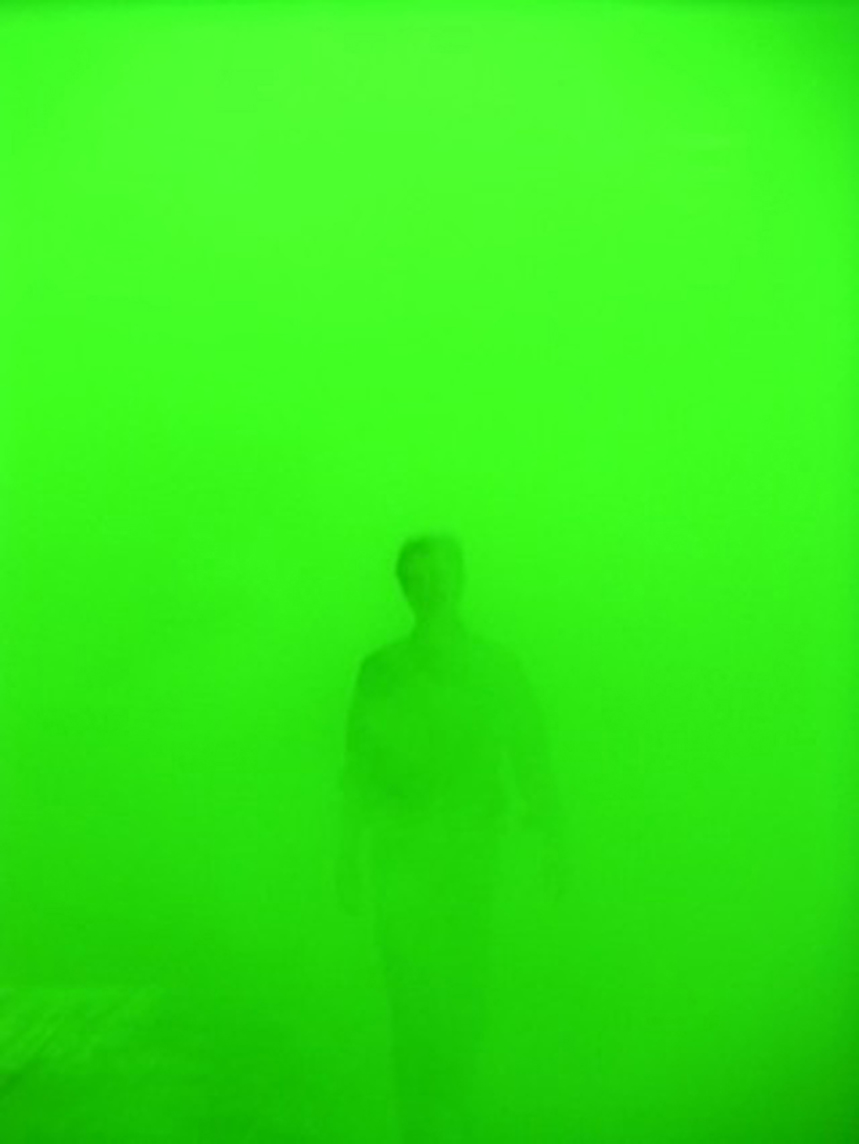
Born in 1956 in Folkstone (England), lives and works in Brussels. Photography, video, sculptures, installations. Ann Veronica Janssens stepped into the public area with her installations, which find their roots in minimalist art. She constructs rooms and sculptures with simple building materials, above all making allowance for all aspects of the light, thus appearing as ephemeral. Clear, geometric forms are a dominant feature of her sculptural work.

Raven Kwok

1194D^3
Initially started as a tweak of 115C8 in 2013, one of Kwok’s Algorithmic Creatures based on finite subdivision, 1194D is an experiment on multiple geometric creatures co-existing within a tetrahedron-based grid environment. In 2017, The project was improved and revised into an immersive triple-screen audiovisual installation as 1194D^3 for .zip Future Rhapsody art exhibition curated by Wu Juehui & Yan Yan at Today Art Museum in Beijing, China. The entire visual is programmed and generated using Processing. All stages are later composed and exported using Premiere.

Ouchhh

H OM E OMOR PH ISM
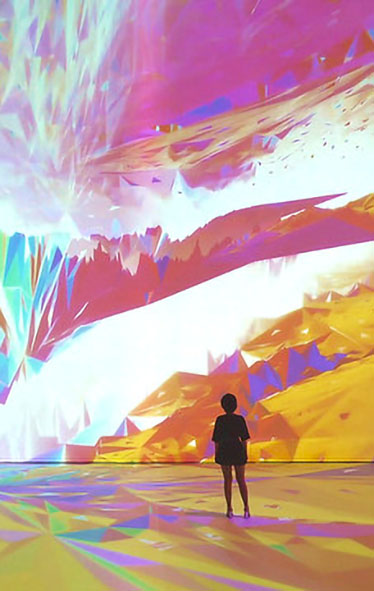
H OM E OMOR PH ISM es un proyecto dirigido y animado por Ouchhh que, mediante la técnica de proyección por mapeo sobre una cúpula, muestra una serie de transformaciones geométricas inspiradas en las formas del paisaje de Nuevo Mexico: los grandes llanos, las montañas rocosas, la meseta del Colorado y las cuencas y sierras.

Dan Flavin

Untitled (to Barnett Newman) two
Dan Flavin was an American artist and pioneer of Minimalism, best known for his seminal installations of light fixtures. His illuminated sculptures offer a rigorous formal and conceptual investigation of space and light, wherein the artist arranged commercial fluorescent bulbs into differing geometric compositions. “I like art as thought better than art as work,” he once said. “I’ve always maintained this. It’s important to me that I don’t get my hands dirty. It’s not because I’m instinctively lazy. It’s a declaration: art is thought.”

Felipe Pantone

Chromadynamica
Pantone’s work deals with dynamism, transformation, digital revolution, and themes related to the present times. Felipe Pantone evokes a spirit in his work that feels like a collision between an analog past and a digitized future, where human beings and machines will inevitably glitch alongside one another in a prism of neon gradients, geometric shapes, optical patterns, and jagged grids. Based in Spain, Pantone is a byproduct of the technological age when kids unlocked life’s mysteries through the Internet. As a result of this prolonged screen time, he explores how the displacement of the light spectrum impacts color and repetition.

Yihan LI

Since the emergence of time as a concept, the circle has been a graphic representation that registers and measures the passing of seconds, minutes, hours, and even decades. . . . The torus may be seen as a three-dimensional form utilized to represent time as it travels through a cyclic loop. The geometric shape of the torus speaks of duration, of looped time, and of transformations along and in time. In this project, Boolean operations between varying tori in multiple dimensions indicate the interaction between durations—possibly time in addition to time, or interactions diluted by time—that reveal a new architectural realm featuring free curves which direct visitors’ movements inside flowing spaces. People will lose the perception of direction or time and find themselves worshipping in open and serene volumes.

Thomas Canto

Exponential Urban symphony
Canto’s works are precise and geometric in nature, using boundary lines to delineate spaces where tension can be released. He relies on light and shadows to compose his pieces with reflective effects, sometimes layering moving images with video projector mapping over sculptures to rebirth the pieces into installation art.

Asao Tokolo

ppp-creatures-generator
Asao Tokolo studied at the AA School of Architecture in London following graduation from Tokyo Zokei University in 1992. His decorative patterns based on the concept of ‘connection’ stem from September 11, 2001, and he continues to work in fields straddling art, architecture, and design. He designs and creates simple geometric crests and patterns that can be drawn with a ruler and compass, and three dimensional forms using the same principles.

ERIK SÖDERBERG

Organic Cube
GIF
In early 2011 I was exploring the relations of geometry, nature and the human being in a series of 25 pictures that I called ”Fractal Experience”. This is part two – continuing the exploration of geometric shapes, patterns, and fractals with an added element: space-time. This time I’ve worked in 3D and produced a set of animated looping gif’s.
I’ve limited each animation to at most 48 frames, most are around 10-15 frames – to keep the file size small and to maximize the creativity with in these frames.

erik söderberg

Turbulent Flow
Gif
No início de 2011, eu estava explorando as relações da geometria, da natureza e do ser humano em uma série de 25 fotos que eu chamei de “Experiência Fractal”. Esta é a parte dois – continuando a exploração de formas geométricas, padrões e fractais com um elemento adicional: espaço-tempo. Desta vez, trabalhei em 3D e produzi um conjunto de gifs animados em loop.
Limitei cada animação a no máximo 48 quadros, a maioria tem entre 10 e 15 quadros – para manter o tamanho do arquivo pequeno e maximizar a criatividade com esses quadros.

George Vantongerloo

“Vantongerloo, who ascribes to the abstract language of form after 1917, applies himself to Abstract Art in order to get control of rules by which he develops an interest in geometrical relationships and algebraic formulas. In addition to his artistic practice, Vantongerloo also writes theoretical work about his research. Primarily after the publication of his pamphlet L’Art et son Avenir in 1924, he creates new impulses for geometric abstraction with his writings. In this way, for example, he subjects three neo-plastic works of Piet Mondriaan (1872 – 1944) to an analysis in the French publication Vouloir. In this way he opens up the way for his own ‘mathematical’ abstraction.” Sergio Servellón

TATSUO MIYAJIMA

宫岛达男
Connect with Everything

Since 1987, Tatsuo Miyajima has been constructing installations using LED digital counting devices. His works combine a performative aspect with architectonic structures, sometimes taking the shape of geometric patterns or organic shapes as well as encompassing vertical and horizontal surfaces. The LED devices count progressively from 1 to 9 or backwards – Miyajima never employs 0 – establishing a rhythm as definitive as repetition itself and the inexorable passing of time.

PAUL ROBERTSON

Paul Robertson is an Australian animator and digital artist who is known for his pixel art used in short films and video games. He is mostly known for Scott Pilgrim Vs. the World: The Game and the recent release, Mercenary Kings.
His interest in inserting flashing neon colors, geometric shapes, Japanese character animation, and 1990′s computer imagery, deems his work as heavily influenced by the Seapunk/Vaporwave aesthetic.
gif

Stefan Bassing

Spacestream
The project uses generative computational strategies to generate series of special stream paths within 3D space frame, giving it structural stiffness and aesthetic values. The generative algorithm is based on use of multi-agent systems, shortest path calculation, lattice stigmergy and structural analysis. The goal is to create continuously thickened bundle paths within the fuzzy 3D space frame structure, where the bundles double as camouflage and reinforcement for the joints/seams between the welded components, allowing for fabrication of large scale structures, mediating between the discreet components and continuous system.Space Stream is a student project which aims to explore influence of rule-based design systems on low-tech fabrication technique of welding. The research concentrates on wireframe structures, which are strengthened through subdivision of basic geometrical units and bundling and reinforcing of the main structural strands. The custom software used for this project is centered on Dijkstra’s shortest path algorithm in combination with agent-based modeling techniques.

Rejina Pyo

Rejina Pyo is an award winning Korean born fashion designer based in London. Having completed her Central St. Martin’s MA in 2011, Rejina went on to win the prestigious Han Nefkens Fashion award, before establishing her internationally stocked eponymous label in 2013. Rejina Pyo is known for its astute cutting, exploration of geometric shapes and fusing relaxed proportions with fresh and quirky colour combinations, evoking a paired back confidence.

mandelbrot set

mandelbrot set (zooming in)

The Mandelbrot set shows more intricate detail the closer one looks or magnifies the image, usually called “zooming in”. The following example of an image sequence zooming to a selected c value gives an impression of the infinite richness of different geometrical structures and explains some of their typical rules. The magnification of the last image relative to the first one is about 1010 to 1. Relating to an ordinary monitor, it represents a section of a Mandelbrot set with a diameter of 4 million kilometers. Its border would show an astronomical number of different fractal structures.

Frederick Kiesler

Kiesler’s longest-running project was Endless House, a single-family dwelling whose biomorphic form and lack of corners strongly contrasted with the hard geometric edges that defined most modern architecture of the time. He sought to design a structure responsive to the occupants’ functional and spiritual requirements. He developed his ideas for the house over several decades, creating numerous sketches and models. Although plans were made to build a to-scale model in MoMA’s Sculpture Garden in 1958, they did not materialize, and the project remains unrealized. Nonetheless, Kiesler’s Endless House concept was highly influential and stands as a strong expression of his bold statement: “Form does not follow function. Function follows vision. Vision follows reality.”

video

MICHAEL CLARK COMPANY

マイケル·クラーク·カンパニー
Tate Project Part I ]

The choreography rehearsed and performed in 2010 paired the rigour of classical steps with contemporary movement, a juxtaposition that paralleled Clark’s training as a ballet dancer at the Royal Ballet, and his later anti-hierarchical, anti-authoritarian choreographic experiments. Balletic poses, jumps and steps were isolated from traditional narrative sequences and made strange through repetition. The graceful leaps and turns of the trained dancers seemed awkward and uneven, just as they were often out of sync and oriented in different directions. This choreography paralleled the performance space, which was demarcated by geometric and striped floor mats designed by Charles Atlas, which resembled the large windows at the back of the hall and the black beams that extend vertically from floor to ceiling.

XEX

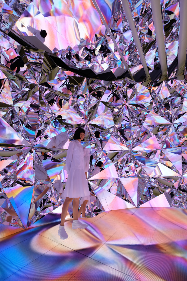
Prismverse
Hong-kong based design studio, XEX, presents ‘prismverse’, an interactive diamond-themed installation in shanghai. The installation was completed for american skincare brand, Dr. jart+, to serve as an experiential pavilion for their ‘instant V7 toning light’ at raffles city mall. The immersive installation is inspired by light rays traveling through a diamond. With a 10 meter-long LED floor and the complex geometrical tessellated mirror wall, the highly illuminated interior becomes a metaphor for the instant tone-up effect of the skin product.

Sydney Sie

Сидни Си
Gradient Colors and Female Forms

Sydney Sie es una diseñadora gráfica y fotógrafa originaria de Taiwan. Aunque también ilustra y anima, lo que más me llamó la atención de su portafolio fueron sus fotografías, pues están llenas de gradientes de colores pasteles que les dan un toque ultra femenino (sin estar lleno de glitter y corazoncitos), y que a la vez están cargadas de misterio y surrealismo. Crea atmósferas e ilusiones ópticas mediante espejos y figuras geométricas que cortan y hacen contraste con las figuras suaves y femeninas.

REJINA PYO

Rejina Pyo is an award winning Korean born fashion designer based in London. Having completed her Central St. Martin’s MA in 2011, Rejina went on to win the prestigious Han Nefkens Fashion award, before establishing her internationally stocked eponymous label in 2013. Rejina Pyo is known for its astute cutting, exploration of geometric shapes and fusing relaxed proportions with fresh and quirky colour combinations, evoking a paired back confidence.

michael maltzan

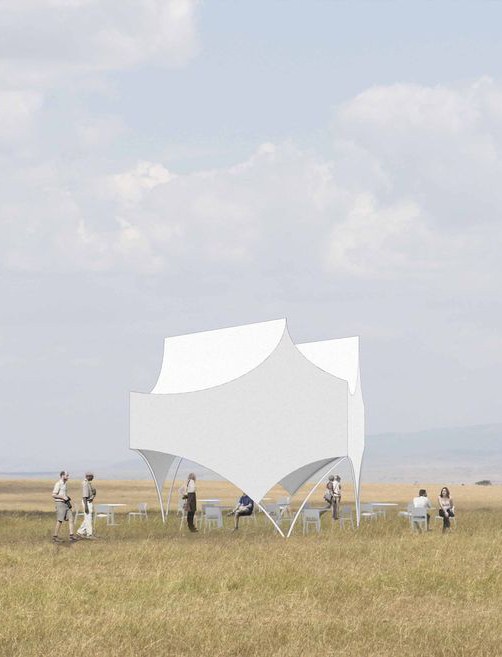
Bettina pavilion
The Bettina is a limited-edition architectural pavilion designed for REVOLUTION that debuted at Design Miami in 2015. It is simple in silhouette yet also a complex three-dimensional form. Recalling the iconic style and pyramidal form of the classic white tent, the contemporary pavilion is simultaneously geometrically taut and sensually draped across the structural frame. Each profile peak is extruded diagonally making a roof of two ridges that appear different from every angle.

Ljiljana Majkić

Cinque Terre

Ljiljana Majkic from Sarajevo is presenting her collection for winter 2011-2012. Collection was named CINQUE TERRE like the Mediterranean coastal town which has inspired her to create this collection as it is a place of unique beauty and architecture with warm coloured, simple geometric facades.This collection has simple, sculptural form, poetic spirit and eclectic character and it was created with a same passion and commitment as the previous one. Her search for new, original design and new shapes has resulted in a series of sensual models.Overall visual experience of her models is the desire to create something that will last longer than one season, so creating for Ljiljana is not only following the trend, or restrict what the trend is set as a rule. Her fashion is characterised by the expression of eclectic styles, and free artistic and creative expression.

Ballet Preljocaj

AND THEN, ONE THOUSAND YEARS OF PEACE
And Then, One Thousand Years of Peace is a huge, ambitious monolith of a work. First created by Angelin Preljocaj for the Bolshoi Ballet in 2010, it takes inspiration from the vision of apocalypse conjured by St John in the biblical Book of Revelation.There are no horses galloping across the stage or horned beasts. But Preljocaj sets himself a barely less daunting task: choreographing the essential meaning of apocalypse, as a cataclysm so profound it lays bare the very essence and history of human nature.Preljocaj launches his work with a shattering opening sequence. Ten women drive through hard, slicing, geometric formations; lights flash, electro-percussive music reverberates; and the air becomes as thick and swarming as a tropical thunderstorm as the movement accelerates towards its convulsive climax.Out of this intensity emerges a Garden of Eden tranquillity, where men lope and flutter in delicately animalistic moves, and two women in white tunics play like lazy cherubs.