highlike

Lebbeus Woods

The Light Pavilion
The Light Pavilion by Lebbeus Woods in collaboration with Christoph a. Kumpusch, in the Raffles City complex in Chengdu, China, by Steven Holl Architects.
.
The Light Pavilion is designed to be an experimental space, one that gives us the opportunity to experience a type of space we haven’t experienced before. Whether it will be a pleasant or unpleasant experience; exciting or dull; uplifting or frightening; inspiring or depressing; worthwhile or a waste of time, it is not determined by the fulfillment of our familiar expectations, never having encountered such a space before. We shall simply have to go into the space and pass through it. That is the most crucial aspect of its experimental nature, and we – its transient inhabitants – are experimentalists.Lebbeus Woods and Christoph a. Kumpusch

Xu Zhen

徐震
Eternity

Xu Zhen is one of the most interesting and promising artists working in China today. An irreverent artist with a voracious appetite for global information and a unique ability to produce work across multiple platforms and media.Xu Zhen is a conceptual artist whose work often takes the form of provocative sculptures, installations and interventions that confront sociopolitical taboos in contemporary China and freely manipulate western expectations of Chinese art and commerce.

Kohei Nawa

Biomatrix
“Biomatrix” is an installation of endles scycles of eruptive cell bubbles emerging on the surface of liquid silicone oil. This circulation of the colored liquid evokes the behaviour of magma or blood, and due to the high viscosity of silicon oil, illustrates the movement of the material at a speed deceptively slower than the viewer’s expectation. The electrically controlled pool becomes an interface that amplifies visual impact, and infinitely produces cell patterns. An orderly grid formation appears as a digital matrix, while closer observation reveals irregularities such as sporadic and simultaneous effervescence and plosive sounds breaking the surface tension.

United Visual Artists

ユナイテッド·ビジュアルアーティスト
美国视觉艺术家
our time

Our Time (2016) is the latest large-scale installation by United Visual Artists investigating our subjective experience of the passing of time. How long is a moment? At what rate does time actually pass? The work joins a series of kinetic sculptures that began with Momentum (2013); an installation designed as a ‘spatial instrument’ that was to reveal the relationship between expectation and perception when intersected with a physical space.
Our Time defines a physical environment where pendulums swing at a pace apparently unhindered by the laws of nature and where no single time measurement applies. The installation combines movement, light and sound as a multi-sensory, multi-dimensional canvas the visitor can enter. Pendulums swing, each to their own rhythm, as time flows through the grid. With light tracing the path and sound its echo, the passing of time becomes almost palpable.

David Colombini

Attachment
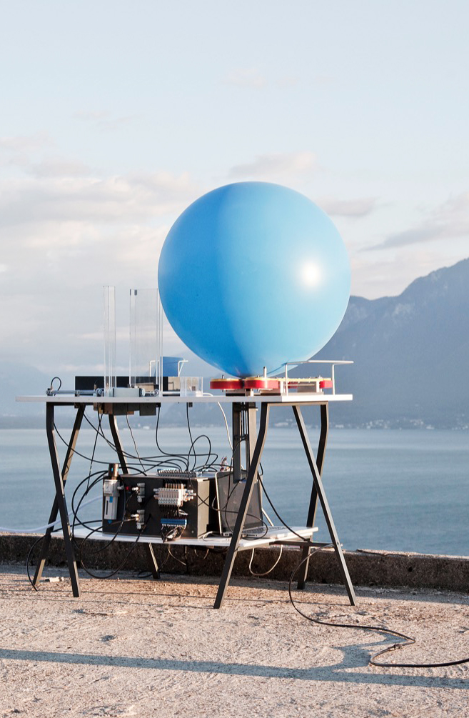
This poetic machine prints your message and a code on a sheet A6, slips it into a biopolymer cylinder attached to a balloon, which is finally released into the air. Then, the balloon will travel haphazardly to a potential recipient.
Where did the idea come from? The basic idea was to take a stand against the current use of «smart» technologies by creating a poetic concept, using current technology that allows us to communicate differently and rediscover expectation, the random, and the unexpected.
For the record, I have always been attracted by what is in the air and remember having won a balloon release contest when I was about ten years old. My balloon flew from Switzerland to Austria, this definitely left an impression on me and perhaps influenced the idea of this project.

Thomas Heatherwick

Seed Cathedral
shanghai world expo uk pavilion
The cathedral‘s architecture was an elaboration of Heatherwick’s 2003 work of the Sitooterie II in Essex, United Kingdom. The initial design strategy for the UK Pavilion established three aims to meet the Foreign Commonwealth Office’s key expectation that the pavilion should become one of the five most popular attractions at the Expo, but built using half the budget of other Western nations. The first aim was to design a pavilion whose architecture was a direct manifestation of what it was exhibiting. The second idea was to ensure a significant area of open public space around it so visitors could relax and choose either to enter the pavilion building, or see it clearly from a calm, non-queuing vantage point. And thirdly, it would be unique among the hundreds of other competing pavilions, events and programmes.

Richard Quinn

Fall 2018
Even though he was only given a few days’ notice of the royal’s attendance, Quinn lived up to the expectations. He maintained his focused vision, shining the spotlight on his impressive printwork and flair for standout, dramatic silhouettes. An array of abstracted floral prints — all created in-house at the designer’s print studio in Peckham — were mashed up on loose halterneck dresses, delicately pleated chiffon skirts and oversize bomber jackets, to create a visual feast of color and pattern.

Amy Stephens

Against expectations
Amy Stephens’ work is fundamentally sculptural in both its form and content, taking for its starting point the tactile and expressive qualities of a range of materials. Contrasting the angularity of wood and metal with the soft tactility of fabric and flock, her assemblages occupy a space between the abstract and the associative, and between seduction and control.

WERNER REITERER

Werner Reiterer’s works walk a fine line between sense and nonsense, exploiting art’s close proximity to life as a means of challenging literal descriptions of reality. In a manner that blurs the boundaries of art and humor, his richly engaging sculptures ask us to participate in their realization while his drawings disturb our expectations of the ordinary in imaginings of absurd proportion. And by scrambling the relationship of images and language he is able to turn our perceptions upside down and, in ways that are both entertaining and illuminating, reassert the power of art to change our lives.

Werner Reiterer

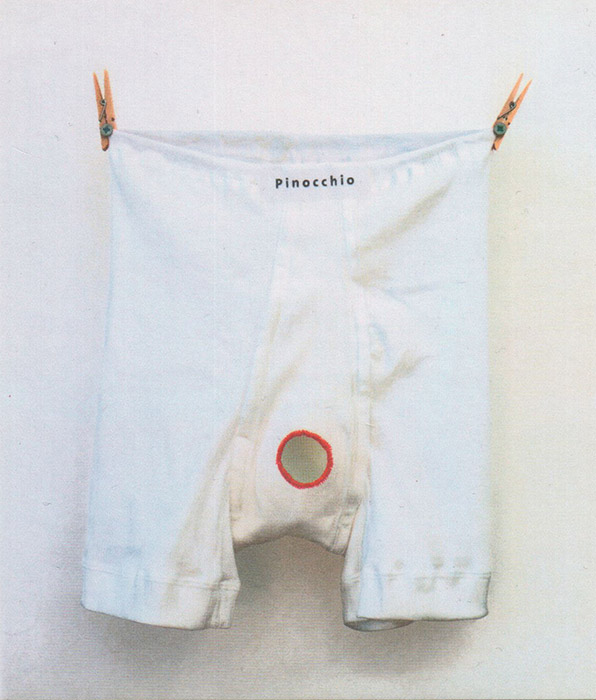
The Mask of Pinocchio/Underpants with a hole
Werner Reiterer’s works walk a fine line between sense and nonsense, exploiting art’s close proximity to life as a means of challenging literal descriptions of reality. In a manner that blurs the boundaries of art and humor, his richly engaging sculptures ask us to participate in their realization while his drawings disturb our expectations of the ordinary in imaginings of absurd proportion. And by scrambling the relationship of images and language he is able to turn our perceptions upside down and, in ways that are both entertaining and illuminating, reassert the power of art to change our lives.

Jason Yi

terraform 01

“A sense of location within one’s physical space, culture and history plays a crucial role in the creation of my work. While images and ideas often begin with the landscape, I am also drawn to the incorporation of non-art materials (e.g., foam, packing peanuts, bubble wrap and PVC tubes) and the juxtaposition of ambiguous imagery, deliberately subverting viewer’s visual expectations. My work invokes the paradoxical notion of “harmonious conflict” where compositional/conceptual relationship of materials and images are questioned and yet valued.”

Tim Coe

Perfect face
FILE FESTIVAL

The viewer is confronted with a face on the screen that is constantly, almost imperceptibly changing. The perfect hair and make-up give rise to the expectation of a beautiful model, but this is not always fulfilled. The starting point is super-model Claudia Schiffer, however, the facial features are in a state of flux, ‘mutating’ every few seconds to a new configuration. Our reaction to the face changes accordingly between attraction and repulsion. Beauty has long established itself as a commodity that can be sold and bought. ‘A PERFECT FACE’ constantly tests and challenges our idea of what beauty is.

Heidi Kumao

Protest

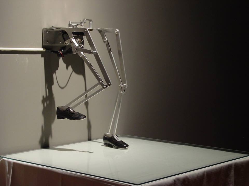
“Protest” is from the project, “Misbehaving: Media Machines Act Out”(2002-2007), a series of mechanical girls’ legs, each with their own prescribed and programmed behavior. In each tableau, an electronically controlled, mechanical being protests with a voice of erratic physical gestures and projected video imagery. As a combination of robotics and performance, they represent girls who disobey or resist expectations. Unlike machines designed for perfect job performance, these machines will declare their fallibility, impatience, approval, and disapproval through small gestural acts. In these tableaus of protest and transformation, the machine is spirited, emotional, thoughtful, and irregular. “Protest” consists of aluminum, mechanized pairs of 6 year-old girl’s legs fitted with shoes and standing on a table top. An electronic circuit and proximity sensors make her responsive to the presence of viewers for whom she stomps loudly and erratically

ANDREW LYMAN

Alone Together

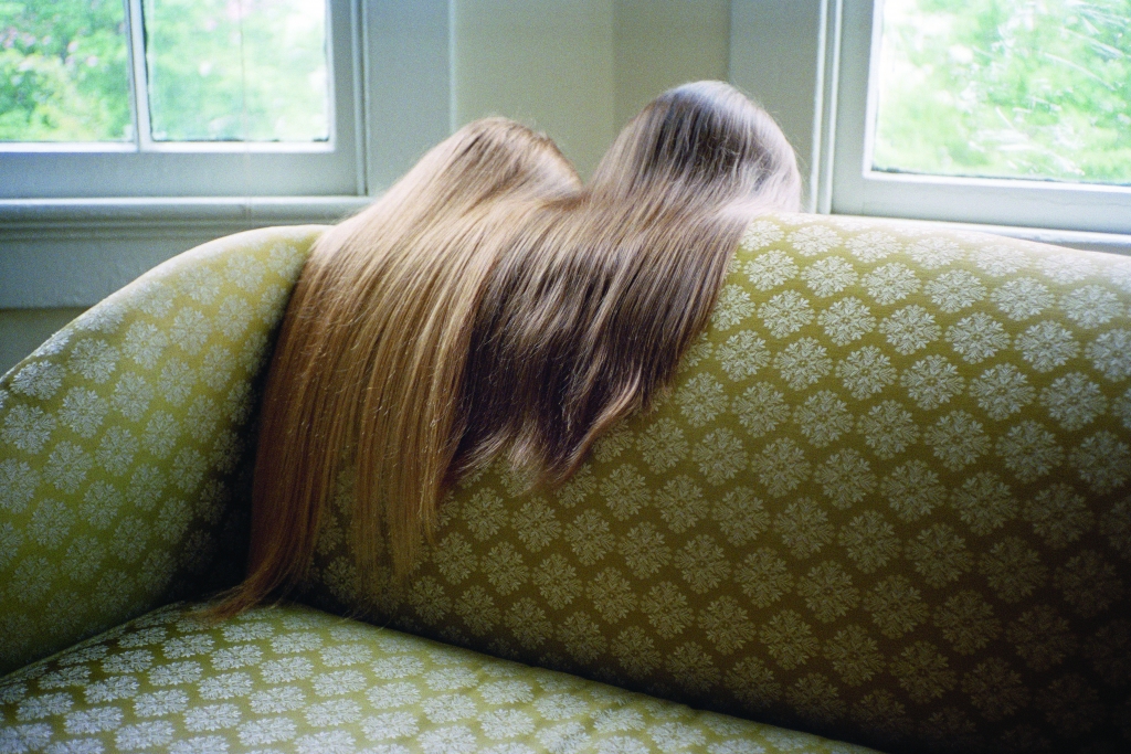
The phrase Alone Together describes a nature of personal relationships and relating to one another that I have found to be characteristic of an experience the generation I am a part of encounters, if not others as well. The phrase in context of communication calls upon the experience and realization that your mental state is completely unique and solitary. There is a push to connect with others as well as to find someone to spend your life with, and along with this push comes the expectation of a complete and total togetherness. There is an eventual point of realization and discovery of your own mental state and its perpetual solitude, transcending physical closeness with others. The photographs in the series evoke contemplation of this experience, through imagery of the mundane, capturing a quiet departure into a somewhat bizarre disconsolate self-investigation. The photographs play with the association of Alone Together to intimacy and love, with an alternate interpretation or redefinition according to newfound phenomenon.

OLAFUR ELIASSON

オラファー·エリアソン
اولافور الياسون
奥拉维尔·埃利亚松
אולאפור אליאסון
Олафур Элиассон
Your mobile expectations: BMW H2R project
2007

Joon Y. Moon

Augmented Shadow
File Festival

Augmented Shadow is a design experiment producing an artificial shadow effect through the use of tangible objects, blocks, on a displayable tabletop interface. Its goal is to offer a new type of user-experience. The project plays on the fact that shadows present distorted silhouettes depending on the light. Augmented Shadows take the distortion effect into the realm of fantasy. Shadows display below the objects according to the physics of the real world. However, the shadows themselves transform the objects into houses, occupied by shadow creatures. By moving the blocks around the table the user sets off series of reactions within this new fantasy ecosystem. In this installation, the shadows exist both in a real and a virtual environment simultaneously. It thus brings augmented reality to the tabletop by way of a tangible interface. The shadow is an interface metaphor connecting the virtual world and users. Second, the unexpected user experience results from manipulating the users’ visual perceptions, expectations, and imagination to inspire re-perception and new understanding. Therefore, users can play with the shadows lying on the boundary between the real, virtual, and fantasy. Augmented Shadow utilizes this unique interface metaphor for interactive storytelling. Maximizing the magical amusement of AR, it is embedding an ecosystem where imaginary objects and organic beings co-exist while each of them influences on each other’s life-cycle, even though it is not in use by users. Light and shadow play critical roles in this world’s functions causing chain reactions between virtual people, trees, birds, and houses. A set of tangible blocks allows users to participate in the ecosystem. Users can influence on the system by playing with the blocks or observe the changes of the shadows as if kids were playing with an ant farm.

CHRIS SUGRUE

delicate boundarie

This interactive installation imagines that the worlds inside our digital devices can move into the physical world. Small bugs made of light crawl out of a computer screen onto the human bodies that make contact with them, often surprising their audience as they try to abandon a virtual existence. The magic of the illusion takes shape as the audience lets them explore their bodies, crawling from one person to the next in a strangely intimate way. As digital technologies have become embedded in everyday life, the line between the virtual and real is increasingly blurred. Delicate Boundaries playfully explores our expectations and understanding of interfaces and interactivity.