highlike

PHILIP GLASS

فيليب الزجاج
菲利普·格拉斯
פיליפ גלאס
フィリップ·グラス
필립 글래스
Филип Гласс
Einstein On The Beach

ROBERT WILSON
Portrait Trilogy:Einstein; Akhnaten; Gandhi

.
Einstein on the Beach is an opera in four acts (framed and connected by five “knee plays” or intermezzos), scored by Philip Glass and directed by theatrical producer Robert Wilson. The opera eschews traditional narrative in favor of a formalist approach based on structured spaces laid out by Wilson in a series of storyboards. The music was written “in the spring, summer and fall of 1975.”Glass recounts the collaborative process: “I put [Wilson’s notebook of sketches] on the piano and composed each section like a portrait of the drawing before me. The score was begun in the spring of 1975 and completed by the following November, and those drawings were before me all the time.”
full opera
ABSALON

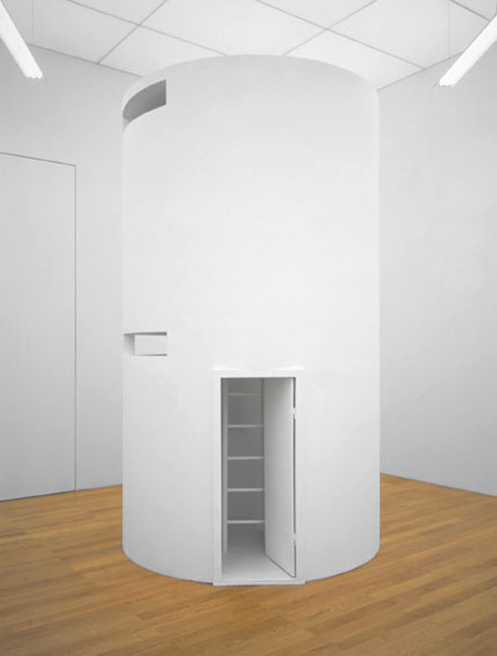
cellule No. 5
Absalon’s best known works, the Cellules, rewrite Cezanne’s “treat nature as the cylinder, the sphere and the cone” to read “treat architecture as the cell, the bunker and the turret.” Not that the Cellules are straightforwardly architecture: they equally evoke Minimalist sculpture, Matt Mullican’s maquettes, Kurt Schwitters’ Merzbauen and the Concrete sculptures of George Vantongerloo. But the model that the Cellules most overtly evoke is the monastic cell. The Cellules were fabricated in wood, cardboard and plaster, and painted entirely white; their average proportions are roughly those of a caravan, and the catalogue informs us that there is always an area in which one can stand up. Their interiors are fitted–fitted rather than furnished–with unobtrusive minimal representations of desks, seats, beds, etc.

Thomas Hirschhorn

توماس هيرشهورن
托马斯·赫塞豪恩
תומס הירשהורן
トーマス·ヒルシュホルン
abschlag

Thomas Hirschhorn’s “Abschlag” installation, which occupies the first room on the main floor, offers a lesson in how not to engage with the Russian milieu: the Swiss artist constructed part of a typical Petersburg apartment block out of cardboard inside the full-height space, ripped off its façade, and deposited the refuse at its base, revealing shabby interiors lined with original avant-garde masterpieces (on loan from the nearby Russian Museum) by the likes of Malevich and El Lissitky. The references allude to a politically radical Russian past; the construction debris acts as a metaphor for history. Though Hirschhorn suggests a recovery of the revolutionary communist spirit of the 1920s, he falls prey to a historically revisionist fetish: citing the Russian avant-garde as a generative point for vanguard culture in the West, and offering it as a source for renewed progressivism in Russia. Hirschhorn seems woefully unaware of the Putin government’s branding campaign, one that aims to sell the Russian avant-guard as a nationalist movement in line with the regime’s own values (perhaps he didn’t watch the Sochi opening ceremony). Hirschhorn ultimately proves Zhilayev right — with its political pretenses, “Abschlag” aspires to make a grand gesture against conservatism, but fails because its critique has already been co-opted..
.

Kengo Kuma

Botanical Pavilion
To realize the ‘Botanical Pavilion’, Kengo Kuma worked alongside Geoff Nees — a melbourne-based artist and curator who has also worked on a number of architectural pavilions. Made in the japanese tradition of wooden architecture, where pieces interlock, held by tension and gravity, the structure at the NGV triennial features a tessellated interior lined with timber collected from trees felled or removed over several years at Melbourne’s royal botanic gardens. Some of the trees used within the architecture pre-date european settlement, while others signal the development of the gardens as a site of scientific research and botanical classification. Prioritizing natural phenomena over scientific order, the botanical species used are color-coded, rather than following any taxonomic order. this approach offers a statement by the designers against the reductive nature of science during the colonial era — a mindset at odds with many indigenous cultural beliefs and knowledge systems.

NILS VÖLKER

Two Hundred and Seventy
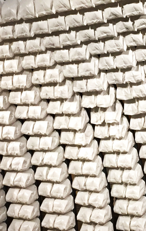
Through the combination of an everyday material with precise technology the mixed media installation fills the whole columned hall from the 19th century with its fluid movement and peculiar sound. Concavely arranged and floating above the spectators heads the form of the artwork seems to pass the skylight like the sun’s rays. Subdivided into nine columns, the nearly 70 square metres large piece of art follows a site-specific choreography determined by a program. Its moving surface is made from 270 white garbage bags, being inflated and deflated. In this way shapes and the boundaries of the installation itself start to dissolve. “Two Hundred and Seventy“ is the first installation with an undisguised view behind the scenes and onto the origin of the wavelike and organic movement: 1080 fans, lots of cables and 45 circuit boards

Andrew Schneider

YOUARENOWHERE
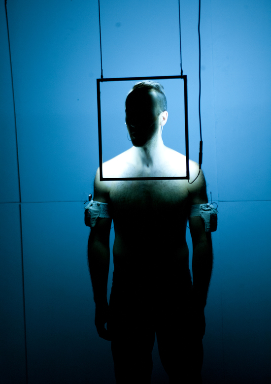
Conjuring a futuristic sort of shamanism, Andrew Schneider’s YOUARENOWHERE experiments with the virtues of sensory overload via quantum mechanics, parallel universes, and the “Missed Connections” board on Craigslist. Battling glitchy transmissions, crackling microphones, and lighting instruments falling from the sky, one guy on a mission and a tricked-out interactive new-media landscape merge to transform physical space, warp linear time, and short-circuit preconceived notions of what it means to be here now.

Tokujin Yoshioka

吉冈德仁
吉岡徳仁
transparent mannequins

Considered ‘grid bodies’, or the ‘transparent body installation’ yoshioka has specially conceived these figures to highlight issey miyake’s garments. in room A, one finds the 1970s collections of miyake dressing figures composed out of 365 laser cut cardboard parts, arranged as a grid structure to create a futuristic human body. they are adorned by pieces that investigate miyake’s constant innovation in fabric-making, and his deep respect for tradition.

Ricardo Barreto and Maria Hsu Rocha

Martela
FILE FESTIVAL
Tactila is an art form whose medium is the sense of touch (tact) which is independent from the all the other ones and has its own intelligence, imagination, memory, perception, and sensation. It is well known that vision and sound have hegemony in arts and in other disciplines. Tactila takes place in time and, therefore, can be recorded and have various forms of notation for subsequent executions. That is why its development became possible only now, thanks to mechatronic and robotic systems which are compatible with machine languages.
The creation of tactile works involves a (tact) composition, which can be made through handmade notation and played on a keyboard or directly on the computer of the tactile machine ( robot ).
Tactile machines can present numerous tactile possibilities through points, vectors, and textures with varying rhythms and intensities, and be run in different extensions and locations of our body.

.

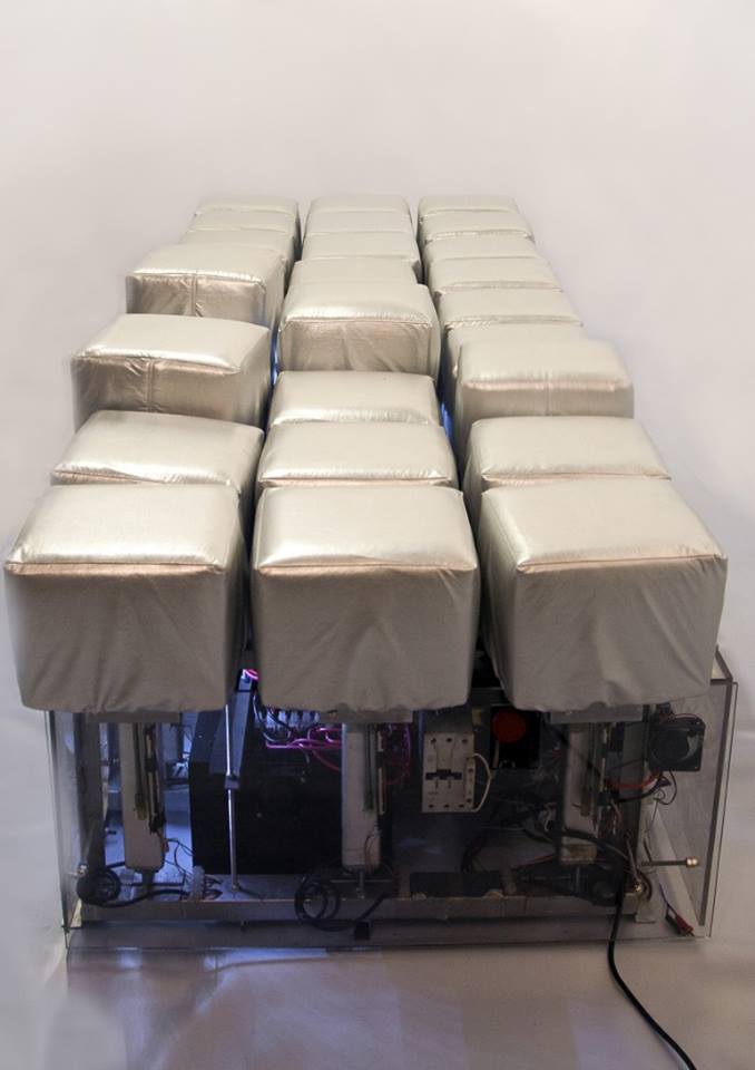
The first tactile machine is called “Martela”. It is a tactile robot comprised of 27 engines subdivided into three squares (3 x 3), i.e., each square has 9 engines. Each engine corresponds to a matrix point, so we have 27 tactile units that allow to touch the user’s body with various intensities.

PAKUI HARDWARE

Shapeshifter Heartbreaker

Shapeshifter, Heartbreaker, is an installation on two levels composed of sculptural work and 3D computer animations that are both abstract and figurative. On the first level Pakui Hardware has designed an office desk using the typical components of a trading floor. However, this is not a work station for individuals; it is for computer aided trading, non-human activities which are approximated in the three channel videos atop desks noticeably lacking keyboards and mice. These activities often occur at an exceedingly fast pace, in the blink of an eye, an expression that lends its name to a video installed on the second floor. There, the blinks of a humanoid form have been accelerated to illustrate how fast the body would have to consciously react if it were operating at the speed of decision making that resulted in the stock market’s ‘flash crash’ of 2010.

Heather Phillipson

100% Other Fibres
Through collisions of image, noise, objects, language and bodies, Heather Phillipson’s videos and sculptural installations behave as places, musical scores, poems and nervous systems – attending to how physical and affective ‘selves’ are constructed, manipulated and, above all, escape. Often rendered as walk-in conglomerations of readily accessible materials (digital images, paint, cardboard, words, audio loops and reproducible consumer detritus), her works stake out an ambiguous territory in which cultural references and emotional responses are mutually contingent and reactive. Collapsing distinctions between the forthright and the inarticulable, the banal and the ecstatic, and between metaphor and extreme literalisation, Phillipson’s work performs constant tonal shifts, disruptions and bleeds. In so doing, it oscillates between physical intimacies and conceptual distances – desire, sensuality, touching and being touched, shame, anxiety, (over-)exposure, resistant surfaces.

pakui hardware

Shapeshifter, Heartbreaker

Shapeshifter, Heartbreaker, is an installation on two levels composed of sculptural work and 3D computer animations that are both abstract and figurative. On the first level Pakui Hardware has designed an office desk using the typical components of a trading floor. However, this is not a work station for individuals; it is for computer aided trading, non-human activities which are approximated in the three channel videos atop desks noticeably lacking keyboards and mice. These activities often occur at an exceedingly fast pace, in the blink of an eye, an expression that lends its name to a video installed on the second floor. There, the blinks of a humanoid form have been accelerated to illustrate how fast the body would have to consciously react if it were operating at the speed of decision making that resulted in the stock market’s ‘flash crash’ of 2010.
.

Tobias Putrih

Re-projection: Hoosac

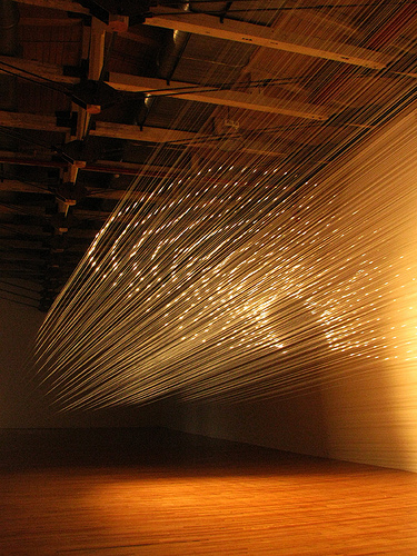
Influenced by the utopian projects — and notable failures — of innovative artists and designers such as Buckminster Fuller, Frederick Kiesler, and Charles Eames, Tobias Putrih likens his works to experiments, or design prototypes. His use of cheap materials, including egg crates, cardboard, and plywood signify both a sense of potential and impending collapse. Many of the artist’s works reference the architecture and spectacle of the cinema: a space suspended between fantasy and reality, image and environment. With Re-projection: Hoosac Putrih distills the cinema to its most basic element: fishing line stretched across the gallery mimics the conical trajectory of a beam of light. A spotlight hits the strands of monofilament which in turn become a screen, reflecting an image in illuminated dots. Inspired by the Hoosac Tunnel just east of North Adams — a storied, engineering marvel that draws ghost-hunters to the area — Putrih’s tunnel is, likewise, both real and a representation, an optical trick that invites both wonder and investigation.

BITCRAZE

Crazyflie
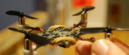
The Crazyflie quadcopter was started late 2009 as a competence development project in the Swedish consulting company Epsilon AB in which all three of us where employed. This project was done on our free-time with component cost handled by Epsilon. In 2010 we finally decided to send to a video of the Crazyflie to Hackaday.com and that’s when things really took off. More development was done and we decided to make a Crazyflie kit that could be manufactured and sold as an open source development platform. To finance the development and manufacturing of the kit we created Bitcraze AB. At this point we felt that the project had outgrown the Daedalus Projects and decided to launch Bitcraze.se. The Daedalus projects website still exists to show off and advertise other Epsilon competence development project but the Crazyflie now lives in Bitcraze.Crazyflie is a small quadcopter that stated with a simple idea: get an electronic board to fly. We are three electronic engineer from Sweden and we wanted to make a small flying machine that could fly indoor (Sweden is often cold outside ) and with as few mechanical parts as possible. The result of this idea was a small quadcopter that uses its electronic board as main mechanical frame and with motors glued to the PCB:This fist prototype was as simple as possible while following our initial target to be small with the minimum of mechanical thought. After a couple of month of programming and debugging it actually flew and had some success when Hackaday featured it. This prototype was however a lot more frustrating to fly then it appears: each crash was potentially fatal for one or many motors. That made it quite stressful to fly as it would not allow mistake and we eventually broke all 3 prototypes (the red board is the 2.4GHz radio and was also a weak point).