highlike

OSKAR SCHLEMMER

أوسكار شليمر
奥斯卡·施莱默
אוסקר שלמר
オスカー·シュレンマー
오스카 슐 렘머
Оскар Шлеммер
Triadic Ballet
1-Margarete Hastings, Franz Schömbs, Georg Verden
1970
2-Super 16mm colour film, directed by Helmut Ammann.
Oskar Schlemmer saw the human body as a new artistic medium. He saw ballet and pantomimes as being free from the historical baggage of theater and opera and, therefore, capable of presenting his ideas of choreographed geometry, the man as a dancer, transformed by his costumes, moving in space. He saw the puppet and puppet movement as superior to that of the human, as this emphasized that the average of all art is artificial. This device could be expressed through stylized movements and the abstraction of the human body. Schlemmer saw the modern world being guided by two main currents, the mechanized (man as a machine and body as a mechanism) and the primordial impulse (the depths of creative urgency). He claimed that choreographed geometry offered a synthesis; the Dionysian and emotional origins of dance become rigid and Apollonian in its final form.
3-Bayerisches Junior Ballet München
Peter Macapia

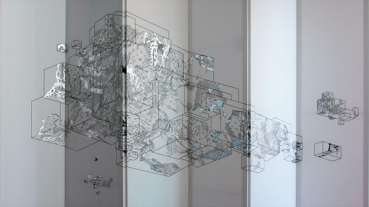
Dirty Geometry:Cloud
Dirty Geometry: Cloud is a six-panel folded screen generated using algorithmic computation with random variables. Between the drawing and the surface lies an infra-thin space perpetually reconstituted; one hue replaces another as the light shifts outside; becoming more intense, now

kenneth snelson

Needle Tower
“Inspired by architect Buckminster Fuller’s interest in the geometry of structure, Snelson’s experiments led to a prototype for a “floating compression structure.” Fuller subsequently credited Snelson with having invented a new structural principle which the architect named tensegrity, a contraction of the words tension and integrity.
These investigations into the physical properties of structure became more fully realized as an art form beginning in the 1950s. Snelson created sculptures consisting of tubes and cables. Cylinders of steel seemingly dance through space in defiance of gravity, yet it is the structural competition between tension and compression which underlies their construction. Snelson finds beauty in bringing these forces of nature into balance: the rigid compression tubes pushing outward, the flexible tension cables pulling inward. His sculptures would maintain their structural integrity beyond gravity, in the vacuum of outer space.” Joelle Burrows

404.zero

7.0
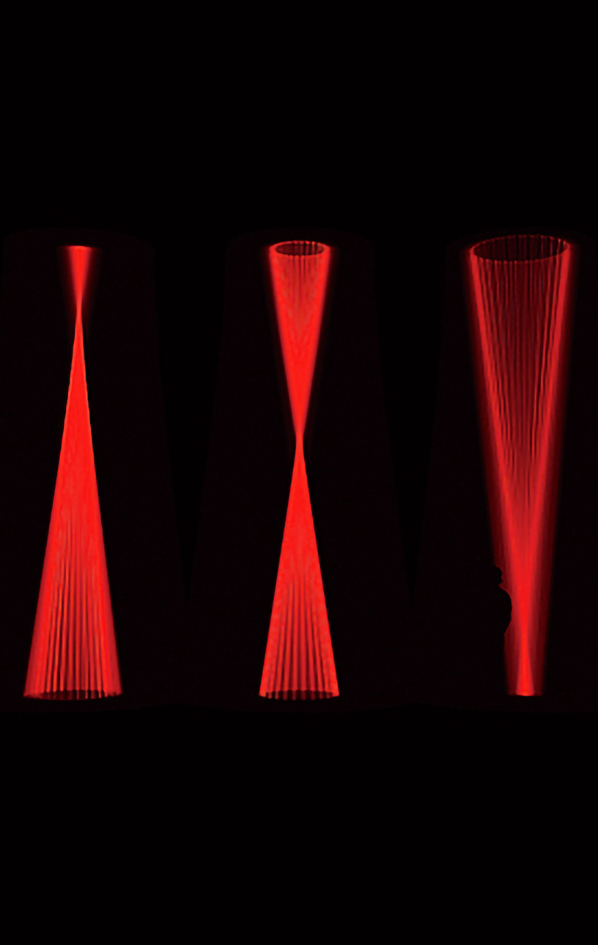
Audio visual installation with sound and seven spinning motorized laser mounted on rotating bars. As the bars spin, the straight-line laser beams spread into a cylinder and cone-shaped sculptures. The inclination and position of the laser changes the geometry.

Maya Alam

Interference Fit Canyon
“by Maya Alam uses an entropic drawing process to capture the coalescence of solid and fluid states of matter within a single object. The drawing is comprised of contours that delineate a cube with hard edges that appear to be soft from particular vantage points and soft edges that appear to be hard from others. These contours are mapped back onto the cube geometry in a transitional process whereby the legibility of the cube becomes progressively more inscrutable. The drawing process parallels the effects created by the presence of a cubic object within the L.A. River that disrupts the flow of water and accentuates the presence of detritus. A process of continual erosion acts differentially on the object over time, transforming its appearance and performance in relation to water flow”. Marcelyn Gow

Ouchhh

H OM E OMOR PH ISM

Dome A/V Performance

A homeomorphism, also called a continuous transformation, is an equivalence relation and
one-to-one correspondence between points in two geometric figures or topological spaces
that is continuous in both directions.Many forms observed in nature can be related to geometry. In accordance with classical geometry,the shapes that found in nature are consisting of lines and planes, circles and spheres,
triangles and cones. These shapes actually are a powerful abstraction of reality, so we need primitive objects to give a form and understand the complex structure that exists in nature.


Godfried Toussaint

The Geometry of Musical Rhythm: What Makes a “Good” Rhythm Good? ” is a book on the mathematics of rhythms and drum beats. It was written by Godfried Toussaint, in order to study rhythms mathematically, Toussaint abstracts away many of their features that are important musically, involving the sounds or strengths of the individual beats, the phasing of the beats, hierarchically-structured rhythms, or the possibility of music that changes from one rhythm to another. The information that remains describes the beats of each bar (an evenly-spaced cyclic sequence of times) as being either on-beats (times at which a beat is emphasized in the musical performance) or off-beats (times at which it is skipped or performed only weakly). This can be represented combinatorially as a necklace, an equivalence class of binary sequences under rotations, with true binary values representing on-beats and false representing off-beats.

imagen: Ethan-Hein-blog

ERIK SÖDERBERG

Organic Cube
GIF
In early 2011 I was exploring the relations of geometry, nature and the human being in a series of 25 pictures that I called ”Fractal Experience”. This is part two – continuing the exploration of geometric shapes, patterns, and fractals with an added element: space-time. This time I’ve worked in 3D and produced a set of animated looping gif’s.
I’ve limited each animation to at most 48 frames, most are around 10-15 frames – to keep the file size small and to maximize the creativity with in these frames.

LARS SPUYBROEK

Ларс Spuybroek
D-tower
Lars Spuybroek has been researching the relationship between art, architecture and computing since the early 1990s. He received international recognition after building the HtwoOexpo in 1997, the first building in the world that incorporates new media and consists of a continuous geometry. With his Rotterdam-based office NOX he built the D-Tower, an interactive structure changing color with the emotions of the inhabitants of a city (in collaboration with Q. S. Serafijn), and the Son-O-house, a public artwork that generates music by visitors exploring the space (in collaboration with Edwin van der Heide).

George Balanchine

The Nutcracker
Waltz of the Flowers
New York City Ballet

“You don’t think of choreographers as mathematicians — yet group dances involve arithmetic and geometry. Nobody mastered those aspects of the art more brilliantly than George Balanchine.
See what he does with the “Waltz of the Flowers” in “The Nutcracker,” as in this short detail:As it begins, 14 women, arrayed in four rows, face front. The two demi-soloists start: They dance from our right to left, with two turning jumps at the end of the phrase. Then a row of four women behind them take up the same phrase — but now the first two women repeat the phrase in the opposite direction, from left to right.It’s like seeing screens sliding in opposite directions. Then the next row takes it up; then the next; suspense and excitement build. It’s an accumulating canon — not spread out across the stage but at close quarters”. Alastair Macaulay

Tom Hull

hyperbolic cube
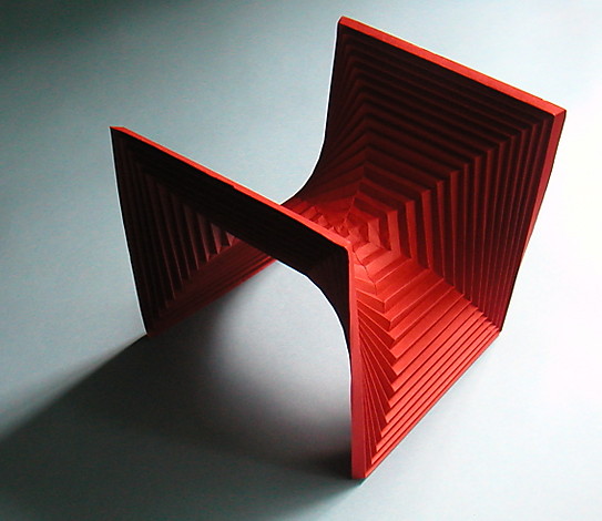
Departing from the Hyperbolic Cube (Thomas C. Hull, 2006), a regular octagon symmetrically folded, we produced origami studies of octagonal and cubic volumes in order to understand the spatial qualities of classic hyperbolic paraboloid shapes. The geometric principle is a folded octagon that traces the outline of a cube, creating an internal, vaulted space. After several iterations we achieved the intended balance: the asymmetry of the structure enhances the visual properties of the basic form, the duplicity between the strong orthogonal geometry and the curvilinear forms continuously altering from different viewpoints. It reveals itself in a constant, visual shift as one navigates towards and around it.

video

SHIRO KURAMATA

倉俣 史朗
glass chair

Shiro Kuramata’s approach to designing objects reflects the atmosphere of innovation in postwar Japan. By 1970, Kuramata had introduced alternative materials such as acrylic and glass into his furniture, which played on traditional ideas of materiality and form.Transparency, the appearance of weightlessness, and a Minimalist vocabulary quickly became his signature aesthetic. In 1976, Kuramata designed Glass Chair. Its reductivist and planar form reflects his interest in geometry as well as the effect of light as it transforms and illuminates the glass. Kuramata, like many of his Japanese contemporaries, looked to Western culture for inspiration. In particular, the sculptures of Donald Judd and Dan Flavin influenced Kuramata’s furniture designs of the 1970s, such as Glass Chair.