highlike

ALISA ANDRASEK

Cloud Osaka
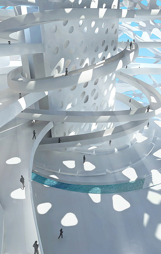
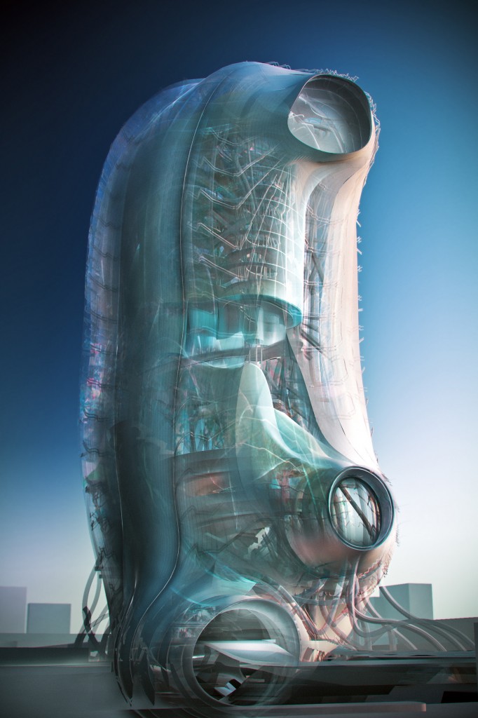
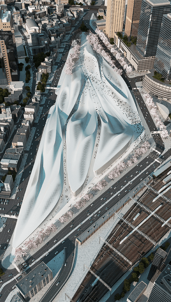
Envisioned as a high-resolution urban interchange, Cloud Osaka embodies Biothing’s approach to complex design synthesis across multiple orders of scale. Due to its central position in the city, a high convergence of users and one of Asia’s densest transportation nodes found in the adjacent JR Osaka Station, the key driver for the project was to understand 2.5 million people traversing the site every day. This is nearly 10 times the number of daily passengers at the busiest airports in the world. Such an extreme volume of pedestrian traffic, compounded by other forms of traffic in the area, warranted choosing computational physics simulation ordinarily used to simulate systems like river flows; indeed, a key driver for the project became the concept of a “river of people”.
JIACONG YAN

We only come out at night
FILE FESTIVAL 2007
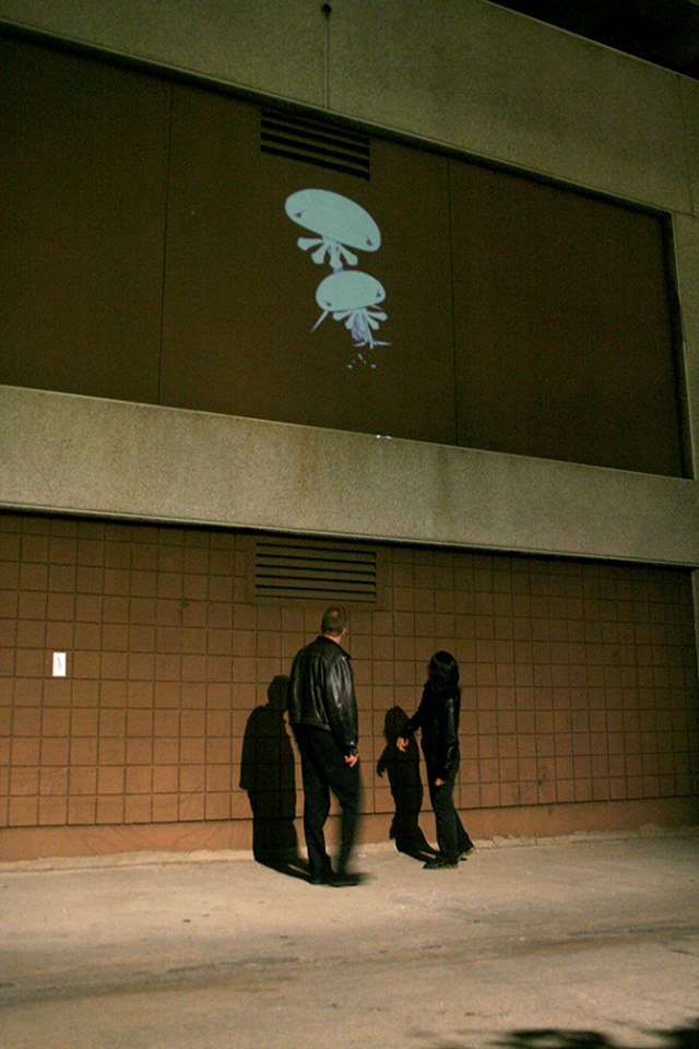
We Only Come Out at Night is an urban graffiti project involving interactive public projections. A site is selected at dawn and a sticker is stuck or a stencil image is sprayed at the location. When the sun sets, jellies are projected over the heads of pedestrians on the street. As the pedestrian walks underneath the projection, the monsters grab the shadows of the people and eat them. The sticker is then removed and the project visits another place at dawn. A website is created to track the history of the monster appearance in order to promote and create a mythology. There are seven monsters in total, each monster’s design and behavior is unique. Gula, the monster that always eat, Avaritia, the monster that stuffs you into his pants, Invidia, the monster that takes your image and pretends to be you, and so on. Each monster is unique but always sad.

Golan Levin

Ghost Pole Propagator II
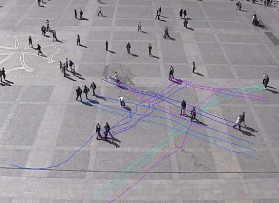
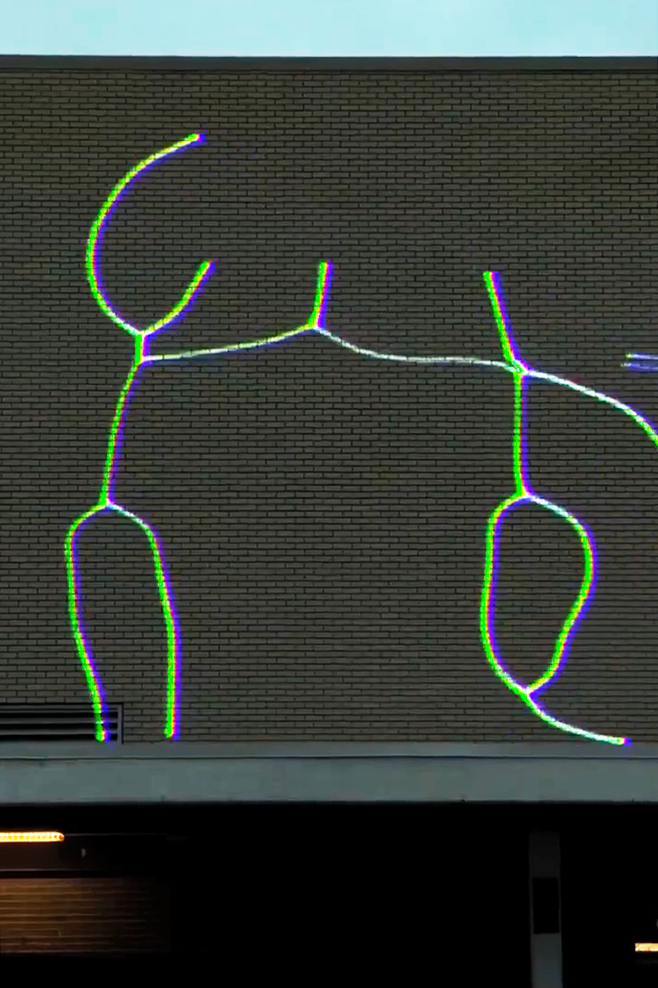
Ghost Pole Propagator captures and replays the skeletons of passersby in its environment, creating a layered and dynamic tapestry that reflects the history and activity of a locale. Presenting a universal communication of presence, attitude and gesture, the stick-figures this artwork generates are compact and expressive means of representing the human form. The format of the work is variable; in some presentations, the project serves as a kind of ‘interpretive monitoring station’ for nearby pedestrian traffic.

Michael Pinsky

Transparent Room
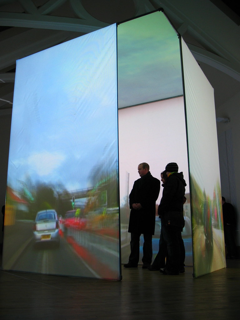
Transparent Room suspends viewers in a virtual space where they see through walls to hidden rooms and city streets, and through ceilings to the sky. The room’s confining walls are replaced by projections of the outside world, its time accelerated as clouds speed by and as cars and pedestrians alike race down the street. In this caricatured passing of time, views of the cityscape and of the building’s interiors are magnified, first showing details, then textures and, finally, just single colours.

AmorphouStudio

Amorphoustudio’s ‘symbiotic towers’ in Jumeirah Gardens, Dubai consists of a residential, a hotel, and an office tower, connected on the ground level by a double-deck pedestrian shopping plaza. The connecting plaza creates two environments that can be used throughout the different seasons. The first environment, the lower deck, is a lavish green semi-shaded oasis level that is packed with trees and water to provide gathering zones for people during the hot summer season. It is located on the natural landscape level to be accessible to pedestrians from all sides.

PETER KOGLER

彼得·科格勒
Liquid
Peter Kogler`s works belong to the developing “post medial paintings” (Peter Weibl) in the 80`s. Moulded by the new media, these took on the complex form of installations. One of the main questions was the mental relationship between virtual and real space, as well as the perceptive possibilities of connection. The work, which reminds you of chaotic structures and Baroque dimensions, is based on the circularly moment of repetition, that consciously corresponds to the position of kunst Meran (pedestrian zone).

slot studio

Mexican Space Agency
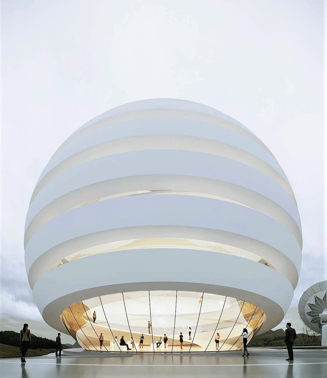
WINNER OF THE MEXICAN SPACE AGENCY’S CONTEST TO DESIGN A NEW HEADQUARTERS, SLOT’S CAMPUS DESIGN RESPONDS TO THE AGENCY’S NEED FOR COHESION, INTEGRATION AND COMMUTABILITY –VALUES THAT BECAME THE PROJECT’S INFORMING PRINCIPLES– EXPRESSED IN THE CIRCULAR LAYOUT FOR CONSTITUENT STRUCTURES. PEDESTRIAN PATHWAYS SPIRAL OUTWARD FROM THE MAIN PLAZA LYING AT THE HEART OF THE CAMPUS AND, AS IF BENDING WITH THE GRAVITATIONAL PULL OF THE MAIN BUILDINGS, VEHICLE ACCESS WAYS WIND IN AN AROUND THE CAMPUS SPACE.

RYAN JOHNSON

Райана Джонсона
pedestrian

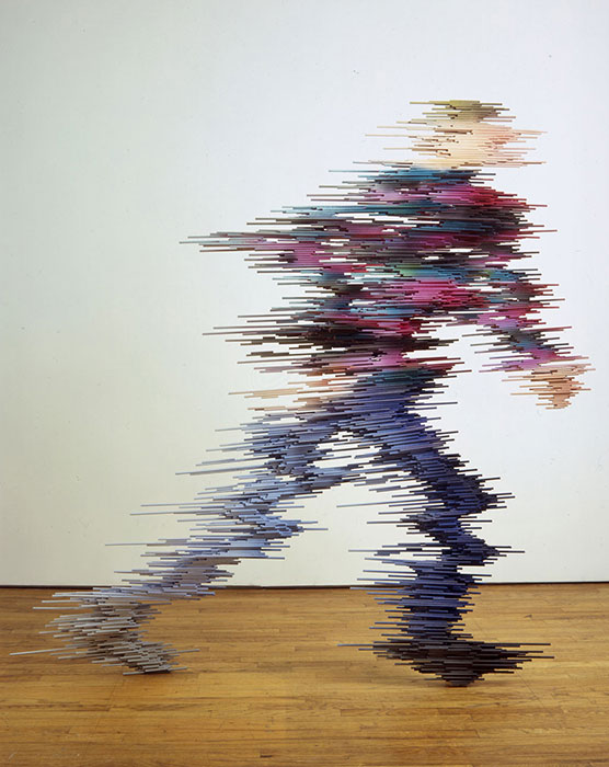
Ryan Johnson’s pieces made from found and repurposed materials are very much rooted in traditional figurative sculpture, but he has abstracted the forms, making his work have a weird gestural quality. The drawing and writing he does on the casting tape he uses plays on the idea that it’s usually wrapped around broken limbs, but it also allows him to use it to create another thread of communication within his work. His ‘Pedestrian’ series of figures made out of wood and paint is also really stunning – they look like people zapping between dimensions.

Jekaterina Nikitina

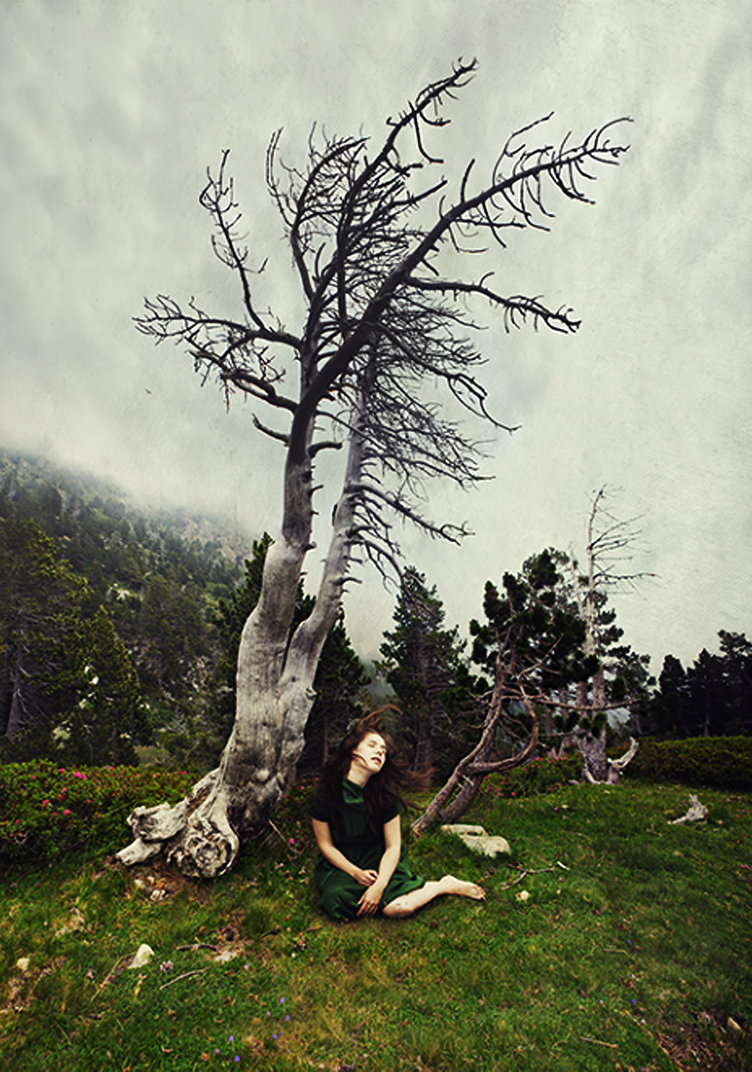
Lithuanian artist Jekaterina Nikitina has an awkward appeal that can easily be considered the trademark of her work. We recently discovered some of her self portraits. While some of her photos were of a relatively pedestrian fare, the majority of the photographs had a foot in quirky surrealism.

olafur eliasson

オラファー·エリアソン
اولافور الياسون
奥拉维尔·埃利亚松
אולאפור אליאסון
ОЛАФУР ЭЛИАССОН
cirkelbroen bridge
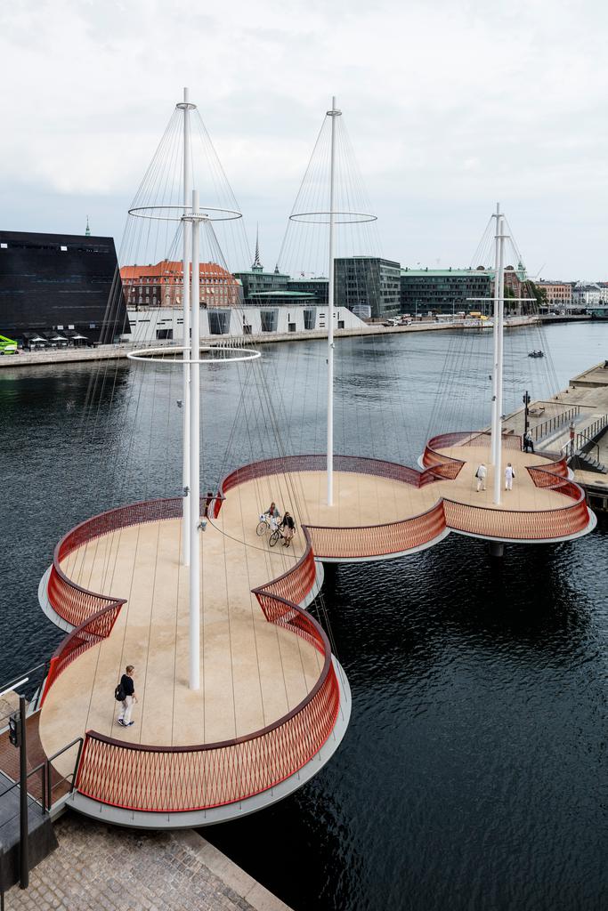
The bridge is made of five circular platforms, and it contributes to a larger circle that will form a pedestrian route around Copenhagen Harbour, where people – cycling, running, walking – can see the city from a very different perspective. As many as 5,000 people will cross this bridge each day. I hope that these people will use Cirkelbroen as a meeting place, and that the zigzag design of the bridge will make them reduce their speed and take a break. To hesitate on our way is to engage in bodily thought. I see such introspection as an essential part of a vibrant city

SS12 Studio Rashid

HyperveloCity

HyperveloCITY is a fast forward connected cultural organism that grows on top of the subway stations in downtown Los Angeles. The movement time line of the users (pedestrians, students, cars and train) is used as the operational strategies of the buildings framework. Velocities and rhythms are used to generate a new perception of space. The distance of the institutions would generate a wider field of influence in a dense cityscape. The main three volumes are an urban art museum, educational institution and a new convention centre, all separated one kilometer from each other. The various components of HyperveloCITY are connected by way of a the underground train system. The project is structured to emphasize the use and efficiencies of the public transport system and create not-so-often-seen public spaces and realms in densest part of downtown Los Angeles.