highlike

Nicole Zisman

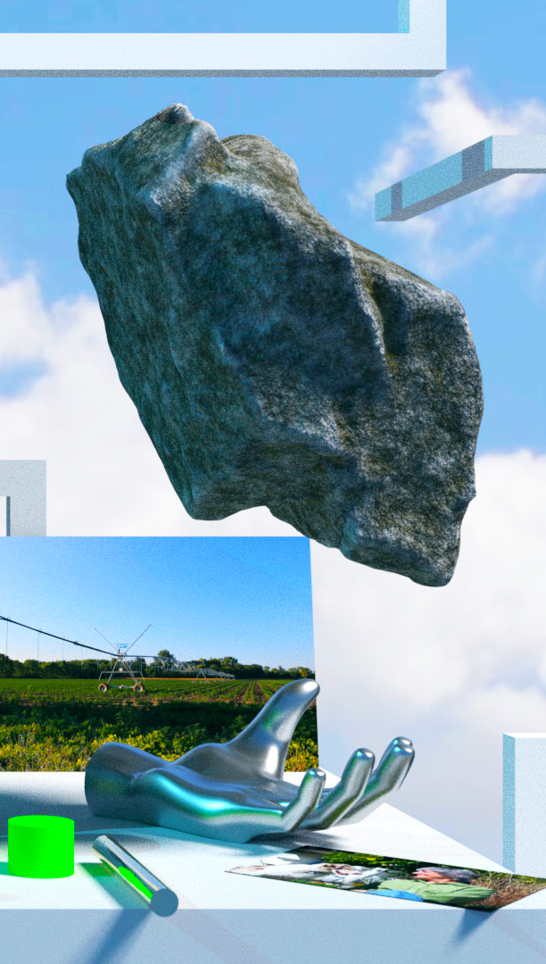
I frequently entertain the idea that everything we perceive might actually not be real at all, that the world around me could actually just be my senses lying to me. The idea that “reality is a hoax” completely freaks me out, so naturally it became the concrete starting point for my collection. From this, I began to develop different ways of “imagining” garments, of finding ways of putting things that are not really there into existence. I wanted to blur the lines of real versus imagined//artificial. Print was the best facilitator of this goal.
ABSALON

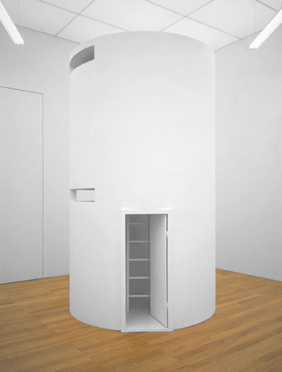
cellule No. 5
Absalon’s best known works, the Cellules, rewrite Cezanne’s “treat nature as the cylinder, the sphere and the cone” to read “treat architecture as the cell, the bunker and the turret.” Not that the Cellules are straightforwardly architecture: they equally evoke Minimalist sculpture, Matt Mullican’s maquettes, Kurt Schwitters’ Merzbauen and the Concrete sculptures of George Vantongerloo. But the model that the Cellules most overtly evoke is the monastic cell. The Cellules were fabricated in wood, cardboard and plaster, and painted entirely white; their average proportions are roughly those of a caravan, and the catalogue informs us that there is always an area in which one can stand up. Their interiors are fitted–fitted rather than furnished–with unobtrusive minimal representations of desks, seats, beds, etc.

Steve Messam

Apollo
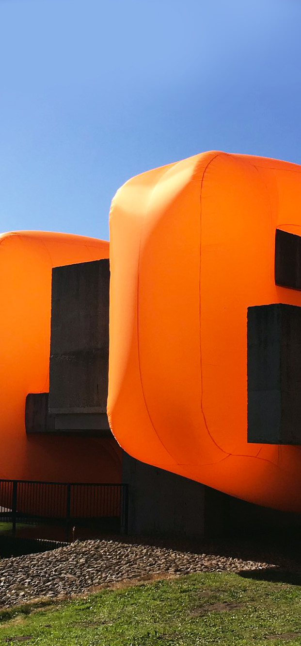
Victor Pasmore’s ‘Apollo’ Pavilion sits at the heart of the Sunny Blunts estate in Peterlee[…] Four large orange forms intersect the pavilion at right angles to the main orientation and appear to slice through the pavilion. The blocks are drawn from the geometry of the pavilion and a nod to the remote object planes of Victor Pasmore’s work. The inflatable textiles blocks create a juxtaposition between the angular grey concrete of the pavilion and the soft, rounded, colourful forms of the installation. The intervention is deliberately bold with a strong visual aesthetic to temporarily transform the pavilion. The piece is also, on the surface, playful, tactile and accessible – encouraging the audience to look at the pavilion with fresh eyes.

François Bayle

Acousmonium

Das Acousmonium ist das Schalldiffusionssystem, das 1974 von Francois Bayle entworfen und ursprünglich von der Groupe de Recherches Musicales im Maison de Radio France verwendet wurde. Es besteht aus 80 Lautsprechern unterschiedlicher Größe und Form und wurde für die Bandwiedergabe entwickelt. Wie Bayle 1993 in einer CD-Hülle schrieb, war es so Eine weitere Utopie, die dem reinen “Zuhören” gewidmet ist … als durchdringbarer “Projektionsbereich”, arrangiert im Hinblick auf das Eintauchen in den Klang, auf die räumliche Polyphonie, die artikuliert und gerichtet ist. Das Verteilen von Kompositionen aus elektroakustischer Musik oder Musique concrète über ein Acousmonium wird als Diffusion bezeichnet. Dies geschieht durch den Komponisten oder einen Interpreten, indem er die räumliche Verteilung und Lautstärke der Musik während der Wiedergabe steuert und anpasst.

YANG Minha

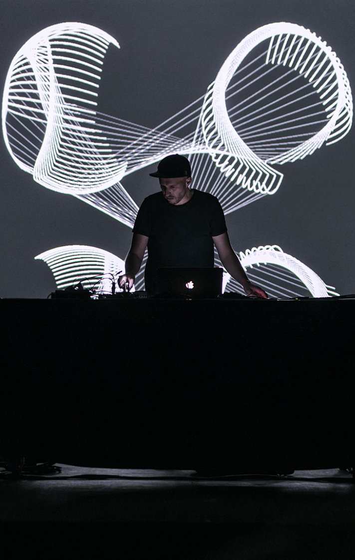
Accumulation The LED light tunnel expresses the accumulation of time. The composition of the frames concretes continuity and shows the locational context. “Accumulation” has six sequences and each movie has the original theme like “Rise”, “Flow”, Accumulation”, “Dimension”, “Light” and “Overlap”.

Fabrice le Nezet

Elasticity
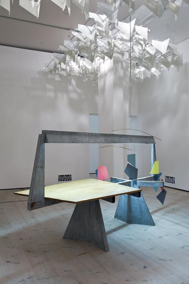
With an urge to constantly explore the intersection between architecture, fashion, and product design, london-based artist Fabrice le Nezet has created ‘Elasticity.’ the work materializes the idea of tension by making the notion of weight and stretch palpable through the use of four massive and abstract metal structures. These components run perpendicularly across the long edges of rectangular voids in the ceiling. by presenting this normal condition, several of the wires bend to support large prisms of concrete that provide a feeling of force and motion. as they drop down to occupy spaces below, movement is emphasized by their strategic orientation below clerestory windows shining light onto the forms. As observers move around the constructs, a contrast is created between the real properties of the materials and the way they are perceived.

Elmgreen & Dragset

Bent Pool
German artists Elmgreen and Dragset have installed a sculpture that looks like an U-shaped swimming pool outside the Miami Beach Convention Center[…] Curved pieces of aluminium were used to create the unusual structure, with the two ends resting atop a concrete plinth. “Bent Pool is shaped like an inverted “U” and stands upright on a two-tier plinth,” the studio said. “The pool seems to have somehow been lifted out of the ground and stretched into a curved form.”

Mark Dorf

Contours
Contours proposes a distancing through de-familiarization of what has become concrete by way of image and language. Active contradiction and abstraction are central to the works through a mixture of variables often seen in opposition or as dis-harmonious. Through the presentation of puzzling symbols, both familiar and skewed, a legible illegibility is produced: information being transmitted, but the immediate read obscured and hidden from sight. Through this, current sight-lines are made visible allowing for critical reflection, while simultaneously revealing the flexibility of language and image in order to engender the possibility of alternative understandings of the world: a crucial consideration in context of our contemporary global social and political shifts.
video

Ai-Spacefactory

Marsha
Marsha is a AI SpaceFactory’s NASA-award-winning design and prototype for a 3D printed Mars habitat. The prototype was printed nearly autonomously in 2019 within a 30-hour construction window. “Our 3D print technology uses a recyclable biopolymer composite which outperformed concrete in NASA’s strength, durability, and crush testing. ASTM lab tested and certified to be two to three times stronger than concrete in compression, our space-grade material is also five times more durable than concrete in freeze-thaw conditions.” Ai-Spacefactory

JKMM

Amos Rex Museum
Amos Rex rethinks the urban park as part of our museum experience. Its structure is built with large concrete domes. This principle is very functional for museum use: it allows long column-free spans and flexible exhibition spaces. The domes contain skylights that introduce natural light into the galleries below as well as carefully selected views of life above. At street level, a new urban square has been created with a unique identity. The domes form an undulating landscape for people to enjoy, especially children. The Lasipalatsi building was restored respecting its valuable 1930´s Functionalist era interiors and details.

Skylar Tibbits

Rock Print
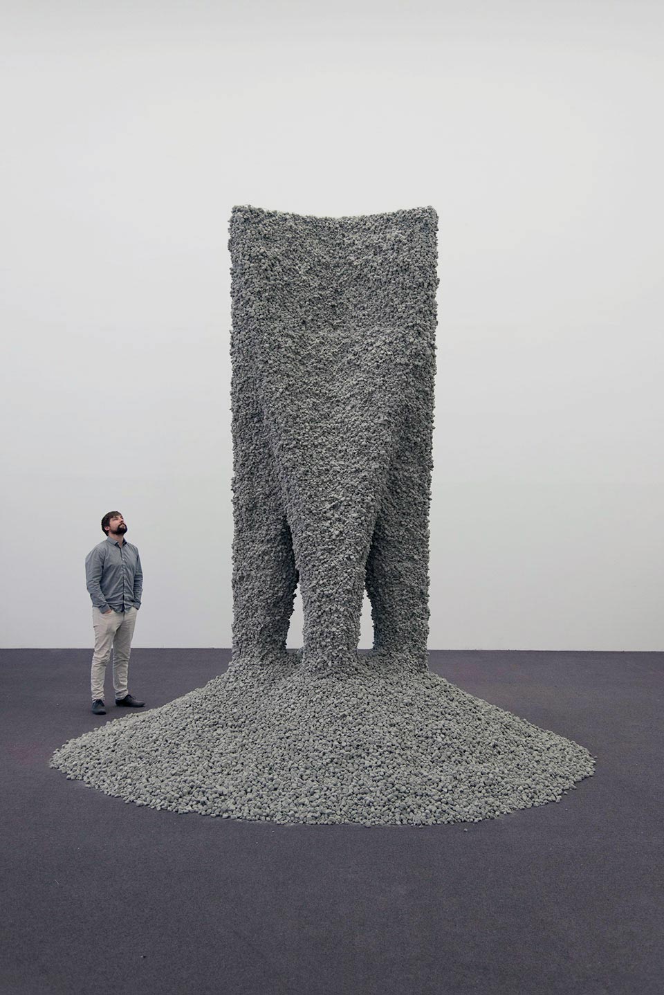
The world has been “about to be revolutionized” by 3D printing for years now, but aside from rapid prototyping, 3D selfies, and the occasional gimmicky 3D-printed house, we don’t see much of it every day. So why hasn’t this technology revolutionized modern infrastructure? One reason is that it still has to compete with concrete, one of the cheapest, most versatile, and efficiently delivered materials in the history of architecture. At the Chicago Architecture Biennial, Self-Assembly Lab at MIT and Gramazio Kohler Research of ETH Zurich showed off a process that might finally one-up concrete, using only a 3D printing extruder, rocks, string, and smart design.

Quintessenz

Lingering Summer
“Lingering Summer” is a site-specific installation created for the 2019 West Bund Art Fair. The gradation of colors from yellow to lime green, and indigo to cerulean blue, is reminiscent of the dynamics of changing colors from early to mid-summer. The ascending and descending of layers create a natural and comforting rhythm, as if forming a virtual space to preserve the summer scene inside the steel and concrete architecture, mesmerizing the audience by breaking them away from reality.

Lina Ghotmeh

Light in Water Installation
‘Light in Water’ is a site-specific installation intended to provide an immersive and emotional experience. It was previously presented at Milan Design Week 2011. The installation took advantage of the unique status of the venue – one of the oldest concrete domes in Paris. The installation was thus adapted to the circular form of the space, defining the inner sanctuary as a ‘place to be’ and an outer area as a space for a bystander. There are sixteen rings of slotted tubes on the ceiling. From each hole, 60 drops of water fall every minute; in total 3 tons of water circulate in the space. The LED lights vibrate between on and off, with frequencies ranging from the shortest interval possible, at 7μs, allowing the viewer to materialise a point of light in water, up to 6000μs, where light becomes the line of water.

ARCHITECTENBUREAU MARLIES ROHMER

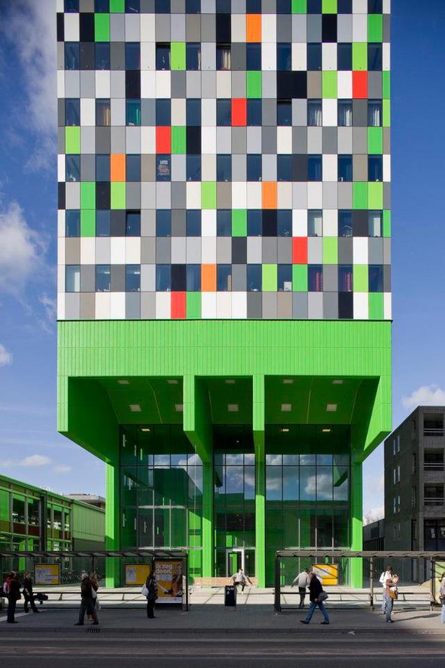
The building of student dwellings in the complex of buildings belonging to Utrecht University has transformed the Uithof site into a full-fledged campus. It will also help relieve the chronic housing shortage for young people in the city of Utrecht. Within the line of freestanding buildings (‘Objectenstrook’) the master plan designed by OMA, our block of 380 independent and clustered rooms presents itself as a solitary mass with a 20 metre cantilever. The spectacular main concrete supporting structure consists of four slabs that together form a theatrical single table leg. The ‘leg’ and its rocking bench dramatize the main entrance and create an urban rendezvous which distills the encounters and the to-and- from of all those students.

MARTIN BOYCE

Бойс, Мартин
马丁•博伊斯
마틴 보이스
מרטין בויס
マーティン・ボイス
Do Words Have Voices

Since 2005, Boyce’s work has drawn largely from an encounter with Four Concrete Trees, a group of sculptural pieces by the Martel Brothers made in 1925. Five years on, and Boyce’s work is an increasingly abstractive and virally pervasive aggregator, a lens through which everything must be seen. Like a strongly held belief or an indisputable fact, this is the world as infinite and varied as it ever was, just with one of the basic settings tweaked.

Tatiana Trouve

I TEMPI DOPPI
Trouvé uses everyday materials to fashion surprising constructions that channel memories, history and poetry. Her installations do not contain direct symbolic allusions, but attract visitors to their concrete, physical presence, infused with spectres and imaginings.more

INGES IDEE

inges idee se compose des artistes Hans Hemmert, Axel Lieber, Thomas A. Schmidt et Georg Zey, qui ont travaillé conjointement sur des projets dans l’espace public depuis la création du groupe à Berlin en 1992. Parallèlement aux travaux réalisés dans le groupe, tous les membres sont actifs dans leur propre pratique artistique individuelle.
inges idee fonctionne comme un collectif artistique dans l’espace public. Ce qui est donc important, c’est de développer une intuition pour les possibilités et les spécificités d’un site et d’explorer l’effet qu’une intervention concrète pourrait avoir. Cela se fait en dialogue avec le site donné, qui, contrairement au «cube blanc» sans référence des musées et des galeries, n’est pas statique et intemporel, mais soumis à un processus constant de changement. Pour bien comprendre un site, ses qualités spatiales, sociales et historiques doivent être examinées.

Thomas Struth

Tokamak Asdex Upgrade Periphery | Max Planck IP,Garching
Since the end of the 1970s Thomas Struth dedicates his work to the world of buildings and constructions as a visible, physical and sculptural symbol of our civilisation.
Struth’s earlier works mainly comprised architectural shots of deserted streets, squares and houses which he aimed to capture by the term unconscious places. His more recent work, however, reveals his interest in sites of high technology and places of exhibition and display. Both his work Tokamak Asdex Upgrade Interior 2 (2009) which was taken at the Max-Planck-Institute in Garching and his photography of a massive concrete construction at the Acropolis Museum, Athens (2009) bear evidence of this new focus.
This excellent selection of Struth’s works enables us to trace his development as a Photographer from small-sized prints from his time as a student of Bernd and Hilla Becher to large-sized photographic tableaus, and to experience Struth’s sculptural understanding of architecture. In addition to that the installation is supplemented by his largest work, a shot of visitors in front of the Aquarium, Atlanta, Georgia (2013) which follows the pattern of his Museum shots.

TOYO ITO

تويو ايتو
伊东丰雄
טויו איטו
伊東豊雄
도요 이토
Tower of Winds
During the day the perforated metal panels that cover the Tower of Winds reflect the city image and make the design appear humble and simple. But during the night, it gets lit up in an ever-changing combination of light intensity and colors. Using computer software, the lighting follows the wind speed and noise levels changing the Tower’s appearance accordingly. The Tower of Winds features more than 1300 light bulbs and 42 flood lights and neon rings (on each floor). The small lights change their colors according to the wind’s noise level and the rings change their intensity according to its speed.
Basically, the Tower of the Winds by Toyo Ito is a wind indicator in a constant relationship with the city and the natural environment, a junction between the two. It is placed at the train station area, welcoming the passengers arriving in Yokohama and its functional role is accommodating another natural element. Surprisingly the Tower of Winds houses the water tanks for the air-conditioning system of the underground mall below. The Tower is not a new construction, but a re-designing of an old concrete tower that already existed there since the ‘60s.