highlike

Yunchul Kim

La Poussière de soleils (Dust of Suns)
In the semicircular conservatory is a tall standing sculpture. It’s called La Poussière de Soleils, the Dust of Suns. On its back are tubes full of murky amber fluid; sunlight that has yet to be illuminated, still yet to set fire. Its façade comprises three hexagonal panels filled with a magical alchemical solution of la poussière de soleils, of the artist’s own invention. Each appears filled with thick golden sunshine. The bubbles blown through them leave trails of light even brighter and more golden; like trails of light torn through the heavens, like pools of shooting stars.

FILE LED SHOW Neuroscientific-Installation


FILE FESTIVAL

FILE LED SHOW

saccade
OUCHHH STUDIO
Neuroscientific-Installation
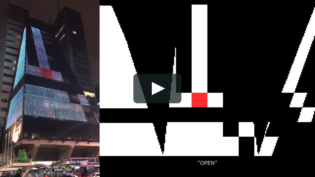
We are invited to São Paulo for our vertical light and sound installation which will transform the facade of São Paulo’s one of the most important architecture which is Fiesp Led Building.
We started this project with the idea that Neuroscience and simultaneous movement of both eyes between two or more phases of fixation in the same direction algorithms, and we transform the high-resolution led screen into a media canvas which transformed into living architecture.

KUNIHIKO MORINAGA AND MAMORU HOSODA

DIMENSION
Mamoru Hosoda collaborated with Morinaga to create this great collection film. It begins with the formation of the clothes as Morinaga designed them, not through cut and drape but via cut and paste, and we see the garments as digital toiles made up of fractal contours true to the representation of futuristic facades stretching back to Metropolis and Tron. Then the dresses form more tangibly, but still in 2D, filling those vectored spaces with the angled jigsaw of reclaimed denim, chino cotton, and gabardine, plus reflective material (all seamlessly bonded) from which they are made. It slowly becomes kind of clear that we are seeing a fashion show in U, the virtual world which Belle’s heroine inhabits—and that it is also being streamed on U’s equivalent of YouTube. There are rooms within rooms within rooms.

.

仮想世界は二次元。非日常の世界。現実世界は三次元。日常の世界。仮想とは、現実にはない世界を仮にあるものとして考えてみること。現実とは、事実として目の前にあらわれている世界そのもの。2022年春夏コレクション「DIMENSION」は二次元と三次元を越境する。画面の中の世界は二次元。細田守監督最新作「竜とそばかすの姫」のアニメーションの世界。劇中に存在する仮想空間’’U’’でコレクションが幕を開ける。CGアバターモデルが、宙に浮くガラスのランウェイを歩く。画面の外の世界は現実。‘’U’’が投影された真っ白な空間を、実在のモデルが歩く。コロナ禍がもたらしたデジタルのファッションショーは、軽々と世界の距離を縮め、すべてをフラットにした。画面の中では、立体と平面の区別はなくフラット。画面の中と外の境界もまた、消えていく。画面の外で纏うだけでなく、画面の中でも纏うことができる。

Alisa Andrasek

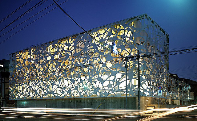
This research used stigmergy behaviour, another example of agency-based systems, which could be programmed to be highly adaptive to local data. What is most intriguing and attractive in this case, is contrasting organic aesthetics emerging from algorithms like stigmergy, with its plant like formations, and the hyper-rationalisation and genericity of voxelised geometry. Different resolutions were introduced in the facade panels, by using an octree algorithm. The result is a building skin that from afar looks like a plant, but in close up has almost Minecraft-like aesthetics coming from a multi-resolution voxel field. Organic stigmergy (stígma + ergon) partly plays a role in the distribution of data through the facade field, rather than generating geometry. It leaves its imprint in the density of geometry

BANDALOOP

100 Northern Ave
You’ve probably never seen anything like this before. Six members of the vertical dance troupe BANDALOOP descended the façade of the new 100 Northern Ave. building commemorating its grand opening at Boston’s Seaport District. The performers are held securely by special rigging allowing them to mesmerize audiences with dynamic physicality and intricate choreography. BANDALOOP honors nature, community, and the human spirit through perspective-bending dance. A pioneer in vertical performance, BANDALOOP seamlessly weaves dynamic physicality, intricate choreography and climbing technology to turn the dance floor on its side. Under the artistic direction of Amelia Rudolph, the work re-imagines dance, activates public spaces, and inspires wonder and imagination in audiences around the world.

FR-EE Fernando Romero Enterprise

فرناندو روميرو
费尔南多·罗梅罗
フェルナンド·ロメロ
페르난도 로메로
Soumaya Museum

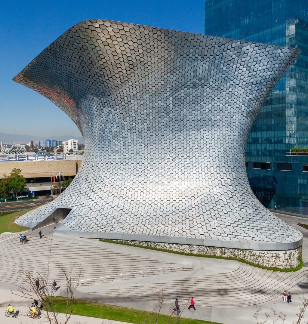
Museum buildings tend to be conceived either for maximum functionality – acting as neutral containers for art – or as iconic structures that represent a city at a particular historic moment. The Museo Soumaya was designed as both: a sculptural building that is unique and contemporary, yet one able to house a collection of international paintings, sculptures, and decorative objects dating from the fourteenth century to the present.The exterior of the building is an amorphous shape perceived differently from every angle, reflecting the diversity of the collection inside. The building’s distinctive façade is made of hexagonal aluminum modules facilitating its preservation and durability. The shell is constructed with steel columns of different diameters, each with its own geometry and shape, creating non-linear circulation paths for the visitor. The building encompasses 20,000 square meters of exhibition space divided among five floors, as well as an auditorium, café, offices, gift shop, and multipurpose lobby. The top floor is the largest space in the museum, with its roof suspended from a cantilever that allows in natural daylight.

Thomas Hirschhorn

توماس هيرشهورن
托马斯·赫塞豪恩
תומס הירשהורן
トーマス·ヒルシュホルン
abschlag

Thomas Hirschhorn’s “Abschlag” installation, which occupies the first room on the main floor, offers a lesson in how not to engage with the Russian milieu: the Swiss artist constructed part of a typical Petersburg apartment block out of cardboard inside the full-height space, ripped off its façade, and deposited the refuse at its base, revealing shabby interiors lined with original avant-garde masterpieces (on loan from the nearby Russian Museum) by the likes of Malevich and El Lissitky. The references allude to a politically radical Russian past; the construction debris acts as a metaphor for history. Though Hirschhorn suggests a recovery of the revolutionary communist spirit of the 1920s, he falls prey to a historically revisionist fetish: citing the Russian avant-garde as a generative point for vanguard culture in the West, and offering it as a source for renewed progressivism in Russia. Hirschhorn seems woefully unaware of the Putin government’s branding campaign, one that aims to sell the Russian avant-guard as a nationalist movement in line with the regime’s own values (perhaps he didn’t watch the Sochi opening ceremony). Hirschhorn ultimately proves Zhilayev right — with its political pretenses, “Abschlag” aspires to make a grand gesture against conservatism, but fails because its critique has already been co-opted..
.

LEANDRO ERLICH

Dalston House
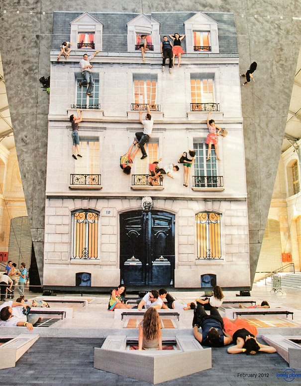
Located in Hackney, Dalston House by Leandro Erlich is a temporary installation comprising a reconstructed house facade lying face-up and a mirror positioned over it at a 45-degree angle. As a person walks over the surface of the house, the mirror reflects their image and creates the illusion that they are walking up the walls. Similarly, visitors can make it look like they are balancing over the cornices or dangling from the windows.

Daan Brinkmann & Nenad Popov

Cellwise
Cellwise is a generative projection specifically designed for the city hall of The Hague. During the festival the city hall becomes the new habitat of a kind of ‘visual lifeform. From the façade’s neatly arranged grid of white tiles, structures of a more entropic nature emerge. Shapes start growing, bursting, dripping, crawling and creeping. Cellwise is exploring the city hall’s sterile architecture, while at the same time challenging it to look for its visual counterpoints.

Behin Ha

TOGETHER APART BILLUND
Together Apart Billund consists of 375 coated mesh fabric ribbons stretched between the roofline of the Billund community building and the ground. Connected to the ground along an undulating line that curves in on itself, the ribbons create a series of cellular spaces. While the surface generated by the ribbons separates the individual spaces, its porosity provides visual interconnectivity between them. With the top and bottom anchoring patterns aligned symmetrically to the building facade, the installation is situated to have an axial relationship with surrounding buildings. The interplay between the linear top anchor positions and curved ground anchor pattern gives rise to differentiated and complex conditions of visual overlap, density, and transparency. The bright orange color of the installation creates a focal point and invites curious passers-by to interact with the work.

LEANDRO ERLICH

Леандро Эрлих
莱安德罗·埃利希
Dalston House
The Dalston House resembles a movie set, featuring the façade of a late nineteenth-century Victorian terraced house. A mirrored surface is positioned on the on the ground lying life size façade, in a 45-degree angle. Visitiors apppear to be hanging of the building or sitting on window sills, by sitting, standing or lying on the horizontal surface. The audience plays an important and active role in the installations for Erlich. By altering the viewer’s relationship with familiar spaces, he playfully disrupts our own notion of reality,through the mirrored projection of the image, creating new possibilities and situations.


Frank Gehry

Luma Arles Tower
Atelier Vincent Hecht’s photos reveal the distinctive facade of the Luma Arles tower, which is finished with 11,000 aluminium panels irregularly arranged around its concrete and steel frame. Described by architecture critic Frank Miller as a “stainless-steel tornado”, the cladding was designed by Gehry to evoke the craggy limestone cliffs around the city for which it is known.

Steven Chilton Architects

wuxi taihu show theatre design
The building’s appearance is composed of three primary elements, the columns, the shade canopy and the building envelope. Representing an abstract impression of a bamboo forest, the slender white columns are positioned around the perimeter of the building in such a way as to provide a screen between the building façade and surrounding landscape. The ‘bamboo’ columns clear around the various entrances to help frame the accesses into the building.

Blake Marques Carrington

The Year We Make Contact
FILE LED SHOW

FILE Festival São Paulo
Documentation of video work displayed on the 3-sided LED façade of Centro Cultural de Fiesp, in São Paulo, Brazil. The work was part of FILE Festival’s FILE LED Show 2018, on view from July 2 – August 8, 2018. The screening program featured a collaboration between FILE Festival and Pratt Institute Dept of Digital Arts in Brooklyn, led by professor Blake Marques Carrington and 13 undergraduate Interactive Arts students.

XAVIER DELORY

泽维尔底洛瑞
Ксавье Делори

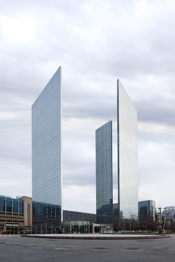
Formes Urbaines, or Urban Forms, is the brainchild of photographer Xavier Delory, who states that the purpose of this ongoing project is “to study the recurrent characteristics of modern cities.” At first glance, the viewer considers whether the buildings in his images are real, though a prolonged study assures us that indeed, this is a commentary on the evolution of modern architecture. The wafer-thin office building, the façades that lack their buildings behind them, an apartment house that screams whimsy with its inverse construction, the biggest flat on top—all of these images were created from actual photographs and then digitally manipulated to achieve the desired effect.

Studio Gang

Mira Tower
A sophisticated curtain wall facade system allows the bays to be attached to a repeatable structural slab from inside the building, reducing the need for a tower crane on site and limiting energy consumption and neighborhood impact during construction. The bays allow for a high-performance facade that is 55 percent opaque without inhibiting nearly 180-degree-views in every unit. The high-performance facade, along with an innovative VRF cooling system, allows the building to exceed ambitious California Title 24 energy standards. This, along with a state-of-the-art graywater harvesting system, green roofs, and high-efficiency fixtures, puts the project on target for LEED Gold certification.

arata isozaki

أراتا إيسوزاكي
이소자키 아라타
矶崎新
АРАТА ИСОДЗАКИ
qatar convention center
Arata Isozaki’s initial concept was based on the holy Islamic Sidra Tree, which symbolizes the end of the seventh heaven. Huge steel columns create a tree-like appearance and an illusion of two trees supporting the roof canopy. The columns of the building grow from two concrete bases along the façade and divide into four branches. These have octagonal cubes as structural cores.

William Cobbing

Chang and Eng
William Cobbing is an artist living and working in London. Starting from a sculptural sensibility his artwork encompasses a diverse range of media, including video, installation and performance. In the artworks, people are often depicted as being fused with the surrounding architecture, or buried under layers of clay or concrete, from which they absurdly struggle to extricate themselves. The space in which he installs the artwork is where it take shape, often responding to the layout of a gallery or an external context such as the facade of a building, or through replacing manhole covers in the street

LEANDRO ERLICH

Леандро Эрлих
莱安德罗·埃利希
Dalston House

The Dalston House resembles a movie set, featuring the façade of a late nineteenth-century Victorian terraced house. A mirrored surface is positioned on the on the ground lying life size façade, in a 45-degree angle. Visitiors apppear to be hanging of the building or sitting on window sills, by sitting, standing or lying on the horizontal surface.

Ljiljana Majkić

Cinque Terre

Ljiljana Majkic from Sarajevo is presenting her collection for winter 2011-2012. Collection was named CINQUE TERRE like the Mediterranean coastal town which has inspired her to create this collection as it is a place of unique beauty and architecture with warm coloured, simple geometric facades.This collection has simple, sculptural form, poetic spirit and eclectic character and it was created with a same passion and commitment as the previous one. Her search for new, original design and new shapes has resulted in a series of sensual models.Overall visual experience of her models is the desire to create something that will last longer than one season, so creating for Ljiljana is not only following the trend, or restrict what the trend is set as a rule. Her fashion is characterised by the expression of eclectic styles, and free artistic and creative expression.

Zhu Pei and UNRBANUS

Digital Beijing
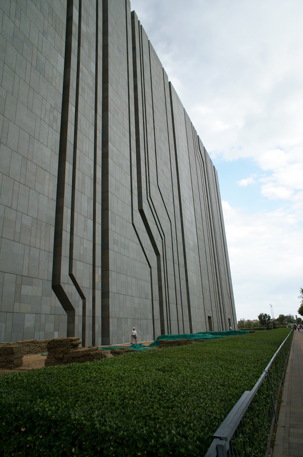
The Digital Beijing building begins to explore what will occur in the digital epoch. The building served as the control and data centre for the 2008 Olympics. The concept for Digital Beijing was developed through reconsideration and reflection on the role of contemporary architecture in the information era. Resembling that omnipresent symbol, the bar code, the building emerges from a serene water surface. The façade itself is detailed to resemble an integrated circuit board.

LAVA

AIA BAR / RE-SKIN PROTOTYPE
The bar design for the AIA at designex was conceived as a “facade mock up” of Tower Skin, the innovative and award winning “Re-skinning” of the UTS Tower in Sydney.more

pierre delavie

architectural abduction

french artist pierre delavie has transformed the grand palais in paris into an ‘urban lie’, distorting the architecture of the famed building with ‘neo – rapt architectural’. questioning reality and manipulating city landscapes, delavie changes the face of building facades, integrating fake structural elements and projected light into the existing space. by manipulating the exterior skin of the renowned european museum, he forms a new archetype he calls, ‘architectural abduction‘, where the falsification of the traditional image is changed and reinterpreted as a new space. additions and subtractions render the structure imperfect, changing the manner in which passers-by perceive the historically significant landmark.

j. mayer h.

于爾根·邁爾
يورغن ماير
위르겐 마이어
יורגן מאייר
ユルゲン・マイヤー
Юрген Майер
finalizes mixed-use sonnenhof complex

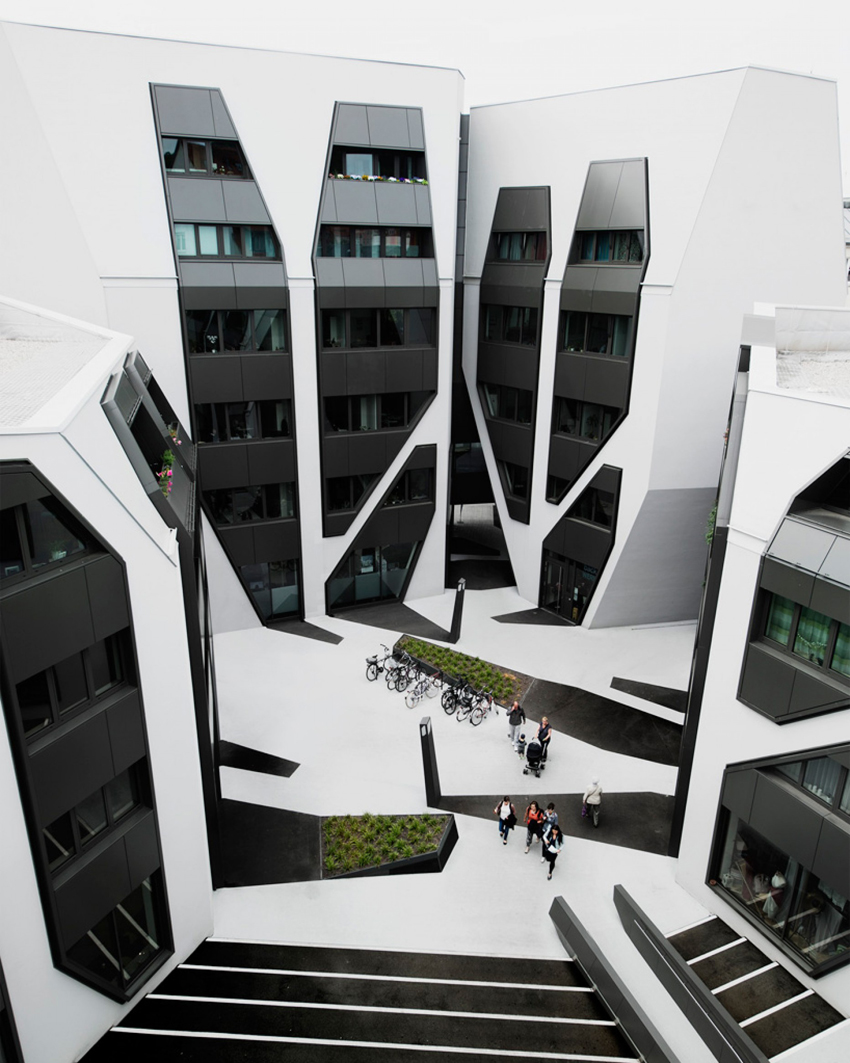
J Mayer H Architects has completed a housing and office complex in Germany, covered with graphic patterns that extend down from facades to create the impression of elongated shadows.The four buildings that make up the Sonnenhof complex range in height from five to seven storeys, and are clustered around a central courtyard.All four buildings feature faceted monochrome facades. Skewed pentagonal and square windows are outlined by grey aluminium panelling, contrasting the stark white plasterwork.In homage to this detailing, J Mayer H chose to paint different areas of the courtyard black and white, creating the illusion that dark shadows are cast onto the ground.Wedge-shaped planters with integrated benches contribute to this effect.The Sonnenhof complex is located in Jena, a town in the Saale river valley in eastern Germany.

Vincent Callebaut

Венсаном Калебо
Mangrove Towers

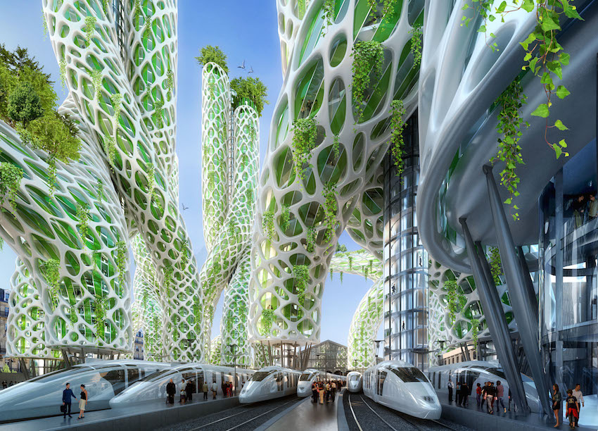
as the name indicates, the design of ‘mangrove towers’ references the shape and form of the distinctive tree. to be built at paris’ busy gare du nord railway station, the structures will accommodate a mixed program of offices, hotels and housing dedicated to international and traveling customers. the station’s platforms will be full of piezoelectrical captors polarizing under the action of the mechanical constraints generated by its inhabitants. the tubular façades will be composed of grätzel cells forming a photo-electrochemical skin.

Nieto Sobejano Arquitectos and realities:united

Contemporary Art Centre in Cordoba
BUILDING FAÇADE WITH AN INTEGRATED LIGHT AND MEDIA INSTALLATION

To transform the façade into a light and media display without fundamentally changing its solid appearance as envisioned by Nieto Sobejano turned out to be the biggest challenge in the project. The façade is accordingly designed to deliver a tactile and solid appearance in the daytime while it turns at night into a unique and dynamic communication wall that reacts very specifically to the architecture. The 100-meter façade consists of 1,319 hexagonal, recessed and pre-fabricated “bowls” on different scales. Each of the bowls serves as a reflector for an integrated artificial light source. The intensity of each lamp can be controlled individually, forming a huge irregular low-resolution grey scale display. The thorough immersion of the “pixel-bowls” – like negative impressions – in the volume of the façade turns the architectural scheme itself into a digital information carrier. During the day, the façade shows a three-dimensional landscape with no sign of being a media facade. Additionally, this tectonically modulated surface topography is characterized by a playful composition of light and shadow that constantly changes with the movement of the sun.

STUDIO FUKSAS

Shenzhen Bao’an International Airport

The new terminal of Shenzhen Bao’an International Airport, the first airport by Massimiliano and Doriana Fuksas, encompasses 63 contact gates, with a further 15 remote gates and significant retail space.
It increase the capacity of the airport by 58%, allowing the airport to handle up to 45 million passengers per year.The sculptural 500,000 sqm terminal evokes the image of a manta ray and features an internal and external double skin honeycomb motif that wraps the structure.1.5 km long, with roof spans of up to 80 m, honeycomb shaped metal and glass panels punctuate the façade of the terminal allowing natural light to filter through. Inside, the terminal is characterized by distinctive white conical supporting columns that rise to touch the roof at a cathedral-like scale.The focal point of the design is the concourse located at the intersection of the building.
Consisting of three levels – departure, arrivals and services – vertically connected to create full height voids and allowing natural light to filter from the highest level down to the lowest.

BAUMGARTNER+URIU

Animated Apertures

instead of windows, mouths with green “hair” that sway in the wind. This is the Animated Apertures Housing Tower, a project of the American architecture firm B + U. The fun building appears to have been attacked by carnivorous plants. The residential building will be built in Lima, Peru. Architects Herwig Baumgartner and Scott Uriu, known for the use of new materials, explain that they wanted to “show that architecture can exist between nature and technology”. Therefore, the designs and colors that imitate plants, in a building that looks more like a living organism. The “hairs” of the windows will be made of a special silicone and will move with the wind, giving the impression of being tentacles. The project is also innovative in its structure, because instead of several small windows, it proposes few and large openings. Thus, professionals avoided a regular facade. The building will have 20 floors and 90 car spaces in an underground car park. The coverage will also have a garden and swimming pool for residents.

SPLITTERWERK

bio intelligence quotient house
Dubbed the Bio Intelligent Quotient (BIQ) House, the approximately €5 million building was designed by Splitterwerk Architects and funded by the Internationale Bauausstellung (IBA), a long-running exhibition series showcasing cutting edge techniques and architectural concepts, for this year’s International Building Exhibition – 2013.
A total of 129 algae culturing tanks are affixed to the East and West sides of the building via an automated external scaffolding structure that constantly turns the tanks towards the sun. The plant cultures are fed through an integrated tubing system, CO2 is pumped in as well. According to Arup’s Europe Research Leader, Jan Wurm, who collaborated with Splitterwerk on the project:The algae flourish and multiply in a regular cycle until they can be harvested. They are then separated from the rest of the algae and transferred as a thick pulp to the technical room of the BIQ. The little plants are then fermented in an external biogas plant, so that they can be used again to generate biogas. Algae are particularly well suited for this, as they produce up to five times as much biomass per hectare as terrestrial plants and contain many oils that can be used for energy.Not only do these tanks provide shade for every level of the building during the summer and biogas for heating during the winter, the facade itself collects excess heat not being used by the algae, like a solar thermal system. That heat can then either be used immediately or stored in 80-meter-deep, borine-filled borehole heat exchangers located under the structure. Total fossil fuels used in this process: zero.

EDUARD HAIMAN AND VADIM SMAKHTIN

Struct- Generative Realtime Audio-Visual Environment
The target of “Struct” was to create installation which could make immersive environment inside the space of public event dedicated to the opening of the office of an architectural company UNK Projects. It was planned to make this installation fully autonomic during the several hours as well as there was an idea to hold the public interested and immersed into the space of environment during the all period of time.

The main conception of the installation is to create the second alternative scale inside the internal space of the office. It was realized screen projection for this with the size of 18×4 meters and taken almost whole the length of the interior. The Animated surface was projected as the extension of the super-graphic situated on the facade of office`s building. The external graphic was created by Vladimir Garanin. The first one layer is the super-graphic onto the facade and another one layer is the real-time generative graphic inside the interior. The visual image and algorithmic sound of the whole structure are connected each other and are forming the whole organism.